In the previous article discussing the growth scorecard, I left open the question of how Apple’s growth is reflected in its share price.
The approach to answering this question is to show how the share price correlates to that growth. The challenge for analysts has been that the company switched from subscription to current accounting for the iPhone (the largest component in its income statement). As they re-stated income and thus earnings, any historic review of P/E or other multiples of Earnings have to also be re-computed.
So this is what I’ve done:
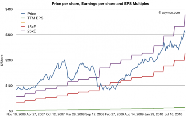
The first chart shows Apple’s price per share (blue) vs. its trailing twelve months earnings (green) and multiples of those earnings (15x and 25x).
The chart shows how Apple was priced well above 25 P/E before October 2008 and has remained within the 15 to 25 multiple bands since the winter of 2008/2009. This seems fairly reasonable and the stock’s rise is a cause of celebration for many, but a cause for concern for some. Is this rise in price matching a rise in value?
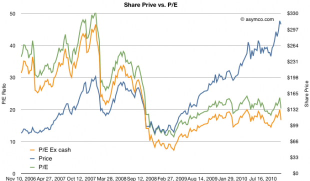
To answer, we need a way to look at the valuation of Apple. One way is to plot the P/E ratio over time. That would show how the market perceives the value of the company (i.e. how many years’ worth of earnings is built into the price) The chart below does that.
I took the additional steps of plotting the P/E excluding cash from the price to show “P/E Ex cash” in the orange colored line and I also copied the Share price line from the first chart on this one for contrast.
What the P/E analysis shows is that as the stock rose, it’s P/E ratio fell. This means that the “valuation” of the company is quite a bit lower now than it was in 2006 and 2007. In fact, as a multiple of profitability, Apple’s stock is nearly half as valuable now as before the recession.
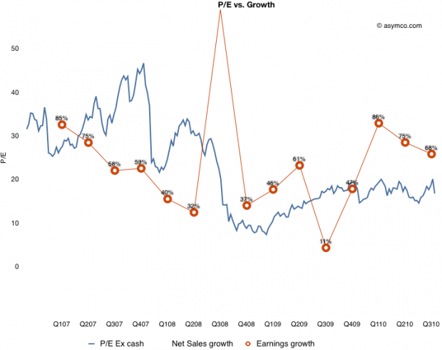
Since valuation is usually correlated with growth, (P/E is often compared in a ratio with Growth) we need to see whether the P/E in the chart above matches the actual growth of earnings. Fortunately we have just measured growth with the scorecard. Here are the two charts together:
What this shows is that while earnings growth did slow down in the lead-up to recession (with the hugely anomalous 3G launch spiking growth to 155% in Q308 causing the year-later plunge to 11%), growth picked up again in the depths of recession and has moved back to pre-recession levels. The only difference is that the multiple assigned to the stock has remained near recession lows. This is visualized by the blue line being mostly above the red line pre-crash and usually under it post-crash.
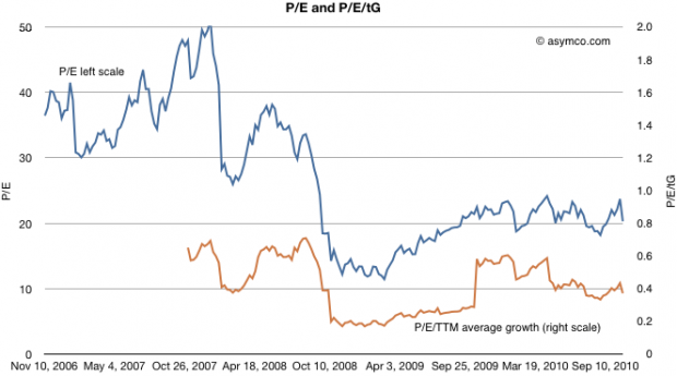
To put a finer point on this, I plot the ratio of P/E and trailing growth (P/E/tG) in the brown line below:
It shows that as a measure of valuation with respect to growth, Apple is trending down. A P/E/tG ratio of 0.4 and closer to 0.2 if we exclude cash shows very weak confidence.
The only conclusion I can draw is that the market does not believe that Apple has significant growth opportunities. A P/E of 20 with consistent 70% growth is, to be blunt, damnation. For comparison, Amazon just reported 16% growth in earnings and was rewarded with a P/E of 68.
Amazon notwithstanding, is Apple an anomaly? Is the disconnect between earnings growth and the stock price unique to Apple or does it apply to most other equities? Is pessimism about Apple a symptom of pessimism in general? I will suggest a way to answer this in a future article.
Discover more from Asymco
Subscribe to get the latest posts sent to your email.


