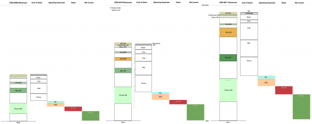
This is the cascading view of Apple’s financial performance in the third calendar quarter. It only includes information that is already in the income statement but shows the relative growth of the individual product lines, their cost structures and the relationship between fixed (Operating) expenses and their variable (cost of sales) expenses at a glance.
In the past I would publish current and year-ago data, but in this quarter’s summary I present three years’ history of quarterly data. Note that the full view is quite large (2,220 x 886 pixels).
Here are some handy tips on how to read the chart:
- The “top line” is the size of the first column in each quarter’s chart.
- The “bottom line” is the size of the last column.
- The blank areas are what Apple pays suppliers.
- The red area is what Apple pays to the government.
- The Pink and pale blue area is what Apple pays its “exempt” employees. (Other Income and Expense is also included but is nearly invisible).
- The Green area is what is declared as earned and becomes the “E” as part of the P/E ratio. (Note that not all of this goes to the Cash account as the cash flow statement will reveal).
- The colored areas in the first column labeled with product name and “GM” (for gross margin) represent what Apple keeps from the sale of each product after paying expenses tied to producing that product.
- The ratio of sold areas to the corresponding white areas below in the first column represent the margin (as a percent) per product line
- You can observe the trend over three years by tracking each of these quantities from left to right.
The scale of the chart is shown by the line near the top representing $30 billion.
Discover more from Asymco
Subscribe to get the latest posts sent to your email.

