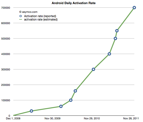
The following chart shows the reported (circled points) and estimated (lines) for Android activations. The resolution of the sampling is every seven days.
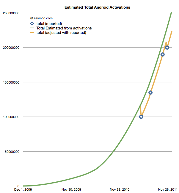
If we take these estimates and then compile a cumulative total of activations we get the green line in the chart below.
The wrinkle in the picture is that Google also occasionally reports cumulative estimates of total Android shipped. They are shown as the blue circles in the chart above. There is some room for error as the cumulative totals may not be reported the same day they happen and the assumptions in the activation rates may not be reflecting occasional slowing.
However that leads to a problem. By adjusting for the reported totals we get the orange line. The trouble with it is that it has these improbable “kinks” where the total is adjusted down, something that is not happening in reality. It’s a kludge we need to make estimates fit reality. Normally, this is something we can sweep under the carpet, but with the size of the market, the errors creep up to tens of millions of unitis.
The first downward adjustment would have been 19 million in May. Today, the difference between the green line and the orange is about 25 million.
So the best we can say right now is that there have been between 224 and 253 million Android devices activated to date. Why Google does not report this data regularly and consistently remains a mystery.
Update: The data used in the charts above is available as a Google Docs spreadsheet here.
Discover more from Asymco
Subscribe to get the latest posts sent to your email.


