Thanks to David Chu for forwarding the data that made this possible and reader Narajanan for spotting the divergence in platform efficiency.
iOS and Android are both growing rapidly. According to Gartner, during the first three quarters of 2010, about 44 million iOS devices and 36 million Android devices were put into use. That’s 80 million devices. An amazing achievement for two platforms that did not exist 3 years earlier.
But obviously not all devices are used the same way. Devices which have unused capabilities limit network effects for a platform and for the category of product in general. Question is: how can we measure the “smartness” of a device; how much more likely is a device to be used as a mobile computer vs. being a regular phone?
The best proxy I can think of is a measurement of browsing use. The smarter the device, the more browsing is a joy and the more it is actually done. Browsing leads to more data load on the network and creates a virtuous circle of revenues for the mobile computing value chain.
If we could measure the increase in browsing generated by each additional phone, we could compare whether one platform is better (specifically, more efficient) at generating value asymmetric to voice.
Fortunately we have data from Netmarketshare.com (see sources below) which attempts to track browser consumption and hence allows us to measure this variable. What we need to pair that with is the incremental increase in the installed base of devices.
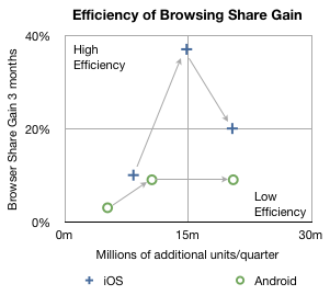
In the chart below I plotted how much browsing share increased for every phone sold by platform over the first three quarters of 2010.
The arrows indicate the sequence in time from Q1 to Q3. The vertical axis shows gain in share three months after the corresponding number of units shipped in the previous quarter on the horizontal axis. So, for example, the second circle means that in the second quarter approximately 10 million new Android devices created a gain of about 9% in browsing share. In the same quarter, 14.8 million iOS devices created about 37% gain in browsing share.
In the third quarter approximately the same number of iOS and Android devices shipped (iOS including iPads and iPod touch) but the browser gain was 20% for iOS vs. 9% for Android.
A line drawn diagonally from lower left to upper right (0,0 to 30m,40%) could represent the average gain in share per units sold–the sort of measure we’re looking for.
Measuring that slope tells us that, on average, every million devices sold should generate a gain of 0.75% share[1]. I took the additional step of labeling two quadrants which are orthogonal to the expected trend. If browsing increases dramatically faster than 0.75%/million units then I call those devices sold as creating “highly efficient” browsing gain. If browsing increase lags dramatically below 0.75%/million units then those devices added share with “low efficiency”.
So four data points follow the trendline down the middle of the chart, however, there are two notable outliers. Finding the causes for these outliers gives clues to what’s happening with the platforms.
I believe the explanation for iOS’s second quarter’s extraordinary efficiency is that was the quarter when the iPad launched. It seems to have yielded a very strong spike and the trajectory of iOS improved even into the next quarter as those iPads continued to be in use. iPad seems to be a very effective way to gain browser share.
I also believe that the cause for Android’s fall in efficiency in the third quarter was that it began to be sold in large quantities in the developing world. The third quarter saw a rapid acceleration of sales without a proportional increase in what was measured as sales in the US (and Europe).
Interpretation
If this trend continues, and there is no guarantee that it will, then a question could be raised about Android’s value to, of all people, Google.
The core value of Android to Google is the increased use of browsing and hence search. All the other Google services and in-app ads are tiny opportunities in comparison to the potential of search on mobiles. One could argue that the raison d’être for Android since day one was to create browsing consumption. In that regard it’s not as good at doing that as iOS is.
Perhaps Google can justify the under-performance of consumption of browsing (and hence search) on Android devices as benign since there is no marginal cost added to supplying Android to non-consuming devices.
But I wonder. There is the problem of opportunity cost: Those iOS devices that create more browsing activity are going to take more share. The more they do that the more Google will have to pay Apple for placement as the default search in mobile Safari.
It may be a stretch, and perhaps the data is wrong, but that’s what this exercise is all about: how much can we learn from fragmentary data? Without a hypothesis there is no discovery.
—–
Notes:
- Since these platforms have very low shares (less than 2% for iOS and 0.3% for Android by November) almost all the gains can be assumed to be against other browsers (e.g. Internet Explorer) and not against each other.
- Update: the original Unit estimates excluded iPad and iPod touch which have since been added.
Sources:
- Browser Share iOS (Netmarketshare.com)
- Browser Share Android (Netmarketshare.com)
- iOS Shipment data (Gartner): Q1, Q2, Q3.
- Android shipment data (Gartner): Q1, Q2, Q3.
Discover more from Asymco
Subscribe to get the latest posts sent to your email.

