In the last post, I highlighted the difference between smartphones and non-smart device sales last quarter. The trajectory of share growth for smart devices would appear to have accelerated due to Android.
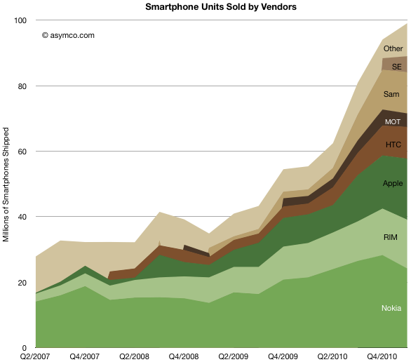
The following charts show the evolution of smartphone vendors and platforms over the last few years.
Like in the past, I used color clustering to show the separation between “integrated” (in green) and “modular” (in brown) platforms and their users.
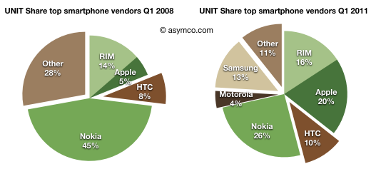
Unlike the non-smart market where “other” make up 30% of the market, smartphones are still a big brand business. “Other” make up only 11% of units. and that number has been trending down. It would seem that the age of unbranded Android phones is still not upon us.
Comparing three years “before and after” here is Q1 2008 vs. Q1 2011 by vendors share:
Apple added 15% of share, Samsung 13%, Motorola 4%, RIM and HTC 2%. Nokia lost nearly 20% of share.
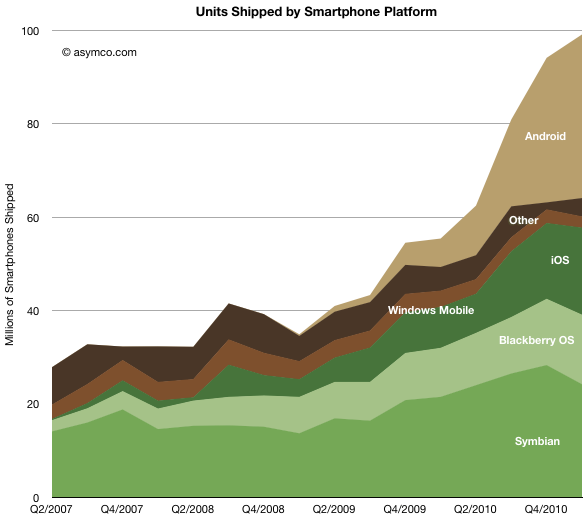
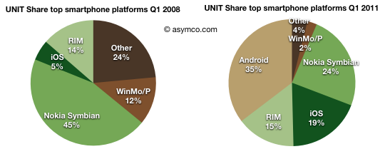
From a platform point of view, the unit chart looks like this:
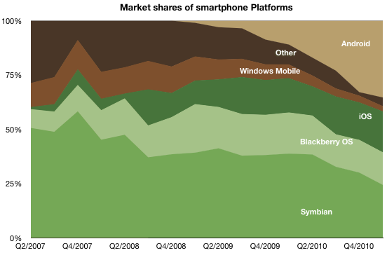
Note that Android’s growth came at a time when Symbian had a terrible quarter. The evidence is visible in the share chart:
Android’s gain seems to be at the expense of Other, Windows Mobile and Symbian. In the pie chart snapshot over a three year period the transfer seems clear.
Android took 35% of share, iOS 14% and RIM 1%. Windows Mobile/Phone has collapsed to 2%.
But again I would caution about drawing “sustainability” conclusions from looking at this market with a share perspective. As it’s growing at a huge rate (73% year/year) it’s bound to be become so large that single digit share numbers still amount to vast ecosystems while huge shares of fragmented products don’t amount to much of value. To emphasize the point, I would remind that in 2008 Symbian was not just Nokia but a lot of “Other” was made up of Symbian in Japan. The combined fragmented footprint of Symbian was well over 60% of the market. It did not do much good for the platform.
Discover more from Asymco
Subscribe to get the latest posts sent to your email.

