Nearly all the data on smartphone shipments is now available for the second quarter 2011. Some fragments are still not public, including ZTE and Huawei (and any others) shipments. We also have estimates for the various platforms including an estimate for Windows Phone and Bada (though not for WebOS).
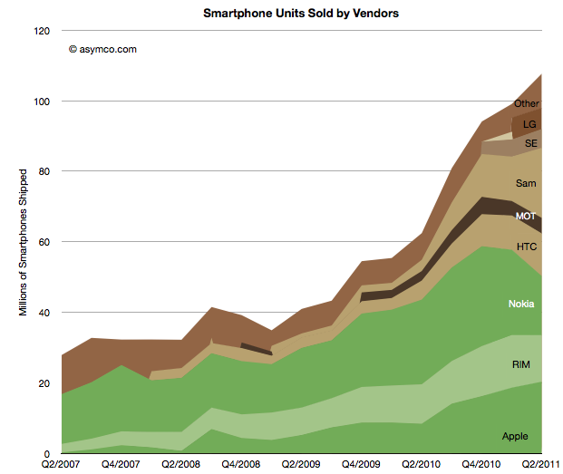
This allows the following chart:
Using the traditional color scheme which separates “integrated” from “modular” vendors, the chart shows overall volume growth and how the volumes are split among vendors.
The market grew at about 73% y/y and 50% compounded over three years and 9% sequentially. The y/y growth rates for individual vendors were:
- Samsung 525%
- Apple 142%
- HTC 124%
- Motorola 63%
- “other” 29%
- RIM 18%
- Nokia -30%
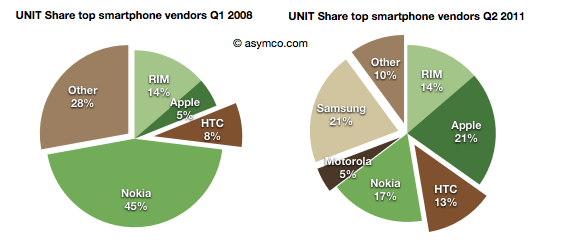
In terms of unit share, the pie charts below show the before and after (three year span):
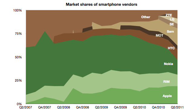
And the stacked area below shows every quarter over a four year period.
The story is largely unchanged since last quarter except perhaps in the rapidity or deterioration in Nokia’s performance and Samsung’s partial exploitation of that decline.
It should be noted that not all of Samsung’s volumes are licensed platforms. An increasing share of Samsung smartphone volumes is Bada, an internally developed OS.
In the charts above I arranged the bars to place Nokia and RIM in the middle to show their double envelopment. A pincer movement is only an analogy but perhaps it’s evocative of what’s happening.
Discover more from Asymco
Subscribe to get the latest posts sent to your email.


