After processing more than 1500 data points on the performance of thirteen technology companies, patterns are beginning to emerge. The steps so far:
- Visualizing P/E and Growth as time series centered on a point of crisis.
- Plotting P/E vs. Growth with an eye toward any clustering/correlations for the cohort.
- Detecting and measuring any change in the relationship between P/E and Growth before and after the point of crisis.
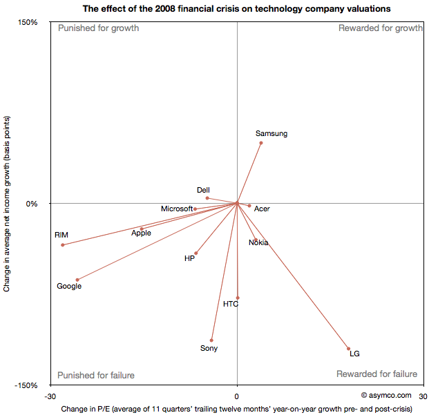
The final step is to plot the changes in the relationship between pre- and post-crisis for the set of companies normalized to the same starting point and then classifying them: 
The chart shows how the “average P/Es” changed after 9/30/2008 vs. how the companies performed during those periods. An evocative categorization is suggested for the four quadrants.
One way to read the data would be as a degree of effect of the crisis. For example, in the case of HP, its P/E dropped by about 6.5 while its average growth decreased by 41 basis points giving an average of 0.16 drop in P/E for every basis point reduction in growth. That would be a fairly modest impact. In the case of HTC, the impact would be even less. The effect on P/E was zero even though growth dropped by about 78 basis points. At the same time the impact on Microsoft was severe with the P/E dropping as much as for HP even though its growth only moderated by 5 basis points.
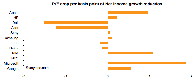
Therefore the “slope” (or angle in vector parlance) of each of the lines in the chart above may be interpreted as the severity of discount in value that the crisis invoked. Those values are shown the following chart:
A strong bar on the right half of the chart implies severe impact, a bar around the middle implies minimal impact and a bar in the left represents an inverse relationship where the market priced in opposition to performance[1]. What should be considered along with this chart is the quality of earnings and consistency of performance (which are shown in the posts linked above.)
Discussion
As noted in a previous article, there are really only six companies which had strong separation between pre- and post-crisis valuations: Apple, HP, RIM, HTC, Microsoft and Google. They are also the companies which had strong P/E drops (except for HTC). As a group they are also the companies with the best growth stories historically. This is perhaps the reason for the drop. Basically, because these were strong companies they “had the most to lose”. The market “punished” them more severely than the weaker companies because the weak had already been discounted.
The other observation is that Apple and RIM are not treated particularly differently. The drops in P/E are at about 1 for every basis point drop in growth. This means that the the degree of value lost is about the same as a function of growth loss. Microsoft seems to have been the most affected. We can argue that it is perhaps weaker than the others strategically so this is reflected here, but I doubt it’s weaker than RIM. Microsoft is also in contrast with Google which seems to have been given a lot of benefit of the doubt.
Nonetheless, this framework offers some hints on how technology companies have been treated after the crisis. There is no rightness or wrongness about this treatment but it may indicate potential for significant reaction in the opposite direction if and when macroeconomic conditions improve. These vectors are, in a way, proxies for volatility or “beta” in terms of correlation to the overall market. The greater the beta, the more amplification to market movement; the greater the slope value
As always, Apple is the canary in the coal mine as far as sentiment is concerned. What should be watched is the pricing reaction as Apple moves from a net reduction in growth to a net increase in growth. How will P/E react? The argument on this site so far has been that growth is exceptionally strong for Apple and it’s not being reflected in the price. However, in this analysis we’ve stretched the time frame and did a longer retrospective. On this new time scale growth is not yet at the levels Apple enjoyed in the heady days of 2005/6. Perhaps this growth will return and when it does we’ll get to see which way Apple’s vector moves.
—-
Notes:
- An inverse relationship with value can happen for various logical reasons, for example that a company has volatile performance which is depending on anomalous events.
Discover more from Asymco
Subscribe to get the latest posts sent to your email.

