In the post on OS turning circles, I used the concept of a radius of turning as an analogy for agility. One problem with the analogy is that turning in circles implies a return to a starting point or at least a closing of the loop. The idea is that there is lifecycle repetition. However, in reality, this does not apply to the world of operating systems.
An OS, as a platform, usually has a finite life. It is born, grows and usually reaches a point where it is no longer supported. Sometimes, a new platform is born to take its place from the original owner but more often a replacement comes from a new challenger company.
So rather than circles, the analogy of OS lifetimes may be more accurate.
If we do think of platforms as finite, then the natural question is what causes an end? We need to look for patterns which may indicate when a platform is reaching end of life.
The difference in this analysis is that the measure of “age” of a platform I use is not time per se but versioning. The logic is that each major version is a meaningful and significant improvement in a platform which needs to be delineated, marketed and celebrated. It embodies the business logic as well as the engineering logic of the platform custodian.
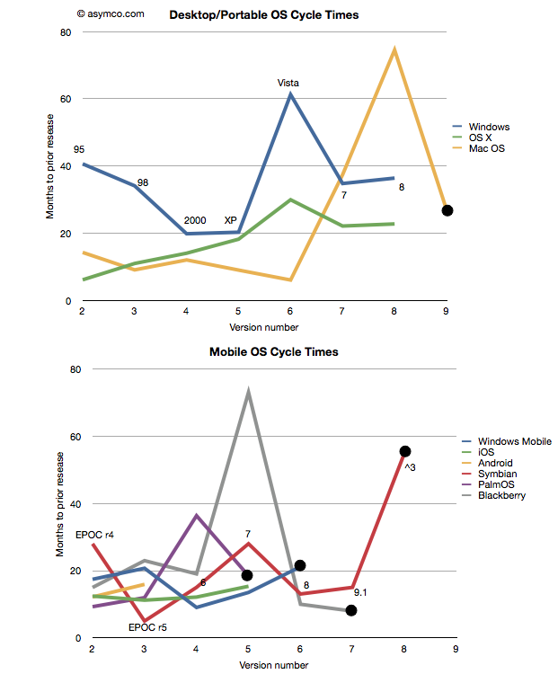
Taking the data from the last post I added a few more platforms: Symbian[1], PalmOS and Blackberry OS[2] to seek out patterns. I also separated the desktop/portable OS’s from Mobile OS’s and plotted these version-demarcated lifespans.
One thing to observe is that the scales of the two charts are comparable. There are examples of short- and long-term version updates and the number of iterations (lifespan) can be similar. I noted also that there were several platforms which have reached end-of-life[3][4]. Those platforms have a big black dot at the end of the line.
That leads to another observation. The end of a platform seems to be indicated not by simple age (the shortest lived was six years and the longest lived was 16) nor by the number of versions (PalmOS lived for five while MacOS lived for nine). Instead the end of life is most clearly visible as a lengthening of the development cycle.
Note that each platform that ended was preceded by a spike into the vertical–a significant delay in the release of a version. The data is one thing, but it’s anecdotally supported by observation. Industry observers note that delays in improving the product are symptoms of some fundamental architectural or marketing roadblock. In the case of Mac OS, Apple struggled to bring modernity to its “Classic” OS. It need memory management, more reliability and a better file system to support the move to networking and media hub use that defined the consumer expectations of a PC.
There was a change in the basis of competition, away from pure productivity and more toward entertainment that turned out to be more demanding in new ways. Apple had to move away from Mac OS and lost time with its internal Copland effort before punting with NextSTEP. Similar transitions are visible with Palm (from PalmOS to WebOS), Microsoft (from Windows Mobile to Windows Phone) and Nokia (from Symbian to MeeGo) and RIM (from Blackberry OS to QNX). In fact, survival of a transition is relatively rare and never without significant pain and loss of value or share.
This is also understandable through the lens of disruption theory. As a product reached the point of being good enough, “breakthroughs” are harder to come by. Engineers and marketers struggle to push the product into increasingly rarefied strata of performance. The old architecture does not fit the new demands but it’s crammed into them anyway. This last big push is then followed by a stall and ultimate demise. Meanwhile, an entrant gains lift in the rich atmosphere of new bases of competition with an architecture that’s built specifically for it. The process then repeats.
And so the charts relate the same story of sustaining improvements followed by inevitable last gasps that Clayton Christensen first illustrated[5] in The Innovator’s Dilemma. A book that came out just as the first mobile platforms cataloged in these charts began their ascent.
—
Notes:
- Versions of Symbian do not match easily to integer values. I used the versions as recorded by pdadb.net. The sequence is as follows: EPOC Release 3: “1”, Release 4: “2”, Release 5: “3”, Symbian OS 6.0: “4”, OS 7.0: “5”, OS 8.0: “6”, OS 9.1: “7” (9.0 was deproductized), Symbian ^3: “8”. Symbian ^4 has been cancelled. These original version numbers are noted on the chart.
- The times recorded are for “general availability of product” which in the case of mobile OS’s means the time when a device using that OS was released.
Symbian PalmOS Blackberry Jun-97 Jun-96 Jan-99 Oct-99 Mar-97 Apr-00 Mar-00 Mar-98 Mar-02 Jun-01 Mar-01 Oct-03 Oct-03 Oct-02 Nov-09 Nov-04 Sep-10 Feb-06 May-11 Sep-10 - End of life is defined as the last version generally available. In some cases (e.g. PalmOS 6) newer versions are built but they may not be released into a working complete product.
- Windows Mobile is treated differently here than in the previous post. I chose to declare it EOL after version 6 and consider Windows Phone as a separate OS. This is because the name change is indicative of a break with the past. As before, I defer decisions about continuity to the developers and/or marketers who choose the naming conventions.
- See slides 3 and 5 here
Discover more from Asymco
Subscribe to get the latest posts sent to your email.

