It takes money to make money. That’s a cliché. But it’s also true. The interesting question is how much can be gained from how little.
In previous articles I explained how Apple’s expenditures of capital for equipment used in manufacturing affects their output of products. The relationship between capital in and product out should stand to reason.
The more surprising aspect of that analysis is that we get to know in advance how much Apple spends (since they tell us their budget a year before it’s spent.) and therefore it becomes possible to get a rough idea of how much they will produce. And since demand has generally been higher than supply we can get an estimate of how much Apple will sell.
The only missing piece to this logic chain is to estimate how much will shareholders benefit from the capital expenditure. I’ll try to establish the relationship through a build-out of graphs.
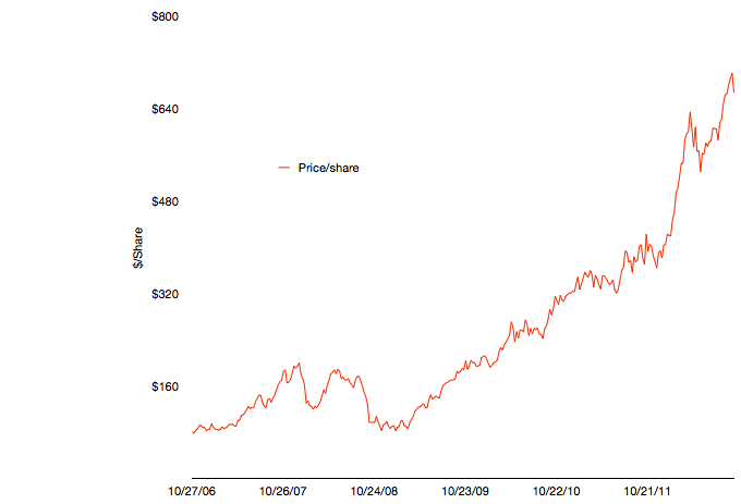
The first graph shows Apple’s share price at weekly resolution.
The time frame stretches back six fiscal years. The time span includes some dramatic periods including the financial crisis and the launch of the iPhone and iPad.
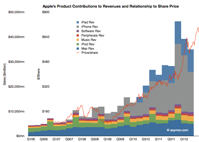
To illustrate the effect of the iPhone and iPad on this share price appreciation, I’ve overlaid a quarterly resolution graph showing revenues over the same time period with each product line shown separately.
Note that I’ve indexed the vertical scale to match approximately the highest peaks of both graphs. The two axes scales are shown separately on the left.
The relationship between growing sales and growing share price is plain to see. Note that the iPhone and iPad account for the vast bulk of sales growth and hence they are mostly responsible for the share price appreciation. Again, this should not be surprising. The scale gives an approximation of the relationship where $50 billion in quarterly revenue roughly yields a share price in the $700 to $800 range.
As I’ve shown in the last post on forecasting production using CapEx (focus on the last chart) iOS device shipments (mostly iPhone and iPad) correlate with capital expenditures in the previous quarter. Using the historic relationship, the next two quarters could see a significant increase in iOS unit production. The sum of the low end of the range implies about 163 million units.
If the relationship is therefore CapEx -> Production and Production -> Share price appreciation, then the transitive implication is that CapEx -> Share price appreciation.
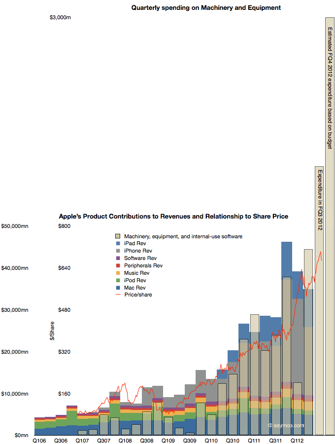
That relationship would be illustrated as follows:
The CapEx data shows the offset to the right due to the relationship with production being time shifted by one quarter. Recall that expenditures are booked ahead of output and therefore we have this apparent view into the future.
The fourth fiscal quarter’s spending has just ended and the output will be produced during October-December period.
The obvious question is whether production will increase in response to spending (as it has in the past), or, put another way, will the stacked bar areas follow the beige bars and, furthermore, will share prices follow production (as they have in the past) and thus the red line will follow the beige bar.
It takes money to make money. The relationship seems to be that $1.5 billion of CapEx per quarter yields a share price of $800. With spending reaching $3 billion per quarter will the share price reflect a similar ratio?
Discover more from Asymco
Subscribe to get the latest posts sent to your email.


