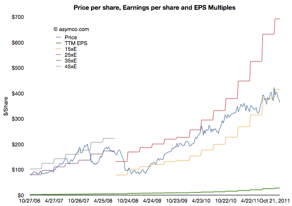
Apple's commoditization discount

When asked where Apple’s growth will come from, most analysts or observers will cite new products. As long as there are new products, then there is growth. Conversely, if there are no new products, then there will be no growth. This is such a commonly held belief that it’s axiomatic: Apple is being valued based on short-term foreseeable growth.

To be more precise, analysts value the wave of growth of every new product and heavily discount the post-growth phase assuming commoditization. There is no value assigned to Apple for extending market reach to the mass market.

Consider: Analysts currently forecast an operating income (or EBIT) of $43.3bn for 2012 and $49.7bn for 2013. That implies growth of 28% in 2012 and 15% in 2013. These growth rates are modest in light of Apple’s recent historic growth and especially 84% in 2011 on EBIT level. Much of this growth has been due to iPhone which quickly captured 4% market share in four years. To suggest 15% growth in 2013 is to suggest that Apple will not increase its phone market share by an appreciable amount. The implicit assumption in that growth figure alone is that Apple will remain a niche player.

Continue reading “Apple's commoditization discount”

Interactive Apple Analyst Data

As the quarter is now at an end, it’s time to once again review the performance of Apple’s most highly paid observers. The data set linked includes published quarterly forecasts starting quarter ending June 2008 to quarter ending September 2011. Thanks to Philip Elmer-Dewitt who collected and processed the data over several years.

Apple Analyst Data | asymco. (Requires Flash)

As with previous interactive data sets, this is based on Motion Charts “gadget” in Google Docs. Try selecting the Motion Charts tab at the bottom of the page and hit the play button.

The way this is set up now is that the origin (0,0) represents actual performance (labeled as “Oppenheimer”). Every bubble is an analyst’s performance measured as a distance from actual. The further the location of a bubble from origin, the worse the error. Placement above zero (or to the right) indicates over-estimation for Revenues (and EPS). Placement below zero (or to the left) indicates under-estimation. Color of bubble represents affiliation (professional or amateur). Size of bubble is iPhone unit error.

You can change the axes, chart type (tabs in upper right), size, colors, and track individual analysts’ performance (by checking a name checkbox). Or just download the data and analyze on your own by selecting from the Data tab.

Who is being reasonable now?

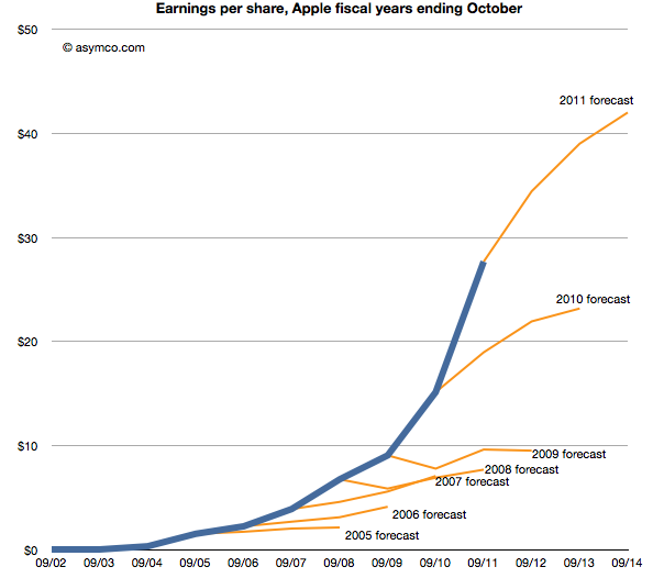
Last week Horace wrote about the apparent “reasonableness” of analyst Apple estimates. He explained how the consensus for Apple’s growth was always deeply pessimistic because its performance could be argued to be anomalous. It was just too good to be true. We reproduce the chart here:

The estimates look like characteristic “tell-tales” of a company running strong into the wind.

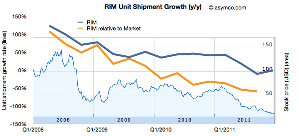
This conservatism in the face of rapid growth sounds “reasonable” but is it always practiced? And what about the ability of this conservative strategy to predict dramatic changes in growth? To test, we started to look at the predictions for RIM. RIM has also enjoyed strong growth over a similar time frame as Apple. How did analysts predict its performance? The following chart was prepared using the same technique as the one for Apple[1]. Continue reading “Who is being reasonable now?”

On being reasonable

The discussion on why Apple is cheap was very useful. The debate brought into focus the possible causes for pessimism in the face of overwhelming evidence to the contrary. But maybe there is yet another explanation. The way the data was presented was as a difference between historic and projected growth rates. Is this the way analysts actually think?

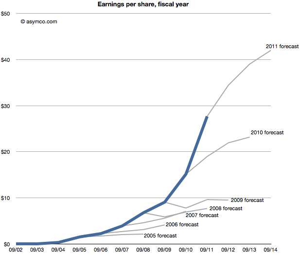
Perhaps they don’t project growth based on historic growth, but project earnings given historic earnings. In other words they don’t look at the first derivative (change in earnings) but the  shape of the actual data.

The following chart shows that data, i.e. forecasts as an extension of a sales trajectory. The blue area are actuals and the grey branches show projections at a given end of fiscal year.

Seen this way, we can imagine how the projections can be considered Continue reading “On being reasonable”

Why Apple is cheap

Imagine it’s late 2005. Apple’s fiscal year just ended and they reported their performance. You’re an analyst whose job includes forecasting the company’s performance for next year. This is a weighty responsibility.  Your forecast will be blended with those of your peers and used as a “consensus” average. That consensus for the next year will be used to measure the current value of the shares in a ratio called the forward PEG or Price/Earnings/annual earnings Growth. You are supplying the earnings and hence growth forecast while the market offers a price.  As a stock is meant to measure future earnings, your forecast is a crucial and frequently cited figure about whether a stock is priced fairly.

There is some comfort in knowing that there will be many others who will offer such a forecast and your contribution is thus not the only way investors can calibrate the price. However, you should think hard about what you are predicting as it also will reflect your skill in predicting such a visible company.

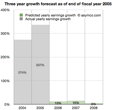
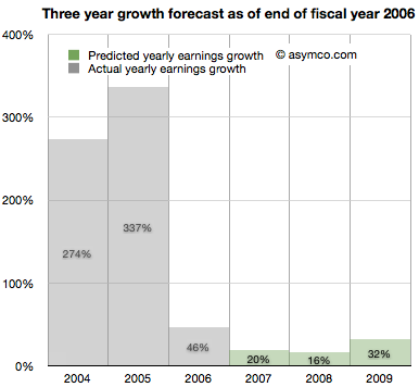
Apple just had a tremendous two years. 2004 and 2005 saw EPS grow at 274% and 337%. This is largely due to the runaway hit iPod. Given all that is known about the company, what will you put forward? While you’re at it can you also forecast two years forward, namely provide a growth forecast for 2006, 2007 and 2008?

Here is what you and your cohorts publish as a consensus:

You go with a 13% growth for 2006,  15% for 2007 and 5% for 2008. The chances are, you reason, that the iPod will not carry the company’s growth much longer. The competition is sprouting all over and Microsoft is rumored to be launching its own music player.

It makes sense to be conservative and offer a modest growth of 13%. At the same time you can rate the stock a buy as it is still growing. The stock just doubled in the last 12 months and the law of large numbers says that growth cannot last at the same rate as we’ve just seen.


It’s now late 2006. Apple just closed out another big year. Contrary to your forecast last year, the company grew at a rate of 46%, more than three times faster than you expected.

It turns out the iPod still has some legs and the company’s Mac business seems to be growing. Looking forward you take your 15% growth for 2007 and increase it to 20% and suggest 16% for 2008 and 32% for 2009.

There are rumors of Apple getting into the phone business.

Continue reading “Why Apple is cheap”

Estimates for Apple's first fiscal 2012 quarter

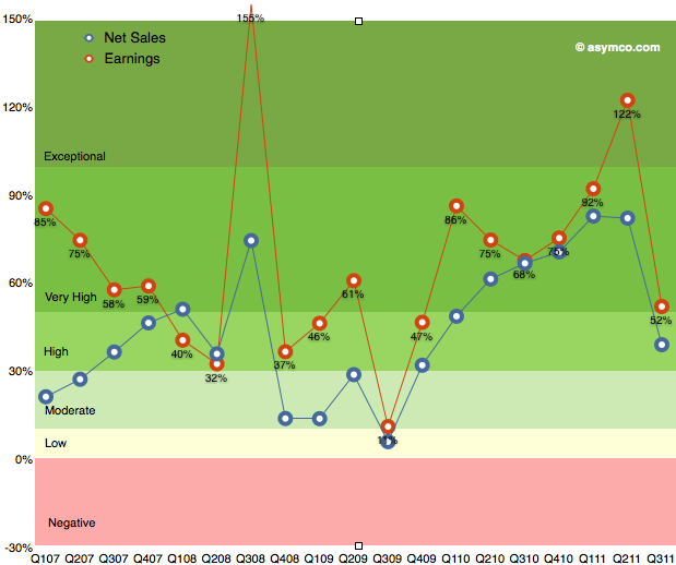
As the chart below shows, the last quarter (third calendar, fourth fiscal 2011) was slow with only 52% earnings growth. The discussion centered on the (surprisingly) disruptive effect of the iPhone transition. Surprising since most analysts, myself included, were lulled into thinking that the portfolio of iPhones and their wider distribution would create a smoother sales pattern vis-a-vis the more cyclical pattern seen in the first three years of production.

The second quarter was surprisingly strong and the third was surprisingly weak. So how do we estimate the fourth? Continue reading “Estimates for Apple's first fiscal 2012 quarter”

Does Growth Matter?

In last week’s discussion of Apple’s (historically low) valuation, comments arose that perhaps the company’s discount is not unique. Can we look at comparable companies and determine whether the relationship between growth, size and valuation are consistent?

The challenge is in finding “comparable” companies. Apple is characterized by being large in terms of market capitalization, highly profitable, in the technology sector and growing relatively quickly. One can find a cohort of companies with each of these characteristics but not all.

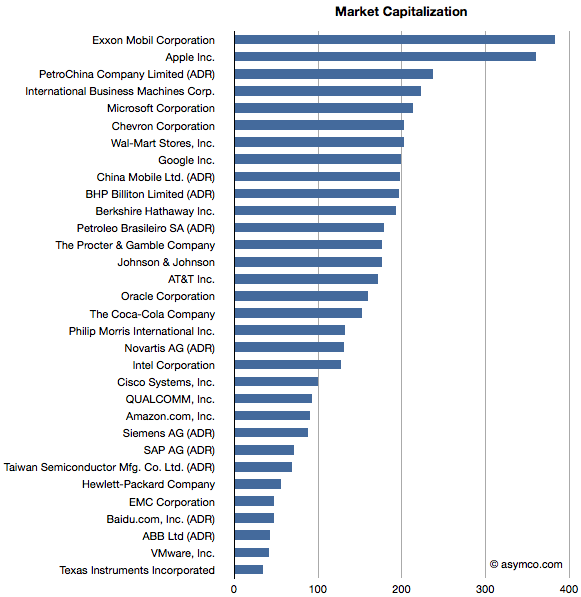
Here is an attempt at looking at the largest companies by Market Capitalization (the so-called Mega-caps) to spot patterns of valuation. Some of the companies in the top 20 mega-caps were technology companies so I thought I’d highlight them. I then also added a few of the top 20 technology companies by capitalization to create a larger sample.

The group I settled on is shown in the list below ranked by market cap.

Companies below $130 Billion in market cap (i.e. below Novartis) are in the top 20 technology list but not in the top 20 overall list.

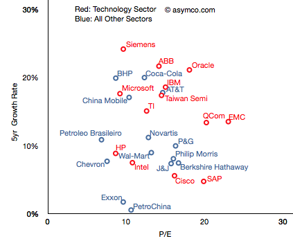
I then plotted the P/E rate vs. 5 year Growth Rate for these companies, separating the tech sector by color (Red):

The pattern is not encouraging. It appears that there is no correlation. Perhaps the technology companies are, as a group, further up and to the right, but overall they are equally unobservant of growth.

For example, SAP has grown less than 5% in five years and yet enjoys a P/E of 20 whereas Microsoft has grown 18% and has a P/E of less than 10. The non-technology sector companies are similarly broken. Berkshire Hathaway, a conglomerate, is rewarded for slow growth and China Mobile is punished for relative high growth.

But you’ll notice that some companies are not on this chart. That’s because they are outliers. Their growth or P/E are so far out of this cluster that the would make it impossible to discern individual performance. The complete “top 20” picture is shown in the following chart which will require either a large display or a lot of scrolling (1300×1364 pixels): Continue reading “Does Growth Matter?”

The thermodynamics of Apple's share price

Andy Zaky at Bullish Cross wrote a great post on Apple’s valuation, showing the deep discount of Apple’s earnings vs. an average company. It essentially states that Apple’s money is not green.

Felix Salmon took it forward by enumerating a few explanations that might be used for the despondent valuation. None are successful arguments, but that should not be a surprise.

To understand the phenomenon a bit more precisely, I maintain and think about these charts:

This shows Apple’s share price (“P” in blue) and its earnings per share (“E” in green). In addition Continue reading “The thermodynamics of Apple's share price”

Interactive charts for Apple's product lines

Warning: This requires Flash.

This is a data set that shows Apple’s product-level performance according to Units sold, Average Selling Prices, Cost of Sales, Gross Margin, Unit Growth, Revenues, Revenue Growth and Gross Margin contribution. It, along with all the other data sets are available under the Products menu at the top of this page.

Default settings:

  • Line Chart
  • Y-Axis set to Revenues.
  • Color set to GM (Gross Margin percent).

Continue reading “Interactive charts for Apple's product lines”

Apple could buy the mobile phone industry | Updated

The last time I did this comparison (Apple could buy the mobile phone industry | asymco) was in June after the end of the second quarter. The following chart is an updated look.


Here is a discussion of the changes since the last analysis: Continue reading “Apple could buy the mobile phone industry | Updated”