The down payment on iCloud

Balance Sheets are not typical targets of focus in software or services or “high tech” companies. Except for Cash, there are usually not much in terms of assets for analysts to contemplate. With outsourced manufacturing, even hardware companies don’t maintain depreciable assets on their books.

Apple, as usual, is different. It turns out there is a lot there and there’s a lot to learn from what’s there. I’ve looked at the Cash and Long Term Securities in the past but in the next few posts I’ll dive into fixed (non-current) assets. Specifically Apple’s Property, Plant and Equipment.

Apple Inc. has selected North Carolina as the location for a new data center and will invest more than $1 billion in the project over nine years, Gov. Bev Perdue announced

via It’s Official: Apple iDataCenter to North Carolina » Data Center Knowledge.

When Apple committed to the North Carolina data center in mid-2009 the iPhone was two years old. Only 26 million iPhones had been sold to date (about as many as Apple now sells every quarter.) Clearly if the commitment was on such a scale there must have been a plan. A big plan.

We don’t know for sure if NC was used last week or whether it was handling only part of the load, but let’s assume it was. What I want to think about is how much iCloud would thus cost and hence what would be the cost for alternative providers of such a service. That analysis might let us determine if “cloud” forms a substantial barrier to entry for competitors.

Beside the public statement above (which may have been designed for political benefit) can we find any evidence of what Apple spent on data centers? That’s where the PP&E line comes in.

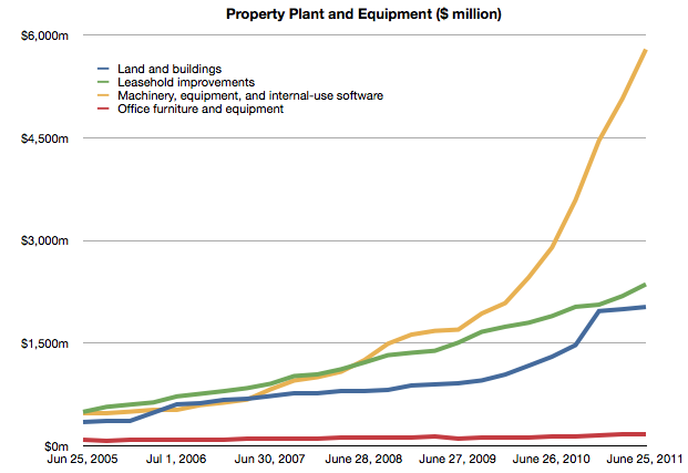
The following chart shows the Property, Plant and Equipment asset in Apple’s Balance Sheet.


Each line represents a particular type of asset and its value at a particular point in time. I will now pay attention to the blue line, Continue reading “The down payment on iCloud”

iOS vs. Microsoft: Comparing the bottom lines

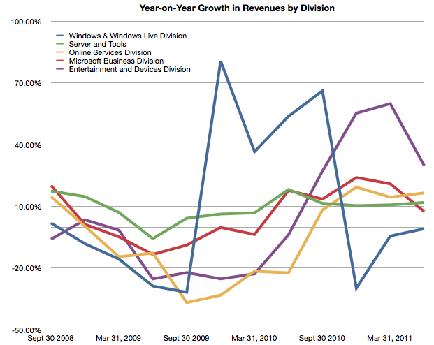
I began comparing Microsoft and Apple’s financial performance with a review of “top line” or revenues by product lines over a four year period.

This post is about the “bottom line” for the same companies and products.

Before I jump in I would like to make sure there is no confusion about the terms. I will be comparing “operating income”[1] as a measure of “bottom line”. This is a common way to compare the profitability of companies because it excludes taxes and interest income. These non-operating expenses/income can distort a comparison of performance because they can be the result of investment activity or changes in tax law or where the company is domiciled. One should not make judgements of comparative performance on those non-operational bases.[2]

Another challenge is that some companies report operating income by division while others don’t. We can usually compare overall operating income but usually not on a division or product-level. This is the challenge I will try to overcome in this analysis between two very different operating models.

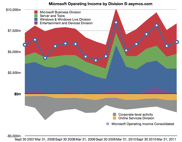
The first chart shows Microsoft’s Operating Income by Division as reported by the company.

Each area represents a business division. Note some are showing negative income (losses). Continue reading “iOS vs. Microsoft: Comparing the bottom lines”

Comparing top lines: Apple vs. Microsoft

I’ve been providing analysis of Apple’s operating and financial performance for some time. Recently we’ve begun to look at comparisons of financial performance for comparable companies. Now it’s time to dig deeper and do comparisons of operating performance as well.

To start, Microsoft.

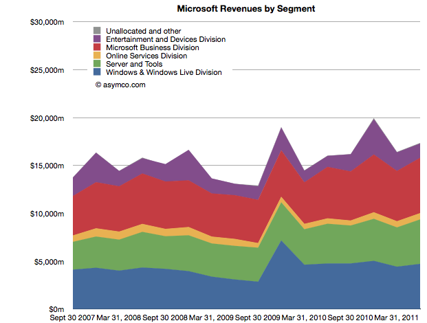
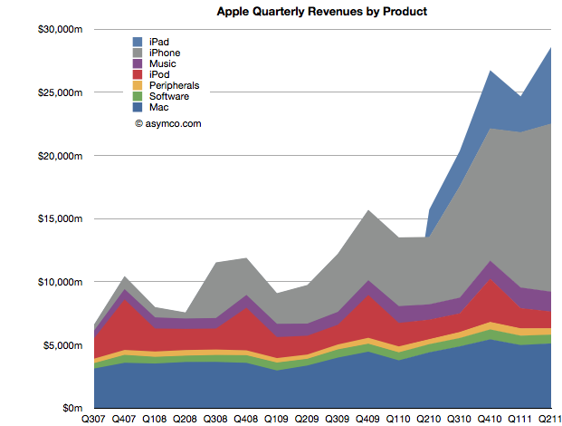
Whereas Apple has product lines (iPhone, iPad, iPod, Mac, iTunes, Peripherals and Software), Microsoft has business divisions (Windows & Windows Live, Server and Tools, Online Services, Business (Office), Entertainment and Devices). The charts show revenues for both Apple and Microsoft according to these defined segments.


The second chart should be a familiar one:

Note that the horizontal and vertical axes are the same. The period of coverage is from mid-2007 to the end of June 2011 which corresponds to the life of the iPhone. The vertical axis ranges up to $30 billion/quarter in both charts.

When shown this way, the exceptional growth for Apple becomes easier to understand (and perhaps Apple’s valuation premium of 15.7 P/E vs. Microsoft’s 9.5). Microsoft has been growing these past four years but not nearly at the rate of Apple. Microsoft grew quarterly revenues from the ~$15b range to ~$17b range.

Additional points of interest:

  • The Mac business generates more Revenue than Windows
  • iOS powered devices generate more revenue than all of Microsoft’s products put together
  • Apple’s revenues grew 413% since Q2 2007 while Microsoft’s grew 26%
  • The release of Windows 7 had a marked effect on revenues in the launch quarter but the sales did not seem to grow above the previous version’s run rate ($4.2b/quarter vs. $4.7b/q on average).

But most importantly, whereas Apple’s growth has come from new businesses (iPhone and iPad), Microsoft has organically grown existing businesses. The condemnation of leadership at Microsoft should hinge on the absence of significant top line growth. Note that neither the Online Services nor the Entertainment and Devices divisions had appreciable net growth.


Visualizing the Steve Jobs era

On October 4th, Tim Cook will take the stage at Apple’s fall event. With Steve Jobs’ transition to head the Board of Directors of Apple and after serving as CEO for fourteen years, it is time to take a look at his reign.

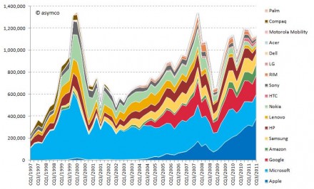
Looking at his performance vs. peer companies from a capital market performance, I have composed the following two charts:

Market capitalization of selected peer companies by calendar quarter in USD million sorted by most recent market capitalization (1997-2011)

Market capitalization of selected peer companies in USD million sorted by recent market capitalization (1997-2010)

Market capitalization as share of combined market capitalization by calendar quarter sorted by most recent market capitalization (1997-2011) Continue reading “Visualizing the Steve Jobs era”

When will Apple's share price reach $500?

Apple’s share price has recently hit a new all-time high, over $400 per share. As often happens there was no specific new information from the company to justify this increase. On the other hand there is usually no news to justify share price drops in Apple. In fact, the stock is up on what would be considered counter-indicative news: the resignation of a very important CEO.

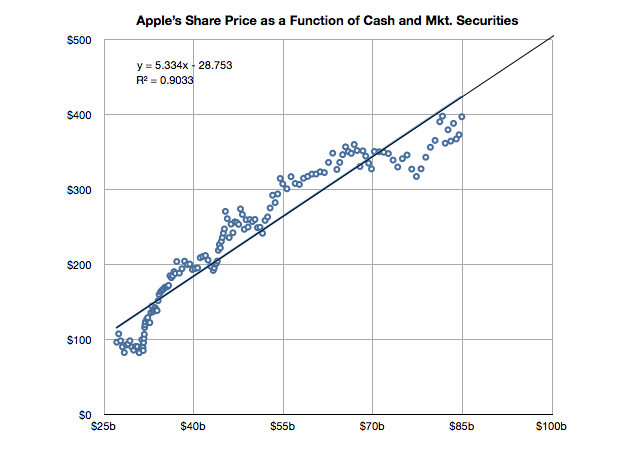
But readers may recall that there is a measure of performance for Apple we can turn to that seems to show strong correlation to its stock price. It’s not income and it’s not growth in income but it’s the strength of the balance sheet.

I demonstrated this relationship last May with a post titled The market values Apple’s balance sheet, not its income statement.

It’s time to look at the data again to see if the relationship still holds. I added the data for Q2 and made some estimate about the cash position since July 25th (we will know this data with more accuracy when Q3 data is reported in a few weeks).

The slope of the line above has decreased slightly but a strong correlation can still be observed. Continue reading “When will Apple's share price reach $500?”

Growth and punishment: The vector space model

After processing more than 1500 data points on the performance of thirteen technology companies, patterns are beginning to emerge. The steps so far:

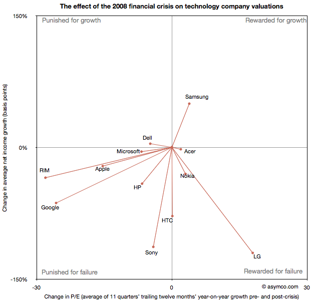
The final step is to plot the changes in the relationship between pre- and post-crisis for the set of companies normalized to the same starting point and then classifying them: 

The chart shows how the “average P/Es” changed after 9/30/2008 vs. how the companies performed during those periods. An evocative categorization is suggested for the four quadrants.

One way to read the data would be as a degree of effect of the crisis. Continue reading “Growth and punishment: The vector space model”

A comparison of P/E compressions

Following the presentation of growth/PE of comparable companies in the previous post, here are charts showing the Growth vs. P/E as a scatter plot. I highlighted the quarters pre-crisis as red dots and the quarters post-crisis as blue dots. I also added a vector line showing the migration of the average (centroid) of the pre-crisis values to post-crisis values (11 points averaged in each case).

Continue reading “A comparison of P/E compressions”

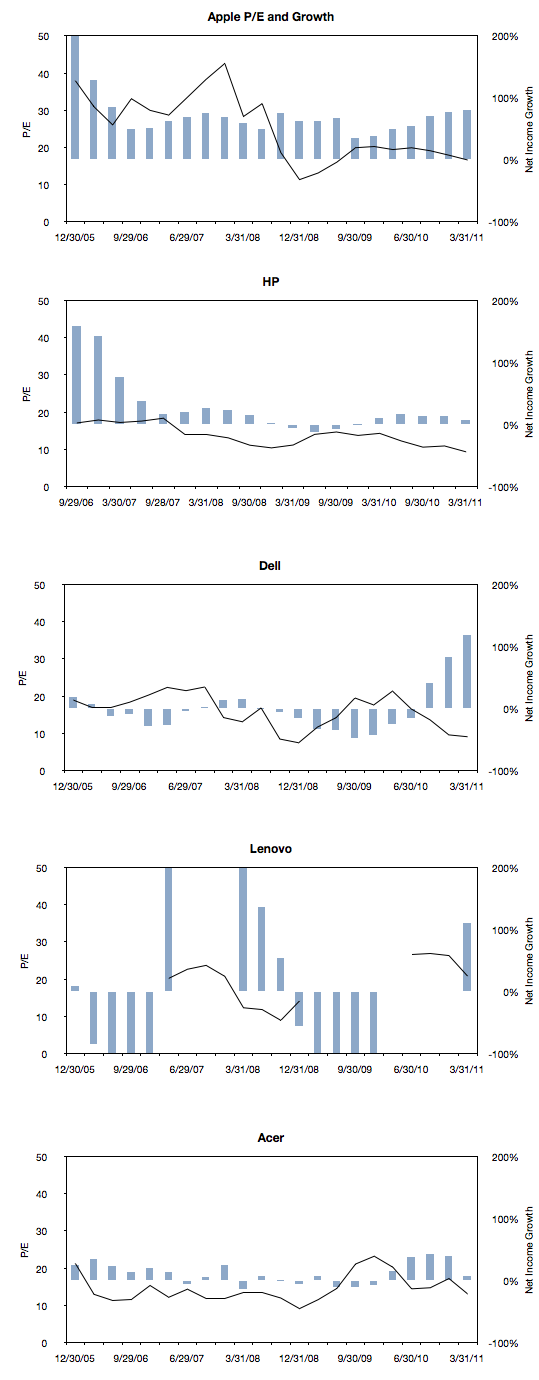
Growth profiles of 13 companies

The previous article showing the profile of Apple’s growth vs. its P/E prompted a similar review of a set of comparable companies. The cohort is composed of:

Apple
HP
Dell
Lenovo
Acer
Sony
Samsung
LG
Nokia
RIM
HTC
Microsoft
Google

The following charts are a simple representation of P/E (line chart with left scale) with Net Income growth super-imposed (bar chart with right scale.) The time period is 22 quarters; 11 quarters after the crisis (i.e. quarters after the one ending in Sept. 2008) and 11 quarters before the crisis (quarter ending 12/20/05 through the one ending 6/30/08).

We made one change to the growth data from the previous post where the Net Income growth is not quarterly year-on-year but average of four quarters year-on-year. This reflects the fact that P/E is also a trailing twelve months’ earnings. It also has the benefit of smoothing the growth data making it easier to discern.

Here are the charts:

Continue reading “Growth profiles of 13 companies”

Apple's P/E compression illustrated

The reason we look at valuation is that it offers insight into how innovation is perceived. If a company is a successful innovator it usually creates vast wealth for its owners. However, the timing of that wealth creation depends greatly on its recognition by others. In other words, valuation lets you determine how recognizable innovation is. If your analysis tells you that a company is supremely innovative but nobody else recognizes this then you have an investable opportunity.

So with that in mind we like to compare industry and innovation analysis with what “the market” thinks about Apple.

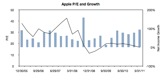
The latest method we had in mind was to compare P/E (a measure of valuation) and Growth. We’ve shown before that they seem to be moving in different directions. That’s not been news for over a year. What we will try to do now is to see if there is discernible change in the relationship before and after the financial crisis.

The following chart is a simple representation of P/E (line chart with left scale) with Net Income growth super-imposed (bar chart with right scale.) We chose a time period of 22 quarters. 11 quarters after the crisis (i.e. quarters after the one ending in Sept. 2008) and 11 quarters before the crisis (quarter ending 12/20/05 through the one ending 6/30/08).

We then plotted a scatter of all these pairs (P/E vs. Net Income Growth). Continue reading “Apple's P/E compression illustrated”

Why Apple's shares rose after Steve Jobs resigned

CEO resignations often cause share prices to rise. Witness the effect of the latest CEO departure on Yahoo!. This typically happens because CEO replacements are not necessary when companies are successful. In times of crisis, the market sees management change as a hopeful sign. But Apple is doing well. So it was commonly believed that if Steve Jobs were to leave the helm at Apple the stock would fall. However, as the chart below shows, the stock price has since risen.

Apple’s share price rise of 3% even out-performed the Dow Jones index, and this phenomenon is not for the short term only. The Jobs resignation sent Apple puts to one-year lows.

So how do we reconcile this? How can such a valuable person be priced as a liability? Continue reading “Why Apple's shares rose after Steve Jobs resigned”