Cash exceptionalism

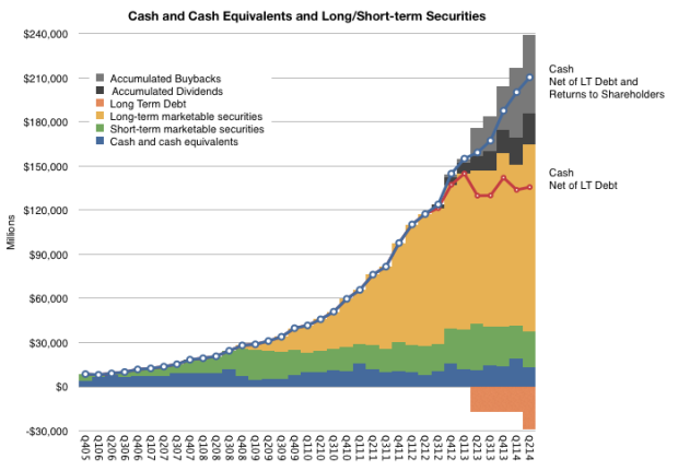
Prior to implementing a dividend and share buyback plan, Apple had accumulated about $120 billion in cash and marketable securities. In the eight quarters since implementing the cash return plan, Apple has paid about $21.5 billion in dividends and spent another $53 billion of its shareholder’s money buying its own shares and retiring them. That’s $74.5 billion in cash that’s been removed from its balance sheet.

To avoid some repatriation taxes it also borrowed about $29 billion.

Of course, in the meantime, it also generated cash from operations.

Before the plan’s implementation, eyeing the cash allowed for easy tracking of the accumulation of retained earnings. After the plan it’s become a bit more complicated. The following graph shows all the quantities involved:

Screen Shot 2014-08-18 at 8-18-2.09.00 PM

The graph lets us answer the question “What would have happened if Apple had not paid any dividends, bought back shares and taken on debt?”1

The answer is in the blue line. It would be about $210 billion today. There are about a dozen companies other than Apple worth more than that amount.

As the company is not growing as quickly as it used to, the slope of the blue line is constant (i.e. it’s nearly linear.) Though that might be seen as evidence of failure, it’s more useful to treat this vast quantity as a recognition of past successes. The company’s beleaguered status needs to be carefully preserved.

  1. The grey and black area of the last column is the total “cash returned to shareholders” and sums up to the $74.5 billion mentioned earlier. The grey area is only theoretically valuable as it depends on the outstanding (i.e. not retired) shares retaining their value. In this case, the value of the shares grew, making this an actual gain for shareholders []

Best guess for how many iOS devices will ship in 2014

In October 2013, at the end of its last fiscal quarter, Apple stated:

The Company’s capital expenditures were $7.0 billion during 2013, consisting of $499 million for retail store facilities and $6.5 billion for other capital expenditures, including product tooling and manufacturing process equipment, and other corporate facilities and infrastructure. The Company’s actual cash payments for capital expenditures during 2013 were $8.2 billion.

The Company anticipates utilizing approximately $11.0 billion for capital expenditures during 2014, including approximately $550 million for retail store facilities and approximately $10.5 billion for other capital expenditures, including product tooling and manufacturing process equipment, and corporate facilities and infrastructure, including information systems hardware, software and enhancements.

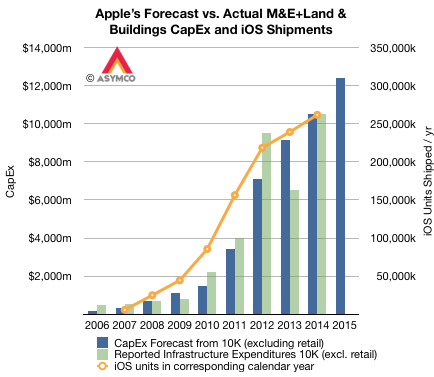
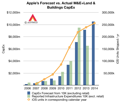
These 10K (fiscal year annual) forecast figures for capital expenditures are shown in the following graph. Note that they also include the fiscal years from 2006 to 2012. Note also that the graph includes the actual expenditures (in green).

Screen Shot 2014-08-12 at 5.37.57 PM

From 2006 through 2013 the sum of the forecasts was $23.445 billion while the sum of the expenditures were $24.662 billion. With the exception of a carry-forward in 2012, the forecasts are broadly in-line with expenditures, with about 5% more spent than forecast.

This pattern of accuracy in spending makes a $10.5 billion expenditure during the current fiscal year believable. In other words, taking the forecast at face value, and given that three quarters of the fiscal year have already passed, what does it imply for the current and last quarter? The following graph shows what Q3 spending should be relative to previous quarters (and 2011, 2012 and 2013). Continue reading “Best guess for how many iOS devices will ship in 2014”

A Dollar a Day

There are 80 million Mac users. The last 12 months saw sales of 18 million Macs.

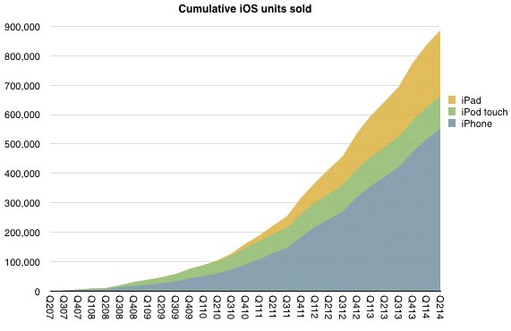
As of the end of June there were 886,580,000 iOS devices sold. As of today the total is well over 900 million. One billion sold will happen well before this year is out. Estimates of current iOS users vary but they are probably at least 500 million and could be 600 million.

Screen Shot 2014-07-25 at 7-25-2.44.06 PM

Apple claims 800 million iTunes accounts.

Therefore, in terms of revenues:

  • Mac User = $289/yr
  • iOS User = $262/yr
  • iTunes User = $25/yr1

Adding iTunes usage to either Mac or iOS yields Continue reading “A Dollar a Day”

  1. Measured from billings []

Who Solved the Capitalist’s Dilemma?

In The Capitalist’s Dilemma, Clayton Christensen and Derek van Bever introduce a powerful new theory which explains the relative paucity of growth in developed economies. They draw a causal relationship between the mis-application of capital in pursuit of innovation and the failure to grow.1

In particular, they observe that capital is allocated toward the type of innovations which increase efficiency or performance and not toward those which create markets (and hence long term growth and jobs.) This itself is caused by a prioritization and rewarding of performance ratios rather than cash flows and that itself is due  to a perversion of the purpose of the firm.2

For this statement of causality to be confirmed we need to observe whether it predicts measurable phenomena. For instance, we need to see whether companies which create markets apply capital toward market-creating innovations and whether companies which create value through efficiencies or performance improvements hoard abundant capital.

Over the entire global economy, the pattern of capital over-abundance is easy to see. The amount of cash or securities on balance sheets is extraordinary and unprecedented (estimated at $7 Trillion, doubling over a decade). However, growing cash is not a perfect indicator of inactivity. Cash is the by-product of earnings after investment. So if operating profits are growing and investment is growing, but not as fast, then it’s possible to grow cash while still growing investment.

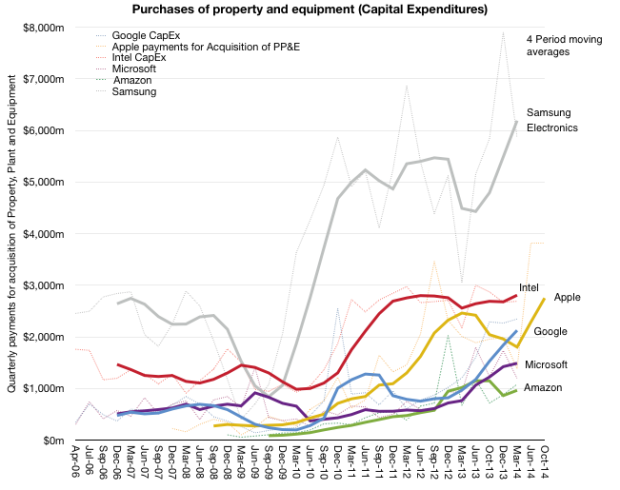
The better measure is investment in capital equipment or, more specifically, purchases of plant, property and equipment.3 Indeed, on a global scale, capital expenditure as a percent of sales is at a 22-year low.

CapEx is a good proxy for non-financial “investment”. It’s also a measure that can be easily obtained as companies report this activity in their Cash Flow Statements.

So the best method for assessing the theory’s predictive power is to look at market creators and measure their investment in PP&E. At the same time we need to look at market sustainers and measure their (probable) lack of investment in PP&E.

So here is my first attempt:
Screen Shot 2014-05-27 at 5-27-3.25.43 PM

It’s an admittedly small sample of companies that are not that dissimilar. But within this group, over the time frame of about 9 years, we can see how capital expenditures are growing.4 This sample shows that for a few companies, the amount spent on capital equipment grew dramatically. Especially since they are in businesses that might be thought of as not capital intensive.

Continue reading “Who Solved the Capitalist’s Dilemma?”

  1. and, indirectly, in the increase in inequality and hence the destabilization of socio-political institutions []
  2. That being the creation of customers not shareholder returns []
  3. Operating expenditures can also be measured but they cannot grow inorganically due to most of the costs being related to skilled employment which has supply constraints. []
  4. Note that Apple’s data extends to the end of their fiscal year and reflects their forecast given last October in the 10-K filing []

Teenager stores

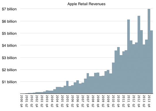
The Apple stores are now 13 years old.1 In the first full year of operation (2002) the stores generated revenue of $282 million. In the last full year (2013) the revenues were $20.228 billion. Quarterly sales during the last seven years are shown below:

Screen Shot 2014-05-20 at 5-20-11.16.21 AM

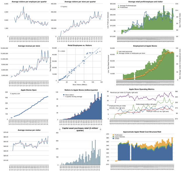
Additional details regarding average visitors per employee per quarter, average visitors per store per quarter, average retail profit/employee and visitor, average revenue per store, employment and visits correlation, employment per store and in total, stores open over time, visitors over time, average revenue per visitor, capital asset purchases and estimated cost structure per visit are shown below:

Screen Shot 2014-05-20 at 5-20-11.19.51 AM

The Apple store concept has reached teenage years and it seems a good time to renew their character.

  1. The first store at Tysons Corner in  McLean, VA opened on May 19 2001 []

Surprise

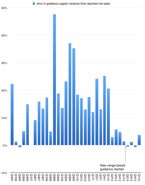
After n quarters of predictability, Apple surprised with sales performance that was 3.74% above the top of their guidance. This may not seem significant but since instituting a new range-bound guidance method in Q1 of last year the company reported revenue within about 1% of the top of the range.

This is in stark contrast to the wide variance in prior years. The following graph shows the “error” in guidance as the percent difference between reported sales and guidance1.

Screen Shot 2014-04-25 at 4-25-10.18.06 AM

So prior to last quarter we were lulled into thinking that guidance was very nearly perfectly predicting the company. As I tweeted, it took the “sport” out of trying to do any forecasting. All an analyst had to do is tweak the main product growth figures to hit the sales target and then subtract the (generously provided) operating expenses and (also provided) tax rate to get the earnings. Only unknown to getting to an estimate of EPS was how many shares would still be outstanding.2

Knowing Apple also means that average selling prices are also very rigidly set in stone so the degrees of freedom in analysis were becoming highly constrained.

But just when you think you spotted a pattern, it changes. The company surprised with performance outside the band. The following graph shows the estimate ranges it has given and the actual revenues delivered.3 Continue reading “Surprise”

  1. Upper end of range in quarters where a range was given. []
  2. The company itself would not know shares outstanding as their buying was opportunistic during the quarter. []
  3. Next quarter is also pencilled in. []

On the future of Google. Part 2

In Part 1 of a look at Google’s future I showed that Google’s revenues have been highly correlated with the population of Internet users in the markets it serves. If there were a causal relationship between population of users and revenue growth then the company would face a growth inflection point when that population becomes half penetrated.

In Significant Digits Episode 1 (Part 1) I showed data which suggests that the inflection point will come in 2016. Essentially the argument is that Google’s growth is ultimately limited by the population of users and that itself is a predictable number. I also used the example of the PC and smartphone penetration curves to show how the perception of the fortunes of companies whose revenues are based on those technologies were affected by inflections in their respective adoptions.

However, correlation is not causation. These users we count are not the customers who pay for Google’s services. Users (or usage) is therefore only a proxy. It may be a good proxy and intuitively it makes sense that it’s a driver of growth but fundamentally the company lives on a stream of revenues paid by advertisers1. In order to really evaluate the opportunity we need to “follow the money” and track down where it comes from.

We don’t have visibility into the exact sources of these revenues but we have a top-level geographic segmentation (shown below.) Continue reading “On the future of Google. Part 2”

  1. This is true to date and certainly it could change but hints of how that might change are still not visible to me []

The billion dollar hobby

During the latest shareholder meeting Tim Cook revealed that Apple TV sales were above $1 billion in the last fiscal year (ending September 2013). The company later clarified that this figure includes device and content sales.

This poses a problem. In previous statements the company cited device (unit) shipments rather than value. The statements made to date suggested that cumulative volume of 3rd (current) generation Apple TV totaled 6 million units as of January 1, 2013.

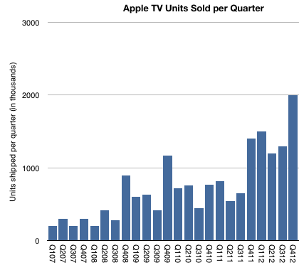
The following graph includes an estimate of quarterly Apple TV sales based on comments made to date.

Screen Shot 2014-03-02 at 3-2-8.07.43 PM

As there were no additional comments during 2013, the “Billion Dollar” quote is all we have to go with for the year.  The problem with trying to separate content from hardware is complicated by several factors: Continue reading “The billion dollar hobby”

A margin of error

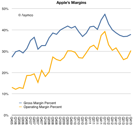
Prior to Apple’s earnings report I read at least one article suggesting that the most important indicator to watch was Apple’s margin. I suppose this was due to a recent decline in margins from a peak gross margin of 47.4% in Q1 2012 to 36.7%.

As the graph below shows, margins began to recover by Q3 2013 and are nearly on par with year-ago levels.

Screen Shot 2014-02-12 at 10.32.50 AM

The guidance for the present quarter is a gross margin between 37% and 38%. This would imply a flat q/q GM line (blue line above.)

This is not quite catastrophic.

To better understand margins, it helps to compare them with other companies. When Apple reached that peak of near 50% gross margin I noted that such a level was higher than Microsoft’s and Google’s. The irony being that Apple was nominally an (implied) low-margin hardware company while Microsoft was an (implied) high-margin software company and Google was an (implied) high-margin internet services company.

Here is the picture with the last two years added: Continue reading “A margin of error”

Apple’s Growth Scorecard

Apple revenues grew at the rate of about 6% in Q4, while earnings grew at 5%. These were improvements over Q3 and Q2 but the rate of top line growth is has not been this low since 2009. The bottom line is also slower than it’s been for the entire “epoch” or era of the iPhone.

The components of sales growth are shown in the following table:

Screen Shot 2014-02-05 at 12.05.10 PM

The company delivered performance inline with its own guidance so there should not have been surprises in the top and bottom lines. However, the disappointment might be in the low growth for iPhone (at 6%) and iPad (at 7%). The Mac and iTunes grew at moderate rates (16% and 19% respectively) while the iPod continued its decline with -55% growth and Accessories remained fairly flat.

As the graph below shows, the iPhone and iPad are the bulk of the business so their performance is a large part of what is observed. Continue reading “Apple’s Growth Scorecard”