Minding the store

Apple’s Retail head was recently replaced. The hire seems to have been a mistake dealt with quite swiftly. It is tempting to think that the firing of a manager is due to a failure in their performance, measurable in quarterly reported metrics. But this is not often the case. It may be true of sales or some operations, but most strategic management decisions take months to make and years to implement before you can have the luxury of measured results. And even then the dependencies of performance are many and outside the control of specific managers.

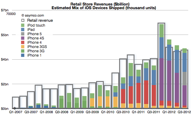
John Browett joined Apple in April and left in October. A mere six months. How did Apple retail perform in those two quarters? Very well actually. Which is to say, as well as it has previously given the overall performance of the company. The correlation can be shown between store revenues and iOS device shipments:

Store visits increased to 94 million in Q3, second only to fourth quarter of 2011. The growth was 21%. Year-on-year growth in revenues was about 17% for both quarters, in-line with company growth. Profits grew 5% in Q2 and 25% in Q3.

Average visitors per employee picked up slightly but remained largely unchanged since 2008. Continue reading “Minding the store”

ReCapEx now available for iPad, iPhone and iPod touch

In addition to the video (On Capital Spending’s Transformation of the Electronics Industry – YouTube), you can download the presentation used as an iPad Perspective story here.

It is a featured story on Perspective App on the iPad and now on iPhone and iPod touch.

ReCapEx: The curious case of Apple's 2012 and 2013 Capital Expenditures

The latest yearly report from Apple includes, as it has in the past, the forecast of Capital Expenditures. I’ve been tracking this data as an indicator of both strategic intent and potential forecasting tool for iOS device production.

Before exploring Apple’s own forecast, we should look at how they met expectations for fiscal 2012.

In October 2011 the company forecast was as follows:

The Company anticipates utilizing approximately $8.0 billion for capital expenditures during 2012, including approximately $900 million for retail store facilities and approximately $7.1 billion for product tooling and manufacturing process equipment

In October 2012 it reported:

The Company’s capital expenditures were $10.3 billion during 2012, consisting of $865 million for retail store facilities and $9.5 billion for other capital expenditures, including product tooling and manufacturing process equipment, and other corporate facilities and infrastructure. The Company’s actual cash payments for capital expenditures during 2012 were $8.3 billion.

There are two points that need to be highlighted:

  1. Expenditures overall were $2.3 billion higher than forecast. Nearly all of the over-spending was for “product tooling, manufacturing process equipment and infrastructure”. Retail was planned at $900 million and actual was $865 (an under-spend of $35 million). As no major real estate assets were acquired (change in those assets was $380 million, less than 2011 or 2010) the “deficit” in budgeted expenditures can be attributed entirely to product tooling and manufacturing process equipment.[1] The $2.3 billion spending over expectations amounts to 34% of forecast.
  2. The cash payments for capex were $2 billion lower than expenditures. This is a curious situation which was not highlighted in previous 10 K reports. What this implies is that much of the “over-spend” was not paid for though cash and since no new debt was booked it’s likely to have been paid for through some form of vendor financing. I’ll explore some explanations below.

So it’s important to note that the company spent a great deal more (one third more) than expected and paid for some of the acquisitions through uncharacteristic or unorthodox means.

The historic budgeting for Machinery & Equipment (+Land & Buildings) is shown in the following graph: Continue reading “ReCapEx: The curious case of Apple's 2012 and 2013 Capital Expenditures”

The iPhone and Apple's Margins

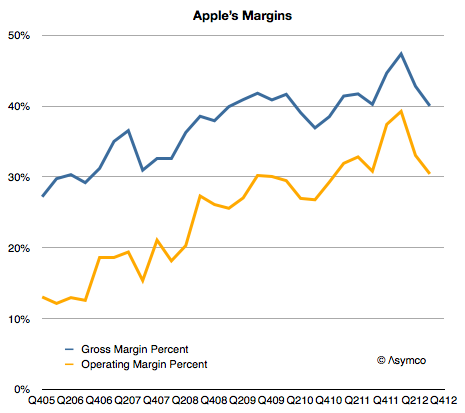
As the following graph shows Apple gross margins and its operating margins have both been on a consistent upward slope since early 2006.

The reason is that the company has moved to more mobile devices as a percent of products shipped. Whereas Macs have had decent margins by the standard of the PC industry, they are not as profitable on a unit basis as iPods, iPhones or iPads. As portable or mobile products grow rapidly, it would follow that margins would as well.

However, the growth is not monotonic. There are occasional dips in gross margins. The cause is the launch of new device versions. On the following graph I show the launch times for the iPhone versions and the company’s gross margin as well as my estimates for iPhone and other product line margins. Continue reading “The iPhone and Apple's Margins”

iPad sales grew 44 percent in Q3

The iPad grew shipments at 26% y/y but “sales” as measured by sell-through were up 44%. Detail from Tim Cook’s discussion:

“The June to September [sequential change] was 17 million to 14 million…   as we had talked about in the July call, the June quarter contained 1.2 million increase in channel inventory and so … the comparison looks very different than our reported [shipment] numbers do… On a year-over-year basis, because of the year ago quarter having also a channel inventory build as we stock the channel to the [proper] level, the sell through year-over-year actually grew 44% and so the underlying sell through was extremely strong.”

Sell-through, (or “sales” vs. “shipments”) is a much better indicator of demand, obviously. Also see transcript for explanation of sequential decline (educational buying).

44% is not spectacular but it places the growth far more comfortably in the “high” bracket than the 26% units and 9% revenue growth that shipments data would indicate.

What is Apple's Realized P/E ratio?

The Price/Earnings ratio is a very simple measure of the “value” a company has. The Price is the current share price and the Earnings is usually the sum of the last 12 months’ earnings per share. In other words it measures how many of the last year’s earnings are built into the share price. Put yet another way it’s the answer to the question “If earnings don’t change, how many years will I have to wait before I’m paid back for my share purchase with retained earnings.”

So a company with a P/E of 10 implies that if nothing changes, in 10 years a share owner would “earn” back the price they paid for the share. Any earnings after 10 years would be “profit” for the share owner. You can imagine it even more simply as buying not shares but an actual small business of your own. You pay up front for it and then wait until it pays you back. After getting paid back for the initial purchase you then make money that you can set aside.

Obviously this figure of P/E is very sensitive to growth in earnings. Consider paying $100 for a share of a company having just earned $10/share last year. It would have a P/E of 10. If earnings stayed at $10/yr for 10 years, you’d “get your money back” in 10 years. However if earnings grow at 20% then next year the earnings would be $12 then 14.4 then 17.3 then 20.7 etc. Adding these up means you’d get your $100 back in five years, not 10.

So with a company growing at 20% the “realized P/E” is 5. You realized the price of $100 in five years’ worth of earnings. In the scenario above you paid expecting to wait 10 years but you got paid in five. If that’s your retirement plan then you can retire five years early. Not bad.

Let’s then look at what Apple gave investors as “realized P/E.” Continue reading “What is Apple's Realized P/E ratio?”

Using Capital Expenditures to predict Apple’s share price

It takes money to make money. That’s a cliché. But it’s also true. The interesting question is how much can be gained from how little.

In previous articles I explained how Apple’s expenditures of capital for equipment used in manufacturing affects their output of products. The relationship between capital in and product out should stand to reason.

The more surprising aspect of that analysis is that we get to know in advance how much Apple spends (since they tell us their budget a year before it’s spent.) and therefore it becomes possible to get a rough idea of how much they will produce. And since demand has generally been higher than supply we can get an estimate of how much Apple will sell.

The only missing piece to this logic chain is to estimate how much will shareholders benefit from the capital expenditure. I’ll try to establish the relationship through a build-out of graphs.

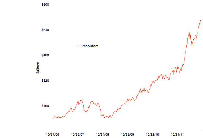
The first graph shows Apple’s share price at weekly resolution.

The time frame stretches back six fiscal years. The time span includes some dramatic periods including the financial crisis and the launch of the iPhone and iPad.

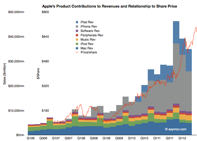
To illustrate the effect of the iPhone and iPad on this share price appreciation, I’ve overlaid a quarterly resolution graph showing revenues over the same time period with each product line shown separately.


Note that I’ve indexed the vertical scale to match approximately the highest peaks of both graphs. The two axes scales are shown separately on the left.

Continue reading “Using Capital Expenditures to predict Apple’s share price”

On how not to be evil

Tim Cook is quoted as having said the inventory is not only evil but that it’s fundamentally evil.

With just-in-time production inventory can be reduced, at least work-in-progress inventory. Unfortunately inventory cannot be completely eliminated. The fact remains that you sometimes need to stockpile product for launch and need to have some on hand depending which way it’s sold. There is also substantial channel inventory (which is off Apple’s books but still evil) that needs to be in the hands of distributors.

Tight inventory management has become a characteristic of Apple and that contributes to getting ranked number one in Supply Chain Management. So we can expect that Apple runs a tight ship. In fact we have evidence of this through the ability to track our purchases from when they ship out of a factory in China all the way to our homes.

This tracking in itself shows that when product is in high demand production is initiated on direct consumer orders not just in response to maintaining a level of inventory. So with that in mind, we can revisit the question of how many iPhones 5 the company has produced.

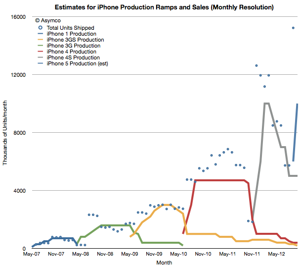
First, we need to step back and recall the method for analyzing production. I built a model which attempts to show what a typical production run for an iPhone model would look like. I first published the process in early 2011.  It used the historic data from iPhone 1, 3G and 3GS to try to predict iPhone 4 production. I’ve updated the model to show what that would look like today.

The assumptions driving the model are: Continue reading “On how not to be evil”