As the chart below shows, the last quarter (second calendar 2012, third fiscal 2012) was disappointingly moderate with 20% earnings growth and 23% net sales growth.
Continue reading “Estimates for Apple's fourth fiscal 2012 quarter [Updated]”
Financial data and analysis
As the chart below shows, the last quarter (second calendar 2012, third fiscal 2012) was disappointingly moderate with 20% earnings growth and 23% net sales growth.
Continue reading “Estimates for Apple's fourth fiscal 2012 quarter [Updated]”
We can put all of our products on the table you’re sitting at. Those products together sell $40 billion per year. No other company can make that claim except perhaps an oil company.
We are the most focused company that I know of, or have read of, or have any knowledge of.
We say no to good ideas every day; we say no to great ideas; to keep the number of things we focus on small in number.
Tim Cook said this in February 2010 at the Goldman Sachs technology conference.
Since then the only product that has been added to the kitchen table has been the iPad. The sales level however, has increased in proportions shown in the chart below.
The revenues are shown with their contributory products and the costs of those products. The payments for costs of sales as well as R&D, SG&A and Taxes are then subtracted revealing the Net Income (in green). This is done for the second quarters of 2010, 2011 and 2012.
Since Tim Cook made the analogy, the table holding the products has not gotten any bigger but the sales level has more than doubled while profits have nearly tripled.
In his talk he cited revenues of $40 billion (for the pervious year, 2009). In the last twelve months Apple’s revenues were $148 billion.
Tim Cook went on: Continue reading “Think small”
In the 2011 Annual Report(10K) published October 26th Apple states:
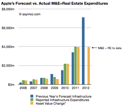
The Company anticipates utilizing approximately $8.0 billion for capital expenditures during 2012, including approximately $900 million for retail store facilities and approximately $7.1 billion for product tooling and manufacturing process equipment, and corporate facilities and infrastructure, including information systems hardware, software and enhancements.
The history of these expenditures is shown below (the blue bars are statements from 10K reports including the one above shown as the right-most bar):  Three 10Q reports so far this fiscal year have given us updates on asset values and the change in these values are shown as the right-most yellow bar. The asset value change suggests $3.9 billion has been spent so far of the $7.1 billion budgeted. Thus we can estimate that about $3.2 billion remains to be spent in the fourth fiscal quarter (thus bringing the yellow bar to parity with the blue bar in the chart above–a parity that was achieved or exceeded for five out of the last six years).
Assuming $200 million of the fourth fiscal quarter budget will be for land and buildings[1] results in an estimated $3 billion remaining for product tooling and manufacturing process equipment and data centers.
The history of spending for various cost centers is shown below.[2]
Continue reading “Estimating third and fourth quarter iOS shipments”
As the following revenue growth table shows, the second calendar quarter of 2012 was not like the recent past.
The bottom line growth (earnings) is the slowest since Q309 which had a difficult comparison with Q308 when the iPhone 3G launched and saw 800% iPhone growth. This past quarter also had a difficult comparison with 150% iPhone growth a year earlier and 122% earnings growth.
This is shown in a different way in the following graph: Continue reading “Apple's growth scorecard for the third fiscal quarter 2012”
Did I get anything right in last forecast?
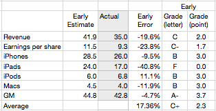
The table below shows the scores for my various estimates[1]

Last quarter I managed a B+ overall but this quarter was a C+. The iPad estimate was a complete failure mitigated slightly by a, directionally at least, correct call on the iPhone. The failure on iPad dragged down revenue and EPS while the accuracy on iPhone improved the gross margin. iPod and Mac estimates were consistent with recent performance.
The error on iPad is a harsh lesson which shows how the category is still unpredictable. With only four quarters where we could measure y/y growth, and with those quarters showing 183%, 166%, 111% and 151% growth, I assumed that the 150% growth was sustainable.
Continue reading “Scoring my performance on the third fiscal quarter forecast”
Here is the second Perspective “padcast” where I discuss:
The discussion is an audio presentation with animated, interactive motion charts which can be manipulated by the user.
It’s available as an in-app purchase for $0.99 on the iTunes app store via the Perspective iPad app.
My thanks to Adam Lashinsky of Fortune for inviting me to Fortune Brainstorm Tech in Aspen this week. I was asked to participate in a panel session with Gene Munster of Piper Jaffray to discuss “The Future of Apple”. The session was moderated by Adam.
Here is a full video of our conversation: FORA.tv – Future of Apple.
As the chart below shows, the last quarter (first calendar 2012, second fiscal 2012) was robust with 94% earnings growth and 59% net sales growth. Subject to the usual superlatives, the performance was, again, unexpected by many.
Much of that surprise was due to the underestimation of iPhone sales in China during what is a holiday quarter in that nation. Growth this quarter will be more difficult to estimate. The iPhone is still the most important component but the iPad is becoming increasingly decisive in overall performance. In fact, I’m projecting that the iPad will have the equivalent of 73% of the iPhone revenues this quarter. Continue reading “Estimates for Apple's third fiscal 2012 quarter”
Markets are difficult to measure. Mainly because the information is not easy to obtain and that which is obtained is not made public. Collecting, analyzing and filling in the gaps is big business with many firms involved in selling it.
However, with all the analysts and companies selling and promoting their “numbers” it’s important to understand the difference between the methods used. There are for instance at least the following measurements:
Each measurement tells a different story about the market but the best story is told when all data is analyzed in a combined integrated market review.
Before diving into that it’s important to understand the difference between the first and second measurements or the difference between shipped and sold.
During my talk at the first Apple Investor Conference in January I said that I would pay very close attention to the Machinery, equipment and internal use software line item from its PP&E during the next quarterly report (it appears on Page 13 in the latest report).
The reason I consider this important is because capital spending has provided reliable foreshadowing of iOS device production. This is itself because Apple invests in the equipment used in the manufacturing processes for its devices. The more spending on equipment, the more production capacity is brought to bear and the more units are produced. Since iOS devices tend to be supply constrained, the more units are produced then the more are sold.
The first quarter of the fiscal year saw a very small increase in CapEx which caused me to “backload” spending later in the year. By watching this spending, we can assess approximately when and for which products is investment allocated. If the spending happens early then we can anticipate an early update to the iPhone. If it happens late then we can anticipate a late release. So has the ramp-up begun as of the second quarter (first calendar quarter)?
The following chart begins to give us the answer. It tells the story of spending by tracking the change in asset values:
Stripping out the Machinery and Equipment portion (in yellow above) and overlaying the following quarter’s iOS shipments yield the following composite graph: Continue reading “Up to eleven”