A three year view of Apple's fourth quarter

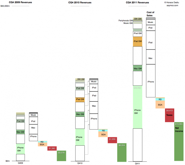
This is a summary view of Apple’s income statement for the fourth quarter of 2009, 2010 and 2011. The full size is 999×893 pixels. Click on image below for full size bitmap.


The convention used is to show revenues in the first column, cost of sales in the second followed by operating expenses, taxes and net income in the last (dark green) column.

Continue reading “A three year view of Apple's fourth quarter”

The world's biggest startup

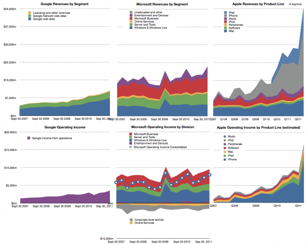
Last year we began offering revenue and operating income comparisons between Apple and Microsoft. It was becoming evident that the iOS franchise was beginning to overtake both in revenue and profitability the Windows franchise. To offer more dimensions of comparison this time I am adding Google’s top and bottom lines for comparison (click image for detail):

Note that the graphs have the same scales when read horizontally. Continue reading “The world's biggest startup”

[Updated] Following up: When will Apple's share price reach $500

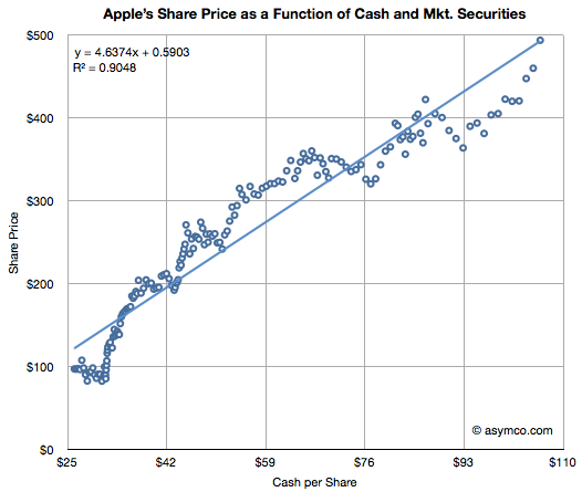
Apple’s valuation since October 2008 has been very highly correlated to its cash (R-squared of 0.91). This tight relationship to Apple’s value is shown in the chart below:

(The chart shows weekly, ending each Friday, share price (vertical axis) vs. interpolated weekly cash per share (horizontal axis) assuming linear growth between quarterly announcements. Share price data is current as of last Friday (Feb. 10) though cash per share is based on announcement date and hence delayed by about three weeks.)

I noted this relationship in May 2011 and followed up in September 2011.  With current cash per share reaching $95 to $100 $103.66 it seems that the share price should be around $500 any time now.

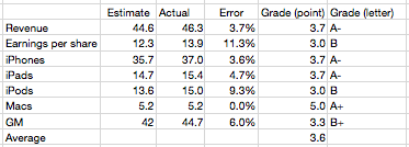
What did I get right (and wrong) about the fourth quarter?

I’ve been publishing my estimates for Apple’s business performance for a few quarters (see here, here and here). My estimates have been collected along with those of dozens of others by Philip Elmer-DeWitt at the Fortune Apple 2.0 blog.

I’ve also been scoring my performance and discussing the causes of errors. Here is the analysis for the fourth quarter 2011.

Continue reading “What did I get right (and wrong) about the fourth quarter?”

Pricing Paradox

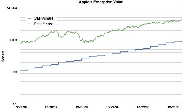
As Apple’s extraordinarily low valuation is being more widely noted, explanatory hypotheses are proliferating. Everyone seems to have an opinion. Some explanations come in and out of fashion. Others are reliable old clichés. We’ve seen liquidity issues with large funds forced to sell, “too much cash”, management transitions, an impending loss of mojo, share price too high to afford, “law of large numbers”, and that old chestnut, competition. None of these satisfy. They don’t explain why reliable growth is not valuable. And reliability is indeed what Apple offers in spades. Consider the following chart:

Note that the scale is logarithmic so that the growth patterns can be seen clearly. Continue reading “Pricing Paradox”

You cannot buy innovation

In a previous series of articles we discussed the capital Apple expends on equipment, real estate, leasehold improvements and data centers. Cost structure analysis reveals subtle shifts in strategy and the CapEx analysis demonstrates Apple’s increasing integration into its supplier network and integration into the distribution and service infrastructure that sustains its ecosystems.

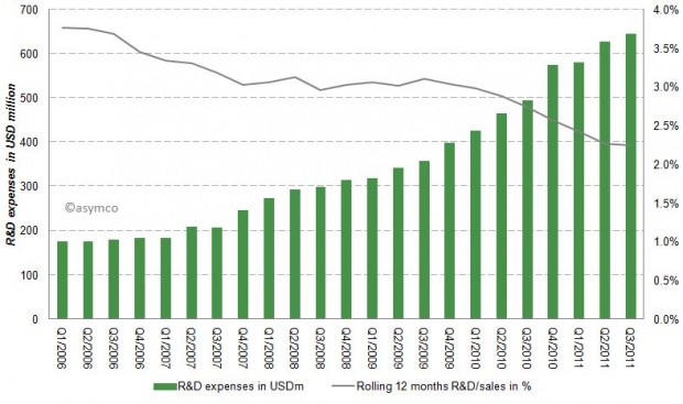
Another form of investing (spending now, reaping benefits later) is the spending on research and development (R&D). Let’s have a look at Apple’s R&D expenses by quarter since Q1/2006.

Apples R&D expenses as percentage of sales have been declining from almost 4% to close to 2% in the last six years as shown in the following chart:

While Apple’s absolute R&D expenses have grown at an annual rate of 33% they have not kept up with the far higher sales growth rate. Apple’s current rate of R&D expenditure is compared to a peer group [1] below. Continue reading “You cannot buy innovation”

Apple's Fourth quarter 2011 Growth Scorecard

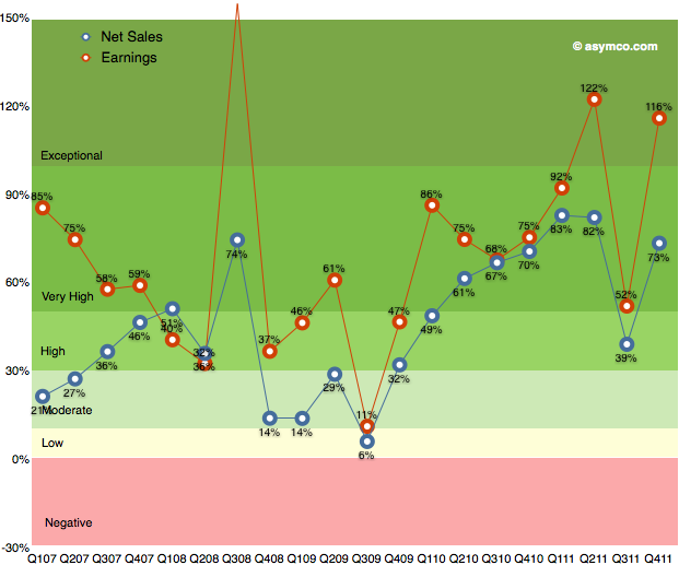
After the transitional third quarter, Apple’s earnings growth returned to an exceptional level. As the following chart shows, earnings growth has maintained above 50% growth since 2009.

Q3 turned out to be a transitional quarter with Continue reading “Apple's Fourth quarter 2011 Growth Scorecard”

Price competition

Apple’s products are often seen as being priced “at a premium”. This is mostly a matter of perception, but in certain categories Apple’s products are priced above the industry average (though probably still affordable to sufficiently large populations). As a result, when competitors launch lower-priced products there is a tendency to expect Apple to react and reduce its prices to compete.

This expectation was evident when AT&T had an exclusive on the iPhone. The assumption among many (expressed in comments here as well as elsewhere) was that a switch to multi-carrier distribution would result in a price reduction and consequently a reduction in margins.

It was evident in the iPod and the Mac businesses over the years as prices for competing products collapsed.

It is also evident with respect to the iPad where expectations are that the Kindle will cause a reduction in the iPad price (and presumably in the margin).

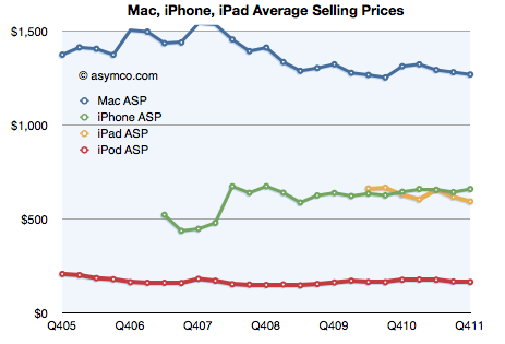
However, the data we have from Apple on their pricing shows no concessions to competitive price pressure. The following chart shows the historic prices that Apple was able to obtain for its main product lines:

Continue reading “Price competition”

Apple added $38 billion in cash last year

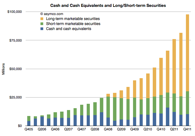
Last year I suggested that Apple could reach $100 billion for 2011. That was based on the addition of about $20 billion during 2010. Apple added $38 billion to reach $97.6 billion at the end of 2011.

The following chart shows the composition and scale of Apple’s cash holdings.

At the closing price, Apple’s market value is equivalent to 4.3 times the value of their cash.

The effect of smartphone growth on share prices

Data on Q4 performance is starting to trickle in. Last week Motorola, as part of a profit warning, revealed their Q4 smartphone shipments were 5.3 million. RIM had reported 14.1 million units (quarter ending November). HTC has also warned that their shipments of smartphones (and tablets) totaled 10 million. Samsung provided guidance on overall sales but since they don’t report data on smartphone (or phone) sales, the estimates are ranging between 32 and 35 million.

Many have forecast Apple’s performance but there are many other companies which are not easily estimated (Sony Ericsson, LG, Nokia, ZTE, Others.) But rather than dwelling on the specific quarter, we can make some long-range estimates of performance based on the historic data.

One method I use is to look at patterns of growth. Growth is the first derivative of market performance and it sometimes shows patterns which the performance itself does not. Consider the following chart showing the growth pattern for RIM.

The blue line shows the absolute year-on-year quarterly growth based on reported numbers of smartphones shipped. I’ve also shown the growth “relative to market” which is unit growth with market growth subtracted. This orange line represents how much faster (or slower) the company is growing relative to the market. If the orange line is above zero, the company gained share. If it’s below zero, it lost share.

I also overlaid the performance of the share price (right scale).

Now compare that with another long-term incumbent in the smartphone market, Nokia.  Continue reading “The effect of smartphone growth on share prices”