Shipped and sold: A brief introduction

Markets are difficult to measure. Mainly because the information is not easy to obtain and that which is obtained is not made public. Collecting, analyzing and filling in the gaps is big business with many firms involved in selling it.

However, with all the analysts and companies selling and promoting their “numbers” it’s important to understand the difference between the methods used. There are for instance at least the following measurements:

  1. Units sold to end users. For example NPD or GfK data of retail transactions. Also Gartner’s estimates for phone units sold.
  2. Units sold to the channel. For example units recognized on income statements usually reported by companies. Also IDC’s estimates for phone units sold.
  3. Units in use. For example comScore and Nielsen survey data.
  4. Units “activated”. The measurement Google uses to describe Android performance.
  5. Intent to buy. For example ChangeWave surveys of early adopters.
  6. Utilization rate. For example browser statistics.

Each measurement tells a different story about the market but the best story is told when all data is analyzed in a combined integrated market review.

Before diving into that it’s important to understand the difference between the first and second measurements or the difference between shipped and sold.

What does “Sold” mean?

Continue reading “Shipped and sold: A brief introduction”

Calculating Google's contribution to iPhone profitability

In the iPhone cost structure analysis I showed how revenues and costs for iPhone are probably allocated. The revenue per iPhone was shown to include $29 for revenue items “above” the price of the phone to the channel. This total includes Apple’s own iPhone accessory sales plus revenue from licensing the “Made for iPhone” trademark to third party accessory makers. Apple also receives some revenues from cloud services. But, pertinent to our recent discussions on the Android business model, Apple also receives revenues from Google.

Wouldn’t it be nice to know how much? Here’s a way we can estimate it. Continue reading “Calculating Google's contribution to iPhone profitability”

Android’s contribution to Google

Yesterday I presented the estimated Android income statement vis-à-vis Apple’s income statement. In this post I’ll compare Android as a part of Google’s overall business.

Recall that Google has already been compared in terms of overall revenue, growth and profitability to Apple and Microsoft here.  The argument can be made that mobility has not yet had a measurable impact on Google (certainly not noteworthy enough to be reported by management).

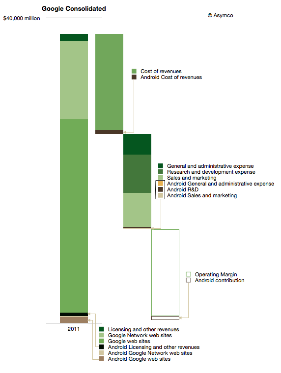
The impact on Google of Android can be shown in the following diagram:

I used color coding to identify non-Android (Green) and Android (Brown) segments of the business. Overall, Android could amount to about 3.5% of total Google revenues and about 5% of operating earnings. Continue reading “Android’s contribution to Google”

Android Revenues in Perspective

Data is useful only when put in perspective. Yesterday’s post on the Android Income Statement showed how sales and revenues are captured and how costs are paid for that revenue. The data was shown for the entire calendar year 2011 and the maximum value in the vertical axis was $1.5 billion.

Google has also reported that their revenue “run rate” is now in excess of $2.5 billion so there is significant growth, as would be expected from an exponentially increasing user base.

However, it’s important to place this growth in perspective, both in absolute and in relative terms.

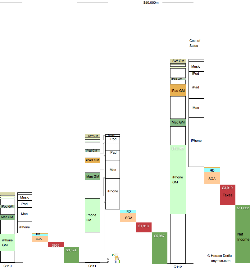
Below is a diagram showing Apple’s revenues for the first calendar quarters of 2010, 2011 and 2012. Each product group (iPhone, Mac, iPad and iPod) is shown separately with estimated gross margins (GM). Operational costs, taxes and net income are also shown.

Consistent with previous versions of this data are the color schemes where white areas represent costs of goods sold.

I also placed a scaled version of the Android Income statement next to the first quarter 2011 revenue bar for Apple. The scale is maintained where $1 billion is represented by the double-ended arrow line.[1] Continue reading “Android Revenues in Perspective”

The Android Income Statement

This is a continuation of the “Android Economics” series of posts. It deals with how revenues and costs are categorized for Android.

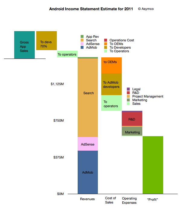
The following diagram shows an approximate representation of what Android’s “Income Statement”[1] would look like.


I’ll discuss the assumptions that are built into the model as I go along. I’ll begin at the upper left and move toward the lower right in the discussion. Continue reading “The Android Income Statement”

Android economics: An introduction

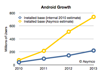
Android has had unprecedented growth. Based on activation announcements, it’s possible to estimate that thus far, about 370 million Android devices have been activated. The total number of devices in use is a lower figure which depends on replacement rate and retirement rate. This total number of devices in use at year end is estimated in the following chart.

I added the blue line which represents what Google had as an internal estimate in mid-2010.[1] The difference between the two lines shows that Android’s growth is far higher than what the company expected.  If the company itself did not expect this growth, it’s unlikely anybody else did either.

Unexpected, exponential user growth is usually accompanied by a dramatic positive improvement in the finances of a company and a higher return to shareholders. The curious aspect of Android’s success is that it has not had an impact on either. The market has not “discounted” the half-billion anticipated Android users into a price for Google shares that reflects this growth. It can only imply that those users are not very valuable.

But why would there be such a disconnect between the number of users and their value? Continue reading “Android economics: An introduction”

What retail is hired to do: Apple vs. IKEA

“Within five years after discount retailing pioneer Korvette’s opened its first store in 1957, over a dozen copycat discounters had emerged. In contrast, the giant discount furniture retailer IKEA has never been copied. The company has been slowly rolling its stores out across the world for [close to 50] years; and yet nobody has copied IKEA.

Why would this be? It’s not trade secrets or patents. Any competitor can walk through its stores, reverse engineer its products and copy its catalog. It can’t be that there is no money to be made: its owner Ingvar Kamprad is the third richest person in the world. And yet nobody has copied IKEA.

Our sense is that the other furniture retailers have followed the positioning paradigm and defined their business in terms of product and customer categories, which are readily copied. Levitz Furniture, for example, sells low-cost furniture to low income people. Ethan Allen sells colonial furniture to wealthy people.

IKEA, in contrast, has organized its business around a job to be done: “I need to furnish my apartment (or this room) today.”  When this realization occurs to people anywhere in the developed world, the word IKEA pops into their minds. IKEA is organized and integrated in a completely different way than any other furniture retailer in order to do this job as well as possible.”

Integrating Around the Job to Be Done (Clayton Christensen, Harvard Business School; Scott Anthony, Innosight LLC, Scott Cook, Intuit; Taddy Hall, Advertising Research Council).

IKEA is the world’s leading furnishing retailer and an amazing success story. As Christensen points out the success is all the more perplexing because it seems perfectly defensible. Nobody has tried to duplicate or undermine IKEA.

Positioned around a clear job-to-be-done it integrated design, manufacturing and distribution (including warehousing) as well as “big box” retailing as an experience.

This may sound familiar.

Apple’s entry into retail depended on a clear job-to-be-done, design, carefully selected merchandise and retailing as an experience. Similar to IKEA, Apple also became a dominant player in its segment and even achieved seventeen times better performance than the average US retailer in terms of sales per square foot.

At first glance they seem to be similar businesses in terms of strategy or “architecture” but how do the actual businesses stack up? Can we find data to support any claim of similarity. Continue reading “What retail is hired to do: Apple vs. IKEA”

The phone market in 2012: a tale of two disruptions

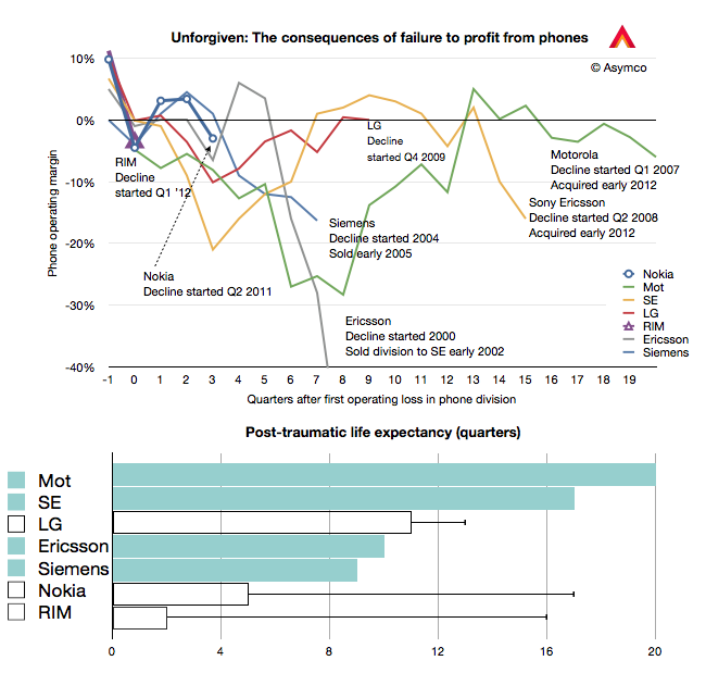
During the first quarter this year HTC, RIM and Nokia all surprised investors with bad news. The effect is evident in the share price of these companies which, in the case of RIM and Nokia is around book value, and in the case of HTC, neared 12 month lows and a 70% drop from peak.

These “misses” in earnings and expectations are on top of the already woeful news from Sony Ericsson and Motorola, which have not had profits for years and LG, which has been borderline since late 2009.

In combination, this seems to imply a dearth of profits in an industry that is, by all measures, booming. Units are up 7% with smartphones up 47%. Revenues are up 20% and overall profits are up 52%. This are exceptionally strong numbers. Few industries can measure growth in double digits.

So if the industry is booming but the majority of participants in the industry are loss making (and surprisingly so) then what is going on? There are two answers: new market disruption and low end disruption.

The new market disruption is the migration of a large number of demanding customers away from phones-as-voice-products to phones-as-computing-products. The low-end disruption is the migration of a large number of less demanding customers from branded phones to unbranded, commodity phones.

The New Market Disruption

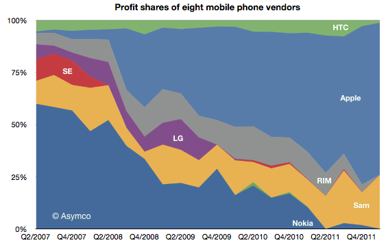
The new market disruption is evidenced by the shift of fortunes to Apple and Samsung and away from every other device maker. Here is the profit picture:

Of the vendors tracked (public companies who report mobile phone divisional performance), Apple obtained 73% of operating profits, Samsung 26% and HTC 1% [1][2]. Continue reading “The phone market in 2012: a tale of two disruptions”

400 million phones per quarter and everything's topsy turvy

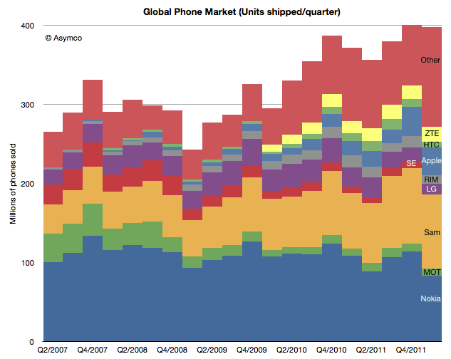
Sony Ericsson is no more. The company remains but the brand is gone. Now the phones it makes will be sold under the Sony name. Unfortunately, that means we no longer get reports from the company on its volumes, profitability and sales. The units will be part of “Other” from now on.

That vendor’s data disappears as did HTC’s and Samsung’s earlier reporting. Bit by bit, vendors are withdrawing information. RIM stopped reporting its average selling prices some time ago, Motorola may disappear completely and they already stopped reporting tablet sales.

This makes the picture of the market fuzzier each quarter. We have to rely more and more on analysts who publish estimates. I try to pick from the available data the best assumptions but the errors are undoubtedly increasing. Here are the charts showing unit volumes in terms of absolute, share and ranking.

Continue reading “400 million phones per quarter and everything's topsy turvy”

Which is best: hardware, software or services?

Apple’s recent margins are nothing short of spectacular. It’s hard to convey just how remarkable 47% gross margin and 39% operating margins are. For a company that sells hardware these are simply unheard-of numbers.

The best way I can illustrate this is by comparing Apple’s operating margins with those of two other platform-based companies, Google and Microsoft.

Microsoft invented the software-as-a-business model and, as software is easily reproduced, their margins are phenomenal. The gross margins are typically in the 80% range for software. Overall, the company had higher R&D and SG&A expenses so their operating margins are a more modest 37% on average. However, Apple managed to exceed this value even though it has the disadvantage of actually having to build things made of atoms. Continue reading “Which is best: hardware, software or services?”