Are Apple’s investments in PP&E extraordinary?

In his recent posts Horace took a look at Apple’s fixed assets and their development over the recent years. He also tested the hypotheses that Apple is making investments into machinery & equipment on which iOS devices are produced by overlaying iOS volumes with preceding changes in property, plant and equipment (PP&E).

The question that has arisen is: Are Apple’s investments in PP&E extraordinary?

To answer, I have compiled the capital expenditures (CapEx) for our previously established peer group [1].

But first we need to clarify what CapEx include and not include. CapEx includes investment into property, plants, equipment, office furniture, larger IT hardware and in some cases patents; CapEx do not include investment into long-term marketable securities or other long-term financial instruments, acquisitions or capitalized R&D. Furthermore, CapEx are gross values and are not net of any sold equipment [2]. CapEx are largely depending on a company’s business model and strategy. For example if you are a manufacturer you need equipment to operate, if you are a software company or a retailer, your business will not be capital intensive.

As the second calendar quarter of 2011 is the latest quarter for which all companies have reported figures, we will take a look at last twelve months’ (LTM) figures from Q2/2011 backwards. The following stacked bar chart shows the combined CapEx of our peer group:


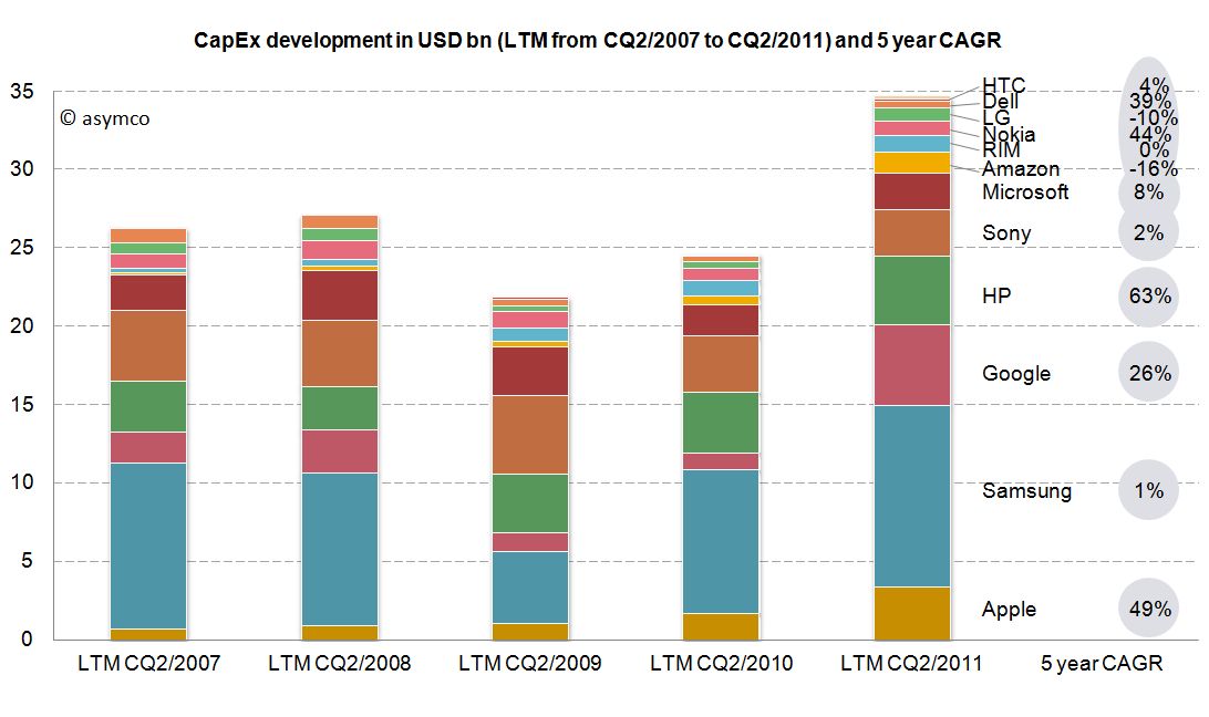
The combined capital expenditures of our peer group for the Continue reading “Are Apple’s investments in PP&E extraordinary?”

How much do Apple's factories cost?

In the last two posts (How much does an Apple store cost?The down payment on iCloud) I discussed two line items in the PP&E asset class on Apple’s Balance Sheet. In isolation, the data is interesting as it gives us an idea of the cost structure of stores and facilities being developed to sustain its current business model. In aggregate, it provides insight into Apple’s strategic intent.

To complete the picture, I will look at the third asset: “Machinery, equipment and internal use software.” It’s the yellow line in the chart below:

It’s plain to see at first glance that it’s the most significant asset. What does it represent and what conclusions can we draw about Apple’s strategy? Continue reading “How much do Apple's factories cost?”

How much does an Apple store cost?

Apple loves to talk about its stores. They do it in every conference call, keynote event and SEC filing. There is a monotony with the repetition of how many they have and how many they are building and how pretty they are. They start to seem like commodities.

But if they were commodities why aren’t there any other networks of successful “vendor stores”?

The answer is partly in the odd integrated business model Apple maintains asymmetric to every other modular technology provider. Apple seems to want to control the relationship with the buyer. It’s also partly in the uniqueness of design, an obsession with the brand. But still, that does not explain why can’t it be copied.

The answer is in the economics.

To understand the cost of developing an Apple store, we turn again to the balance sheet. Fortunately for us, Apple reports details of a particular asset called “Leasehold Improvements.” It’s a substantial asset worth over $2.3 billion in the last statement. It represents “alterations made to rental premises in order to customize it for the specific needs of a tenant.”

The following chart shows the change in that figure quarter-over-quarter.

Can we tie these expenditures directly to stores? Continue reading “How much does an Apple store cost?”

At $2.9bn/yr apps are challenging songs as the most valuable online medium

During the October iPhone event Apple gave an update on the app and song download totals. This is a reliable gauge of the iTunes ecosystem performance and Apple has been supplying these numbers for several years.  Plotting these numbers gives us a good idea of the trend in mobile content consumption. Here is the data to date:

The total number of apps downloaded (excluding updates) overtook songs in June/July and continues on its trajectory. In fact, the rate of downloads for Apps is now over 1 billion / month. Given the data points above, I calculate it to be about 34 million per day. The corresponding rate for songs is 8.3 million per day.

You can see the rate of downloads as it’s changed over time here:

I used trailing four periods’ moving average for the lines to show the trend more clearly. The gap in download rates is large and increasing.

Now most observers would note that songs are much more expensive than apps, especially since there are no free songs and many apps are free. This would imply that the music business is probably more valuable than the app business.

That’s true, but not by much. To determine how much, I used the other data point offered: $3 billion in payments to developers. Since that represents 70% of gross revenues to Apple, we can determine that the average price per app is now 23.8c (down from 28.5c in April 2009)[1]. Knowing the app price we can plot both revenues and the margin that Apple keeps.

We can compare that with the margin that Apple keeps from songs (assuming a price point of $1.2 per song and a 73% pay-out to labels.)

The data jumps around quite a bit but the trend is pretty clear. After paying the content owners, iTunes is left with about $75 million per month from apps and $85 million per month from songs.

Apple then needs to pay other direct costs like credit card processing, bandwidth, storage, curation and testing. Then there are other operating expenses like R&D and marketing. These costs add up such that, according to Apple, they cover revenues, yielding a break-even operation.

Break-even or not, the way the data is trending it’s pretty clear that Apps will be responsible for a the majority of content cash flow at Apple.

At a billion downloads a month (and rising) the value in terms of revenues is already a run rate of $2.9 billion per year. This has been enough to overtake a business that has been running for more than seven years.

Notes:

  1. The payments to developers probably includes in-app purchases.

iOS vs. Microsoft: Comparing the bottom lines

I began comparing Microsoft and Apple’s financial performance with a review of “top line” or revenues by product lines over a four year period.

This post is about the “bottom line” for the same companies and products.

Before I jump in I would like to make sure there is no confusion about the terms. I will be comparing “operating income”[1] as a measure of “bottom line”. This is a common way to compare the profitability of companies because it excludes taxes and interest income. These non-operating expenses/income can distort a comparison of performance because they can be the result of investment activity or changes in tax law or where the company is domiciled. One should not make judgements of comparative performance on those non-operational bases.[2]

Another challenge is that some companies report operating income by division while others don’t. We can usually compare overall operating income but usually not on a division or product-level. This is the challenge I will try to overcome in this analysis between two very different operating models.

The first chart shows Microsoft’s Operating Income by Division as reported by the company.

Each area represents a business division. Note some are showing negative income (losses). Continue reading “iOS vs. Microsoft: Comparing the bottom lines”

Decoding Steve Jobs: Select Commentary from HBR.org – Harvard Business Review

Announcing a new HBS PRESS BOOK

Decoding Steve Jobs: Select Commentary from HBR.org

by Norm Smallwood, Kate Sweetman, Dave Ulrich, Rosabeth Moss Kanter, Jeffrey Pfeffer, Horace Dediu, James Allworth, Max Wessel, Rob Wheeler, Bill Taylor

Source: Harvard Business Press Books

14 pages.  Publication date: Sep 22, 2011. Prod. #: 10973-PDF-ENG

“The news of Steve Jobs’s retirement from Apple may be losing steam but observations on his legacy – and Apple’s leadership future – are only beginning. In recent years, leading thinkers have contributed their thoughts on the Jobs phenomenon on HBR.org. We’ve compiled a few of the best here, and we invite you to read them through the lens of business lessons to be learned.’ We’ve selected six pieces: two from after Jobs’s August 2011 announcement and four from before. We hope you will enjoy them, learn from them, and continue to turn to HBR.org for ideas and inspiration.

Available for download for $1.99 via Decoding Steve Jobs: Select Commentary from HBR.org – Harvard Business Review.

OS turning circles: Questioning Windows' maneuverability

[Updated with Mac OS versions. See footnote 3.]

I’m glad Windows 8 is named the way it is. With Windows 7 Microsoft went to a numbering system which is much more rational than the mixed naming of the past. The number 8 actually corresponds to the actual sequential number of major versions of Windows released to date.

Windows proper actually did not start with what was called “Windows 1.0”. Windows actually started in April 1992 when Windows 3.1 was released. It was the first Windows which was an operating environment onto itself, apart from DOS. It was followed by Windows 95 (which we can call “2”), Windows 98 (“3”), Windows 2000 (“4”), Windows XP (“5”), Windows Vista (“6”), Windows 7 and now Windows 8.

Given this nomenclature and the dates of general availability of said versions, we can derive a measure of the frequency of upgrades. For example Windows “2” followed about 41 months after “1” and “3” took 34 months after “2”. If we continue this for all the versions, and assume “8” will launch by October next year, we can plot the cycle times of new Windows versions.

To make the story more interesting I added the same data for other OS platforms. OS X, iOS and Android have version numbers which correspond to the sequential order in which they were released. I am assuming that the numbering system (1.0, 2.0, 3.0 etc.) are meaningful and that major releases are given a new integer value.[1] Continue reading “OS turning circles: Questioning Windows' maneuverability”

RIM and the lamentation of the analyst

RIM shipped 10.6 million Blackberries and 200,000 PlayBooks in the last quarter. Management noted that their sell-through was significantly higher for Blackberry (13.7 million) but seems to be very weak for PlayBook as the prior quarter saw 500k units shipped. Additional PlayBook units this quarter probably mostly went into new channels in Asia and there were no additional sales into North America or Europe.

The figures for units are very poor. How poor depends on the frame of reference. Consider the shipment chart below:

In terms of the competition, 10.6 million units is less than half what Apple or Samsung sold in its prior quarter. It’s also less Continue reading “RIM and the lamentation of the analyst”

Mobile Impossible

In yesterday’s post about the “biggest mobile loser” I covered the exodus of users from non-smart devices in the US and EU5. I also said that what happens in those regions tends to happen in other regions with a time shift. In some regions it happens quicker but in most it happens more slowly.

But can we be sure that there isn’t vast non-smartphone growth in other regions? Well, no, we can’t be sure. At least not without access to reliable data.

But what we can track is the overall non-smart phone market and compare it to the smartphone market. Here are the growth rates of the two sub-markets:

The difference is plain to see. We can also note that the non-smart market may be heading into a contraction–something noted by some analysts close to the market–but no real sign of that happening in smartphones.

Beside growth, we can also see actuals and the split of various vendors’ volumes in the market. Continue reading “Mobile Impossible”

Biggest mobile loser? The non-smart phone

Yesterday comScore published survey results for EU5 (France, Germany, Italy, Spain, UK) on smartphone use and installed base. The headline is very similar to what would be written about the US: Android had phenomenal growth over the last twelve months. I also noted that the apparent growth of Google (16.2% share change) seemed to be matched by an apparent decline of Symbian (-16.1% share change.) However the reading of the data is not so simple.

In order to understand what has happened to usage, it’s much more valuable to look at consumption and the actual number of users rather than change in share of a subset of the market. Consider the following charts:

The bar chart shows that Continue reading “Biggest mobile loser? The non-smart phone”