Picking up the discussion of vendor share, I used Canalys estimates of platform shares to visualize the effect of Android on the smartphone market:
Continue reading “Android and iPhone: Conquistadors or pioneers?”
Mobile Computing Industry
Picking up the discussion of vendor share, I used Canalys estimates of platform shares to visualize the effect of Android on the smartphone market:
Continue reading “Android and iPhone: Conquistadors or pioneers?”
The smartphone market grew to about 100 million units last quarter. That’s nearly double what it was a year earlier and triple what it was three years earlier, the year the iPhone made its debut.
Few markets grow this quickly, especially as this tripling happened during one of the worst recessions for a century. 100 million units a quarter is not a small number. The rate at which smartphones are growing makes clear the trajectory of where all phones are going.
As I’ve shown in profitability charts, vendors have been benefiting to differing degrees. The overall smartphone market with individual vendors is shown below: Continue reading “Comparing Share of Growth: Integrated smartphone vendors held their own in Q4”
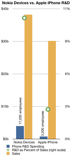
In a recent post I pointed out that Apple’s R&D was about 2.2% of sales in the last quarter. Bernstein took a look at the R&D for Nokia and presented a chart showing the difference between the mobile industry players in terms of total expenditure on R&D.
 I took inspiration from that to plot the Devices R&D for both Nokia and Apple over the entire 2010 period. I also compared that with sales and computed the ratio between R&D and sales.
The result is shown in the chart on the left.
Bottom line: Nokia spent 10.2% of phone sales in 2010 on phone R&D while Apple spent 2.5%.
Bernstein goes on to argue that at least for Devices,
Nokia spent $3.9bn in R&D in 2010, almost 3x the average of its peers, 31% of the industry’s R&D total spending, for an output that we can qualify as visibly disappointing.
To relate the $3.9 billion for Devices into head count, they estimate that Symbian projects employ 6,200 people; MeeGo and Qt 1,800; Services 1,800; and S40 1,800. Hardware headcount is assumed to be 4,700 and 900 more for fundamental research.
People are lining up to call the market for mobile phones. Analysts and amateurs alike are connecting points on charts and predicting with confidence the future of mobile platforms. Consensus is forming that there is no future but a quiescent state. By the acclamation of pundits, the survivors are declared to be iOS and Android. They are also predictably arranged in a way similar to OS X and Windows. End of story.
Except for one thing. Continue reading “Calling the end of innovation in mobile computers”
Prices provide accurate, independent signals about where, when, and how to create and deploy value-creating innovations. The mechanism of free markets signals what should be rewarded and what shouldn’t. When comparing competitors, prices are the best indicators of differentiable positioning.
However, prices are sometimes anomalous and subject to transient market conditions. It’s therefore important to observe pricing over a long time frame.
This chart shows the average selling prices for all phones sold by the eight publicly traded phone vendors (covering approximately 70% of the market) since mid-2007.
There is remarkable stability in the pricing of the competitors. One could argue that only Motorola and LG saw significant swings in price. (Apple’s instability in 2007 was due to the revenue sharing deal for the 2G iPhone on AT&T).
Motorola pared down its portfolio (and its market share) and as a result has seen a doubling in ASP. LG had a rapid rise and rapid fall as its feature phone business boomed and busted.
But otherwise, pricing trends are subtle: down from Nokia and Samsung. Slight decrease for RIM and HTC and stable for Apple. In a future post I’ll dive into the relationship between pricing power and share.
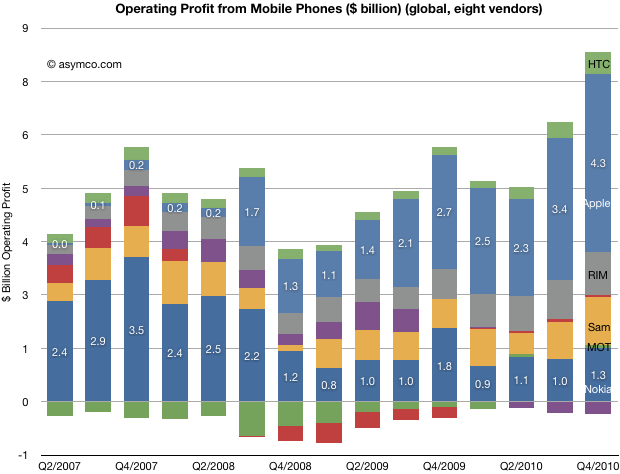
Today’s charts show the amount of profit captured by the top eight public mobile phone companies in two different ways.
The first, as a bar chart:

Continue reading “Making it up in volume: How profit and volumes traded-off in the fourth quarter”
In a recent tally of mobile OS market share estimates from Canalys, the market was organized by OS vendors. The number of devices sold by operating system vendor includes as many OS’s as each vendor may supply.
For example, Microsoft licensed two different OS’s during the period: Windows Mobile 6.5 and Windows Phone 7. Nokia also offered multiple versions of Symbian, which have varying degrees of inter-operability.
Google’s offerings include (as per footnote) OMS and Tapas platforms in addition to Android.
Fragmentation is not a new subject as OS licensing models have been ripe with it for as long as they existed.
What I want to draw attention to is the concept of Google as “vendor.” Continue reading “Google as Android "Vendor"”
The mobile phone market is growing rapidly. It grew 18% in the last quarter. The smartphone market grew even faster, about 75%.
To grow share in this market means growing even faster than the market. What we can see from the following charts is how the iPhone as a product grew in share since it was launched 3.5 years ago: Continue reading “The iPhone share: 17.25% of smartphones, 4.2% all phones”
The following chart shows the units, sales and profit shares for the top eight phone vendors. Continue reading “Fourth quarter mobile phone industry overview”
The smartphone market grew 73% in Q4. Here are the growth rates for vendors which regularly report smartphone sales: