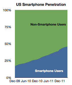
At 50% penetration the US smartphone market is not showing signs of saturation

According to comScore, as of end of May,  the ratio of consumer phone users in the US (aged more than 13) who use smartphones as their primary phone has reached 47%.

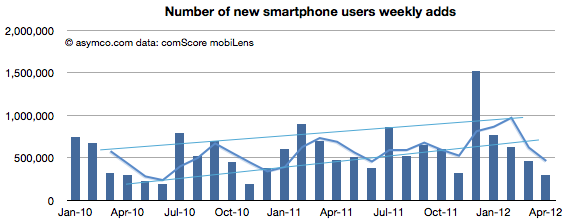
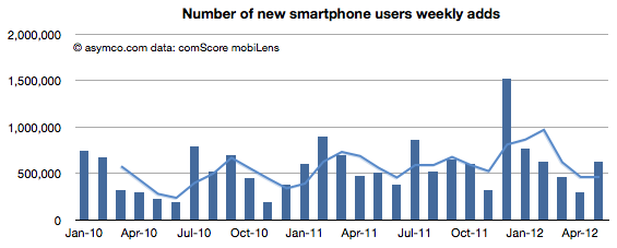
The question is whether this is reaching saturation. My guess has been that saturation will be at levels well above 80%. The data shows that during May the rate of smartphone adoption (first time users) was 630k/week. This number is a good recovery to above the historic mean indicative that saturation is not yet in effect.

50% penetration will happen this summer. A year ago the predicted “tipping point” date was also the same: August 2012.

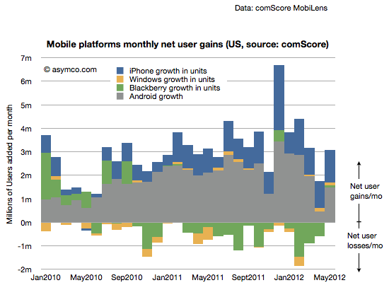
The platform shares data is also returning to a historic consistency. A month ago I asked if there was “trouble with the robot”  because Android net adds dropped to a level unseen for two years and the decline in net adds had been going on for four months.

This last report shows a recovery in Android net adds to about 1.5 million new users.

[Note here too that there is no sign of saturation: The net user gains are far above net user losses. Even BlackBerry showed a gain. In a market where there is saturation, net gains and losses among platforms would balance each other out.]

In terms of share, Android shows two months of no growth. Continue reading “At 50% penetration the US smartphone market is not showing signs of saturation”

RIM's tailspin

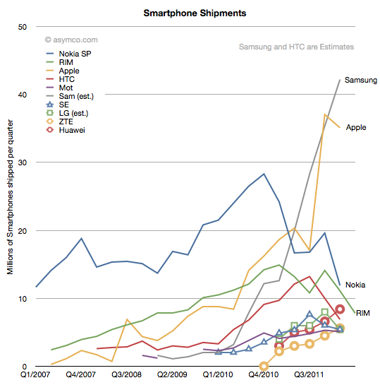
The number of BlackBerry phones sold fell 41% year-on-year in the last RIM fiscal quarter. Sequentially the fall was 30%. Though surprisingly poor, I note that Nokia’s smartphone business fell even more dramatically last quarter (down 50% y/y and 39% sequentially). LG also saw a 44% decline in unit shipments in Q1.

The history of smartphone shipments for the largest vendors is shown in the following chart:

From forecasts made by Huawei it’s probable that they overtook RIM in the last quarter, dropping RIM to 5th or 6th ranked vendor in smartphone units.

RIM’s 7.8 million units is the same level of sales as it had in early 2009. The total market was only about 250 million units per quarter then. It’s around 400 million today. A quick calculation shows that RIM’s smartphone market share has fallen from a peak of 22% to about 6%.

RIM’s stock performance reflects this performance relative to the market. Continue reading “RIM's tailspin”

Activating 5.6 million units per day

Google reported a new activation rate milestone: 1 million/day.

The rate of activations has been increasing steadily which leads to a question: how high can it go?

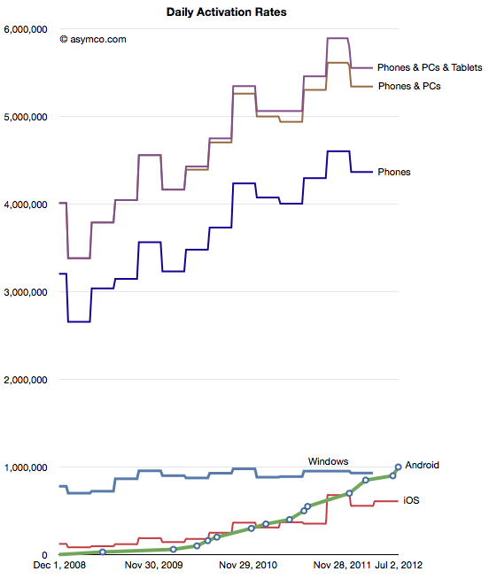
The answer is easy to determine. It can go no higher than the sales rate of phones and tablets and PCs. So what’s that sales rate? The answer is to take sales (shipments actually) per category and cast the data as “activations”.

The result is shown in the chart below:

Defined as “activations” device and computers are being adopted at the rate of about 5.6 million units per day.

Continue reading “Activating 5.6 million units per day”

Horace Dediu on HTML5 vs. native apps « uniform zulu zero zero

This week Mr. Dediu was a guest on The Web Ahead (another 5by5 show hosted by Jen Simmons) where he discussed how the forces of disruption apply to the web. It was an interesting discussion as usual, but if you’re pressed for time you should turn your attention to the bit after the sixty-five minute mark, when Horace volunteers some of his thoughts on the web vs. native application platforms.

via Horace Dediu on HTML5 vs. native apps « uniform zulu zero zero.

A fair summary of what I said and rebuttals by @falameufilho

MacDirectory: Exclusive | Apple's iOS Market Analysis

HD: Apps are like the sauce in a dish. They add flavor and distinguish the dish. Increasingly they also offer nourishment. Some would argue that we can live with plain cooking but spices drove people to do incredible things like risking life to discover new continents. Being the world’s best source for spices means the most innovative and brilliant minds will be attracted to innovate on top of Apple’s platforms.

Read more of the interview by Markin Abras here: MacDirectory: Exclusive | Apple’s iOS Market Analysis.

A more precise measure of Apple's device installed base (and device longevity)

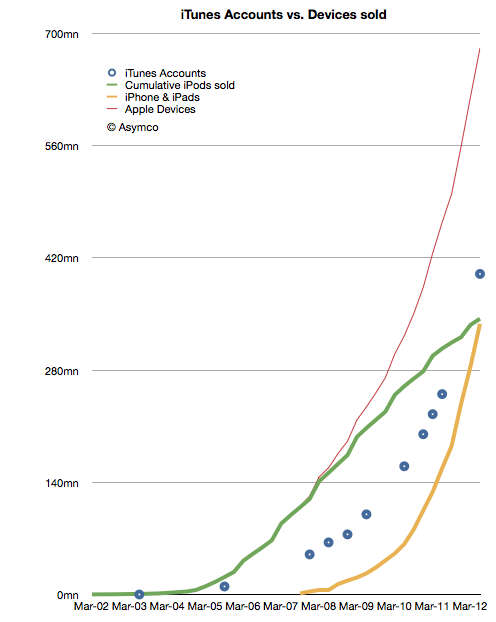
Apple announced that the total number of iTunes account (with credit cards attached) has reached 400 million. This was touted as being the largest collection of credit card accounts for any retailer and I have no reason to doubt it. However, looking beyond the bragging rights, there are more interesting patterns to observe about this asset.

What I plotted was the cumulative number of iPods sold (green), the cumulative number of iPhones and iPads (yellow), the combined devices total (red) and the reported number of iTunes accounts (blue). Continue reading “A more precise measure of Apple's device installed base (and device longevity)”

Are revenues per app decreasing?

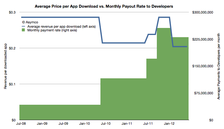
Apple has been releasing data about payments to developers with increasing frequency. Last week’s $5 billion announcement was the fifth such update and came after about one quarter since the last.

Knowing the payments to developers and the cumulative download count allows us to get a very accurate revenue point for each download. As the frequency increases we can observe growth and seasonality patterns.

The following chart shows how average revenue per app download and the average payment rate to developers has changed since the iTunes app store opened and given the data points available:

The green area in the chart should add up to $5 billion. The average revenue for all downloads is 24c.  Continue reading “Are revenues per app decreasing?”

The iOS App market sales run rate is $4 billion per year

At the 2012 WWDC, Apple released new data concerning its App ecosystem. Namely:

  1. 30 billion apps downloaded to date (excluding updates)
  2. $5 billion paid to app developers
  3. 400 million iTunes accounts

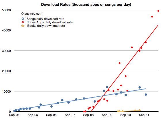
These three data points allow us to update our picture of the app economy. First, the app download rate.

As would be expected from an expanding user base, the app download rate has been increasing. It is now at about 49.5 million apps downloaded every day. The history of this rate is shown in the chart below:

I added the same data for iTunes songs and book downloads for comparison. Note that although music and books are available to the same user base (actually higher due to Macs and iPods which do not run apps,) apps are being downloaded at a far faster rate–at least four times faster.

In terms of total, cumulative downloads, the comparison is even more stark: Continue reading “The iOS App market sales run rate is $4 billion per year”

Trouble with the robot?

The latest data from comScore showed a few surprises:

New smartphone users dropped to a very low level, below the trend line.

Slightly less than 300k new smartphone users abandoned their feature phones every week during the month. Compared with the 1.5 million per week in November, it’s quite a slowdown.

Penetration growth slowed as a result as well. Only 1.3 points of share were gained by smartphones.

It’s still likely that the penetration will reach 50% by the end of summer this year (as was predicted in 2010).

When looking at the picture above broken out by platforms, we see signs that the slowing in smartphone growth seems to be attributable to a slowing in Android adoption: Continue reading “Trouble with the robot?”

Shipped and sold: A brief introduction

Markets are difficult to measure. Mainly because the information is not easy to obtain and that which is obtained is not made public. Collecting, analyzing and filling in the gaps is big business with many firms involved in selling it.

However, with all the analysts and companies selling and promoting their “numbers” it’s important to understand the difference between the methods used. There are for instance at least the following measurements:

  1. Units sold to end users. For example NPD or GfK data of retail transactions. Also Gartner’s estimates for phone units sold.
  2. Units sold to the channel. For example units recognized on income statements usually reported by companies. Also IDC’s estimates for phone units sold.
  3. Units in use. For example comScore and Nielsen survey data.
  4. Units “activated”. The measurement Google uses to describe Android performance.
  5. Intent to buy. For example ChangeWave surveys of early adopters.
  6. Utilization rate. For example browser statistics.

Each measurement tells a different story about the market but the best story is told when all data is analyzed in a combined integrated market review.

Before diving into that it’s important to understand the difference between the first and second measurements or the difference between shipped and sold.

What does “Sold” mean?

Continue reading “Shipped and sold: A brief introduction”