The year of the iPad for the second year in a row

The iPad and Mac businesses both grew well in the last quarter. Tim Cook said they are observing some cannibalization of Mac from the iPad but much more switching to iPad is coming from the Windows PC market.

The evidence is still hard to pin down directly but the fact that PC sales (excluding the Mac) are down gives credence to the claim. Mac growth, in contrast, is largely unaffected. The following chart shows the the iPad volumes vis-a-vis Mac volumes and the Mac growth through recent history.

The iPad has out-sold the Mac since inception and is now about three times the volume. However, the growth rate in the Mac has not changed much.

The impact on the PC market has been discussed recently and the data in the following chart is an update given more precision on the units from Apple: Continue reading “The year of the iPad for the second year in a row”

Is the iPad a PC?

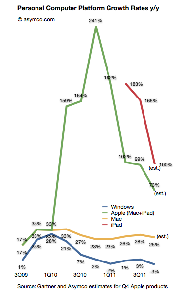
Gartner published its estimates for “PC” shipments during the fourth quarter. As I’ve done in the past, I combined their estimates with known shipments from Apple and separated Apple’s performance from the Windows-based market.

I also take into consideration the iPad as a potential competitor for computing purchases. Apple will report fourth quarter results including Mac and iPad shipments in less than two weeks but I am using my own estimates until then.

Here is how the platforms grew over the last few quarters (all figures are global):

The Gartner data implies Continue reading “Is the iPad a PC?”

Enter, Prise

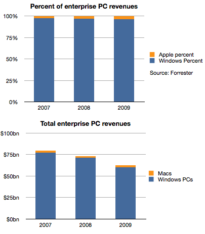
Historically, Apple’s sales to business and government buyers of personal computers have been, in a word, minuscule. To put a number on it, Forrester published data where the estimated value of those sales in 2007 were 2.8%. A figure lower than Apple’s overall market share of PCs in that time frame.

Things did not improve much in the years following. The following chart shows the split between Windows and Mac OS X for the value of enterprise computers sold in 2007 through 2009.

Apple’s share of value went from 2.8% to 3.7%, an increase of 1 point of share, but one which in real terms was not very valuable because the overall market declined due to recession. Revenues for Apple were basically flat at around $2 billion each year as shown in the second chart.

However, the situation changed very rapidly in the last two years. Continue reading “Enter, Prise”

Estimating iPhone sales in the US during Q4

Verizon has been the first source of data on iPhone sales for Q4. They reported 4.2 million iPhones sold. The first quarter of Verizon iPhone sales had 2.2 million units, followed 2.3 million in Q2 and 2 million in Q3. The total for the calendar year came at 10.7 million.

The total for AT&T during the first three quarters has been 9.9 million. If we assume the same 2x sequential increase in Q4 relative to Q3 as observed by Verizon we obtain an estimate of 5.4 million iPhone for AT&T.[1]

The quarter also saw the addition of Sprint to the US iPhone distribution network. Sprint is rumored to have committed to buy 30.5 million iPhones over the next four years. My estimate for the first year was 7 million, placing first quarter sell-in at about 2 million.

An approximate total for Q4 US iPhone activations results in 11.6 million. The following chart illustrates these estimates: Continue reading “Estimating iPhone sales in the US during Q4”

Apple's commoditization discount

When asked where Apple’s growth will come from, most analysts or observers will cite new products. As long as there are new products, then there is growth. Conversely, if there are no new products, then there will be no growth. This is such a commonly held belief that it’s axiomatic: Apple is being valued based on short-term foreseeable growth.

To be more precise, analysts value the wave of growth of every new product and heavily discount the post-growth phase assuming commoditization. There is no value assigned to Apple for extending market reach to the mass market.

Consider: Analysts currently forecast an operating income (or EBIT) of $43.3bn for 2012 and $49.7bn for 2013. That implies growth of 28% in 2012 and 15% in 2013. These growth rates are modest in light of Apple’s recent historic growth and especially 84% in 2011 on EBIT level. Much of this growth has been due to iPhone which quickly captured 4% market share in four years. To suggest 15% growth in 2013 is to suggest that Apple will not increase its phone market share by an appreciable amount. The implicit assumption in that growth figure alone is that Apple will remain a niche player.

Continue reading “Apple's commoditization discount”

The curious case of slowing US growth for Android

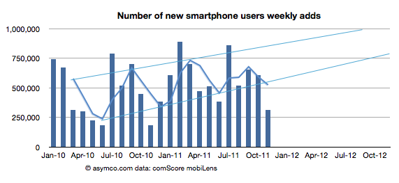
The latest data from comScore MobiLens is showing an uncharacteristic slowing in smartphone growth. In the survey period ending November, the number of smartphone users in the US was 91.4 million. This is equivalent to 39.1% penetration, an increase of 0.6% (i.e. up from 38.5% in the last period.)

The growth is equivalent to 1.4 million new smartphone users (i.e. users who switched from a non-smart device for the first time.) The problem is that this is half the growth of the previous period. The following chart shows the growth as the weekly add rate.

As you can see, the growth has fallen to a level not seen since 2010. The cause may be seasonal as last November was also a slow month. I added a three month moving average which shows that although there seems to be seasonality, the last period did not show the peak of previous periods.

To better understand what happened, I looked at the performance by platform. The following chart shows the net user gains by platform. Continue reading “The curious case of slowing US growth for Android”

Discerning Apple's international product positioning through the big Mac index

Thanks to all those who contributed to the big Mac index there is a substantial amount of pricing data available in one location.

The analysis that I hoped to perform on the data was to see if Apple was pricing specific products differently in international markets. It was prompted by some apparently anomalous pricing of the iPhone 4S in Brazil.

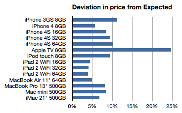
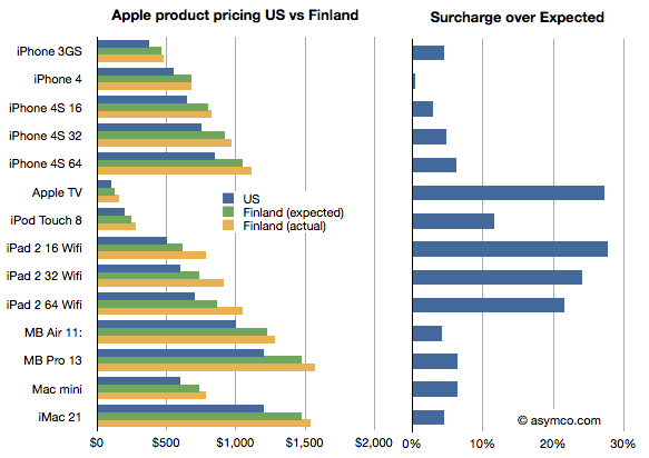
To summarize, the idea is to calculate the “expected” price of an Apple product by taking the untaxed US price and adding duties and tariffs and taxes to determine what that product “should” cost in another country. Then taking the difference between this “expected” price and the actual price to determine if Apple is using pricing to signal in a particular market.

The analysis basically eliminates the effect of government on price and leaves currency and actual pricing signals from Apple as variables.

The analysis is not simple because there are many obscure tax rules. Some products are taxed differently in the same country. I have not completed the country-level analysis but have been able to see some averages over the countries reported (total of 45 reports.)

The following chart shows the average deviation from “Expected” as a percent:

Here are some potential interpretations of this data: Continue reading “Discerning Apple's international product positioning through the big Mac index”

Who is being reasonable now?

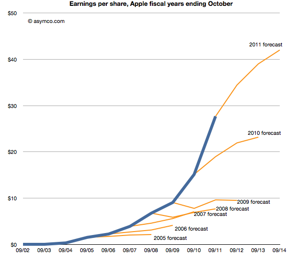
Last week Horace wrote about the apparent “reasonableness” of analyst Apple estimates. He explained how the consensus for Apple’s growth was always deeply pessimistic because its performance could be argued to be anomalous. It was just too good to be true. We reproduce the chart here:

The estimates look like characteristic “tell-tales” of a company running strong into the wind.

This conservatism in the face of rapid growth sounds “reasonable” but is it always practiced? And what about the ability of this conservative strategy to predict dramatic changes in growth? To test, we started to look at the predictions for RIM. RIM has also enjoyed strong growth over a similar time frame as Apple. How did analysts predict its performance? The following chart was prepared using the same technique as the one for Apple[1]. Continue reading “Who is being reasonable now?”

How many Android phones have been activated? (Updated)

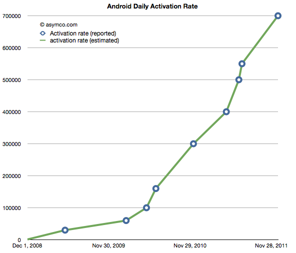
The following chart shows the reported (circled points) and estimated (lines) for Android activations. The resolution of the sampling is every seven days.

If we take these estimates and then compile a cumulative total of activations we get the green line in the chart below. Continue reading “How many Android phones have been activated? (Updated)”

The big Mac (and iPad and iPhone) index (Updated)

Apple’s products are globally consistent. They sell the same exact[1] product in all countries. An unlocked iPhone is the same everywhere. It makes the products “liquid” in that they can be easily bought and sold across borders.

However, laws do not permit the import and friction-free trading of electronic products. In addition to regulations there are duties levied and there are sales or consumption taxes levied on the purchase.

However, knowing the retail price of an Apple product in a particular location, and knowing the tax and duties levied, can we work out if the price is consistent?

Here is an example:

I illustrated the price of a basket of Apple products in the US online Apple store Continue reading “The big Mac (and iPad and iPhone) index (Updated)”