Why is there no iPhone 5?

I’ve been asked what will be the effect on the market of the iPhone 4S. Actually the question was what would be the effect on the market of there being no iPhone 5.

I’d answer that the iPhone 4S is a product designed to compete for two markets: (1) half the current iPhone users who bought a phone prior to the iPhone 4 and (2) non-iPhone users, typically non-smartphone users.

I’ll describe each market briefly.

The current iPhone users

Tim Cook said that half of all iPhones sold to date have been iPhone 4’s. That means that about 70 million iPhone 4’s have been sold. Those are not a target market because of three reasons:

  1. The vast majority of those users are still paying for their iPhone 4 through the subsidy model used to sell them and to change phones today would incur a cash penalty.
  2. Customer satisfaction surveys show that they have 90%+ satisfaction rating for their iPhone 4 and we can therefore assume that they are not looking for something better
  3. Their iPhones are practically new and they still work and are upgradeable.

The other 70 million or so iPhone users have either a 3GS or a 3G iPhone. These are a very different market for three reasons: Continue reading “Why is there no iPhone 5?”

Sprint's gamble

The Wall Street Journal reported that Sprint Nextel made a “multibillion-dollar” gamble on the iPhone. This is based on information that Sprint committed to buy 30.5 million iPhones over the next four years.

Wall Street Journal reporters calculated that the deal is worth around $20 billion on the basis of iPhone ASP during the last quarter (about $650). That Sprint would get that price is possible but not necessarily correct as there is likely to be some discount and the ASP Apple receives includes accessories.

But the “gamble” is more than the deal value. The way it’s being reported is that Sprint bet the company on being able to sell this many iPhones. So naturally we have to ask: how hard can it be to sell 31 million iPhones?

First, note that the order is over a four year period. It’s also not likely to be linear, with volumes accelerating over time. If I estimate a ramp where in year one the commitment is for 4 million, year two 6, year three 9 and year four 12 million we get a total of 31 million. Can Sprint sell this volume?

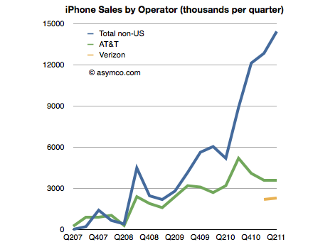
To get an idea we can look at the sales rates for the other US operators. I built a table of iPhone sales by Operator last July. The data is shown in the following chart:

What is interesting is to see the number of iPhones sold in a given time frame as a percent of subscriber base. Continue reading “Sprint's gamble”

The case against the Kindle as a low end tablet disruption

In an Harvard Business Review post Rob Wheeler makes the case for the Kindle Fire as a disruptive innovation. I believe that it is but crucially I disagree that the Kindle Fire is a low end disruption.

My assessment of the Kindle Fire is based on the two attributes which Amazon highlights as the key selling points which offer a basis of differentiation and potential for asymmetric competition: a low price and a new browsing model. I believe that these two attributes result in two opportunities: one for low end disruption and another of new market disruption. I reject the first and tentatively support the second.[1]

The price

It’s immediately obvious that the price point of the Kindle Fire is well below alternatives. That forms the basis of disruptive potential, but before we jump to analyzing the disruption hypothesis we should determine whether and to what extent Amazon profits from the device directly. Profitability gives us a clue to where Amazon will apply resources and thus establish its trajectory of improvement.

We know the margin on the Fire is low because we can calculate the bill of materials for 7″ tablets. Gene Munster of Piper Jaffray estimates that Amazon “loses” $50 for each unit sold. We also know that the design Amazon used is essentially very similar to the RIM PlayBook and was sourced from the same ODM. RIM priced the product at $499 but has struggled to find buyers and is reluctantly dropping the price. We also can estimate that Apple with a product having more than twice the screen size is keeping modest (~30%) gross margins for at a price point approximately double that of the Fire. It does seem that Amazon does not have much or any margin to dip into.[2]

So the Fire can be classified as a low price product. Does that make it a low end disruption?

Continue reading “The case against the Kindle as a low end tablet disruption”

Comparing top lines: Apple vs. Microsoft

I’ve been providing analysis of Apple’s operating and financial performance for some time. Recently we’ve begun to look at comparisons of financial performance for comparable companies. Now it’s time to dig deeper and do comparisons of operating performance as well.

To start, Microsoft.

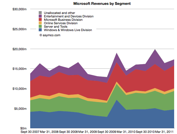
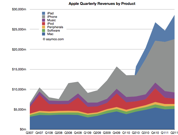
Whereas Apple has product lines (iPhone, iPad, iPod, Mac, iTunes, Peripherals and Software), Microsoft has business divisions (Windows & Windows Live, Server and Tools, Online Services, Business (Office), Entertainment and Devices). The charts show revenues for both Apple and Microsoft according to these defined segments.


The second chart should be a familiar one:

Note that the horizontal and vertical axes are the same. The period of coverage is from mid-2007 to the end of June 2011 which corresponds to the life of the iPhone. The vertical axis ranges up to $30 billion/quarter in both charts.

When shown this way, the exceptional growth for Apple becomes easier to understand (and perhaps Apple’s valuation premium of 15.7 P/E vs. Microsoft’s 9.5). Microsoft has been growing these past four years but not nearly at the rate of Apple. Microsoft grew quarterly revenues from the ~$15b range to ~$17b range.

Additional points of interest:

  • The Mac business generates more Revenue than Windows
  • iOS powered devices generate more revenue than all of Microsoft’s products put together
  • Apple’s revenues grew 413% since Q2 2007 while Microsoft’s grew 26%
  • The release of Windows 7 had a marked effect on revenues in the launch quarter but the sales did not seem to grow above the previous version’s run rate ($4.2b/quarter vs. $4.7b/q on average).

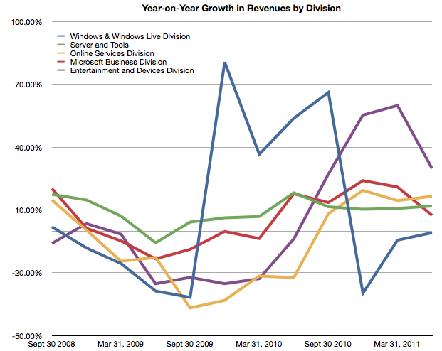
But most importantly, whereas Apple’s growth has come from new businesses (iPhone and iPad), Microsoft has organically grown existing businesses. The condemnation of leadership at Microsoft should hinge on the absence of significant top line growth. Note that neither the Online Services nor the Entertainment and Devices divisions had appreciable net growth.


The perils of possession without utilization

[Updated with new charts including data from StatCounter and not NetMarketshare]

Generally speaking there is an equivalence drawn between iOS and Android as technologies and even as user experiences. However, as I’ve pointed out on several occasions there is a very clear nonequivalence in business models and thus the “fuel” which keeps each platform running. But does this difference in models lead to some difference in the way the products are “hired” to do what they do. Does it imply anything about how the products are likely to evolve?

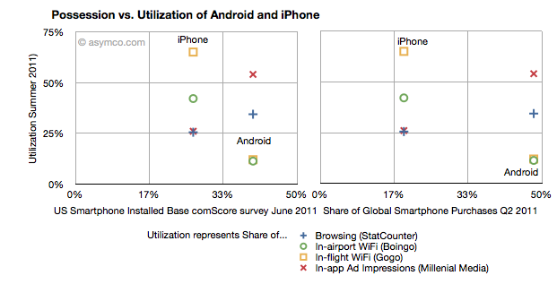
I collected into one place all the data I could find about utilization (how much of a service and how often it’s used) and possession (both in terms of current ownership and new acquisitions) of iOS and Android.

Possession data comes from comScore survey data of share of US installed base of smartphones by platform at the end of June 2011 (first chart) and share of Global Smartphone Purchases as of Q2 2011 sourced from company reports and IDC (second chart).

Utilization data (vertical axes) comes from August  2011 shares of mobile browsers (from StatCounter June 2011), in-airport WiFi associations from Boingo in June 2011 (iPhone vs. Android), in-flight Wifi associations from Gogo in June 2011,  and In-app Ad impressions from Millenial Media also in June.

The charts are divided into nine sections corresponding roughly to “low”, “medium” and “high” utilization vs. possession.

The first chart compares a US-only population for possession vs. a mixture of global and US-only populations for utilization. The second chart compares a global population to the mix of US and global metrics.

What I found interesting is Continue reading “The perils of possession without utilization”

Nokia vs. Android

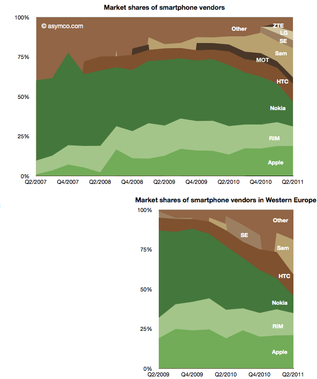
Two years ago Nokia sold 30% of its smartphones in Western Europe. Today it sells 15% in that market. Its unit shipments went from 5 million to about half that and its market share went from 55% to 11%. Its rank in the market went from first to fifth.

The fall is exceptional and dramatic. The two charts below show smartphone market shares. The top chart shows global share and the second shows Western European smartphone shares (European share data sourced from IDC).

The other perspective is shown the the following chart which shows actual units shipped. Continue reading “Nokia vs. Android”

Updated AMP Index for Q2

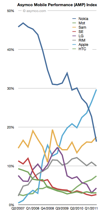
This is an updated view of the AMP index including Q2 data. As a reminder, the AMP (Asymco Mobile Performance) index is an unweighted average of four “shares”:

  1. Share of all handset units sold (global)
  2. Share of smartphones
  3. Share of value (revenues)
  4. Share of profits

You can see the last quarter’s standings here.

The updated index figures and spark lines are shown also on the right-most column on this site.

The biggest mover was Nokia which dropped 6.5 points. The second mover was Apple, with a gain of 3.2. Samsung followed with a gain of 1.38 and LG with a 1.21 and HTC with a gain of 0.95.

RIM lost about 1 point and Motorola and Sony Ericsson remained nearly flat.

The plunge in Nokia’s AMP score is nearly matched by Apple’s gain over the four year time period observed.

The full picture of each component is shown below: Continue reading “Updated AMP Index for Q2”

The fate of mobile phone brands

The violence with which new platforms have displaced incumbent mobile vendor fortunes continues to surprise.

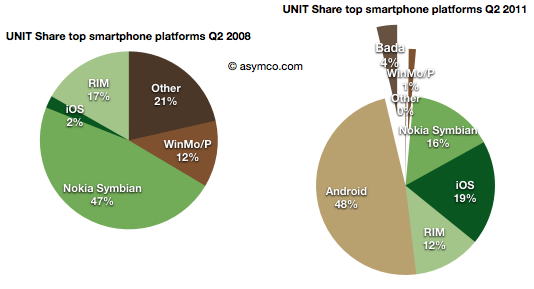
  • Nokia’s Symbian platform has gone from 47% share to 16% in three years
  • Microsoft’s phone platforms have gone from 12% to 1%
  • Other platforms have gone from 21% to zero
  • Although far less dramatic, RIM’s decline from 17% to 12%  is causing acute pain and anxiety

This while entrants have grown share in spectacular fashion:

  • Android from zero to 48% (A two year period)
  • iOS from 2% to 19%
  • Bada from zero to 4% (two quarters only)


The picture of platform share over time looks like this: Continue reading “The fate of mobile phone brands”