State of the Ecosystem

At WWDC 2016 Apple offered a set of new data points to illustrate its ecosystem’s robustness.

First, the number of registered developers increased by 2 million in the last year to a total of 13 million. That is a growth rate of 18%. To compare this total consider that Oracle claimed in 2014 9 million Java developers and IDC claimed in 2014 there were 18.5 million software developers in the world, of which 11 million were professional software developers and 7.5 million were hobbyist developers. It’s therefore possible that Apple’s “market share” among developers is close to 70%.

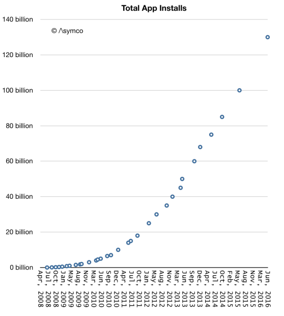
Second, App installs have now reached 130 billion. The cumulative growth is shown in the graph below:

Screen Shot 2016-06-16 at 12.25.11 PM

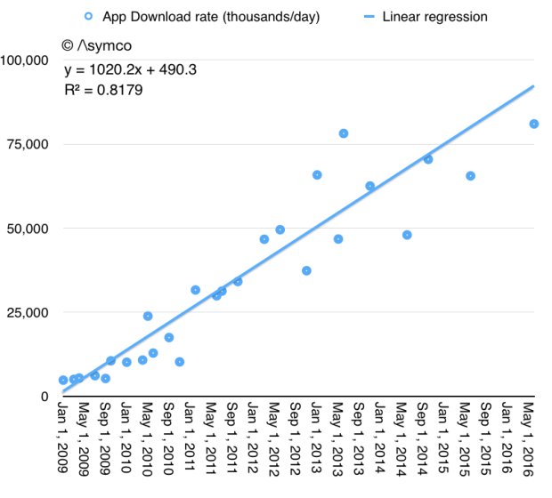
The rate of growth is also shown in the following graph:

Screen Shot 2016-06-16 at 12.33.35 PM

Note that the rate of growth continues to increase and is now above 30 billion/yr. It turns out that apps continue to be a popular download item. The size of the audience continues to grow (see graph below) and it’s therefore understandable that activity in the store continues to grow. Continue reading “State of the Ecosystem”

The Next 40

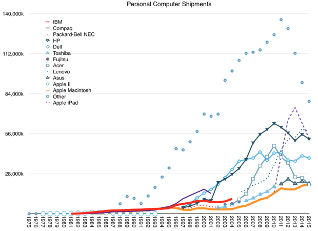
In Apple’s first 40 years it shipped 1,591,092,250 computers1.

This shipment total is higher than any other computer company in its first 40 years. Actually there are no other PC makers that are 40 years old. One computer maker (IBM) is older but they only sold PCs for 24 years and what they still sell they don’t sell in high numbers.

That does not make it the top seller in a given year. Looking at only the Mac, Apple’s traditional form factor personal computer, Apple has only returned to the top 5 last year. Only if including the iPad it was the top computer vendor in 2011 and including iPhone, it was first in 2009.

Screen Shot 2016-03-28 at 11.36.56 AM

After having a 40 year run and after selling more computers than all American and Japanese computer companies put together, how should we think about the next 40 years?

First, clearly Apple shifted from being a “computer company”. It has already changed its name to exclude the word “Computer” but that has been interpreted as saying that it sells devices (which happen to also be computers.) The word “computer” is already archaic. We stopped using computers to compute in the 40s. We used them to make decisions, keep track of things, speed things up and then to communicate and then to entertain.

Devices, it seems, are what customers mainly use to do, well, everything. Computing has grown to encompass most activities we engage in. So is Apple then a device maker? Continue reading “The Next 40”

  1. including Apple II, Mac, iPhone, iPad and iPod touch; excluding Apple Watch, Apple TV and other iPods. Includes Q1 shipments estimated at 63,597,000 Macs, iPhones and iPads []

Significant Contribution

In my quoting of the “Cook Doctrine” I cited the primary criteria for Apple to enter a new market:

We believe that we need to own and control the primary technologies behind the products we make, and participate only in markets where we can make a significant contribution.

These criteria, often repeated, were certainly in force when Apple chose to enter the watch market. Apple has sought and achieved a significant market share and did so while owning and controlling the primary technologies behind the product.

I now turn to the significant contribution criterion to study the possibility of Apple’s entry into the car industry.1

The significance test shifts the speculation from whether Apple would build a car, to how many cars is could build. Making a few cars is easy (see first commandment of The Entrant’s Guide to the Automotive Industry). Making lots of cars is hard and hence significance in the automotive market (as in watches and phones) means achieving some degree of adoption, a higher degree of usage and a very high degree of profitability.

So what does being significant in the car business mean? Does it mean becoming the next Tesla? The next BYD or the next VW? How quickly?

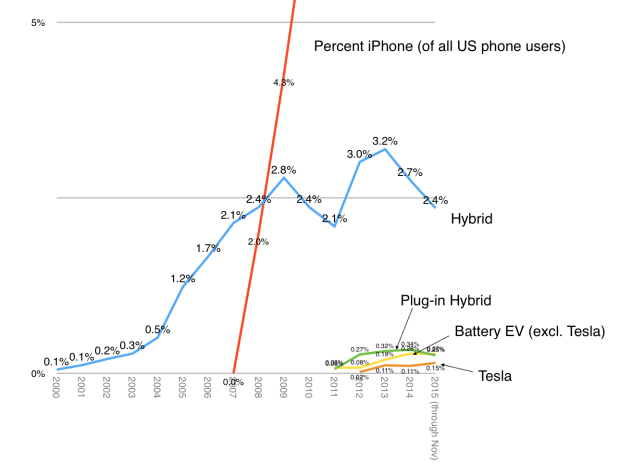
Fortunately, we have something to compare an Apple entry to. Apple has made a “significant” market entry in phones and others have made entries in cars. If we contrast the rate of growth of Tesla, EVs, and Hybrids2 to the rate of growth of iPhones in their respective US markets, we obtain a test of significance:

Screen Shot 2016-01-04 at 12.38.39 PM

The graph shows the percent of sales for the alternative car technologies (and Tesla) vs. the percent of US phone users using iPhones (comScore). Here are the conclusions: Continue reading “Significant Contribution”

  1. Control of the primary technologies behind the product is a topic for another post. []
  2. Of which Toyota has 70% to 80% share []

Apple Watch Keeps Top Gift Spot Ahead Of Black Friday

The Apple Watch continues to hold the top spot among products that will be hot this holiday season, as predicted by the IBM Trend app.

Source: Apple Watch Keeps Top Gift Spot Ahead Of Black Friday

The Apple Watch scored 100 out of 100 on the “IBM Watson Trend Scale”. According to various surveys, about 100 million people will shop this Thanksgiving weekend in the US. One wonders how many purchases by 100 million shoppers merit a score of 100/100.

My estimate for units shipped has been 20 million in the first calendar year. About 7 million have been sold in the first two quarters. That leaves 13 for the holiday and Q1 (which includes Chinese New Year.) I still like these odds.

To learn more about the reasoning around this estimate and hear additional supporting data, join us at Glance conference.

Why does Apple TV deserve to exist?

Since writing Peak Cable six months ago, surveys, research and analysis have contributed to the themes of unbundling the TV package. The data under scrutiny is, as usual, the data that can be gathered. Unfortunately the data that can’t be gathered is where the insight into what is happening may lie. For instance, what matters for an entertainer is not how much you’re watched but how much you’re loved. Measuring love is done poorly with data on payment for subscriptions.

A better proxy might be time. Liam Boluk makes the point in his post that “focusing on cord cutting or even cord shaving largely misses the point.” Don’t follow the dollars, he says, follow the time or engagement. “Relevance” is what matters.

His data shows how linear TV has fallen by roughly 30% among the young (12-34) in the last five years. The trouble for the TV bundle (and advertisers) is that this is the most culturally influential group. They are also the group which will grow into the highest income group over the next decade. And this group does not love TV.

We have to remember that it was the youth who drove early radio, TV and consumer electronics markets. Those young are now the old which still cling to the old media, served by companies that grew old with them. They are the “high-end” customers with which Nielsen itself has grown. They have the most money to spend and they are the targets for the ads1

Paying $150/month to watch incontinence and erectile dysfunction ads—at a time not of your choosing—is preposterous for the young. They may like the programs but not the way they are packaged, delivered or interrupted. They are not smarter than their parents. They, like their parents, took to new technology more quickly. What makes the technology new is also what lets its makers separate the content from its delivery. These new technologies allow “modularizing” or unbundling that which was was integrated/bundled and thus allow their developers to focus on the customer’s real jobs-to-be-done.

Unsurprisingly, incumbents have responded by throttling access to original programming–an asset over which they still exert influence as distributors. Netflix and Amazon are taking the path of responding with their own blockbuster productions. Although Silicon Valley has more capital to deploy than Hollywood  this battle of attrition is by no means one that incumbents will win, and generally, it’s not going to be pretty.

Tweaking the nose of the incumbent might not be the way to establish asymmetry. The better tactic may be to help the system survive but offer a “short-term alternative”. This is how iTunes took on and won Music. When Napster and file sharing created a clear and present danger to the industry, Apple’s approach of a controlled alternative allowed the industry to finally move to a digital download model.

Continue reading “Why does Apple TV deserve to exist?”
  1. no longer the Pepsi generation, they are the Depend and Viagra and pharmaceuticals generation []

Meaningful Contribution

What if Apple did make a car? How significant could their products be? What would it take to influence the industry’s architecture?

The global market is forecast to reach 88.6 million vehicles in 2015 and there are many ways to segment it. One could look at geography or at product configurations or the emergence of new powertrain technologies.

One could also look at the participants.

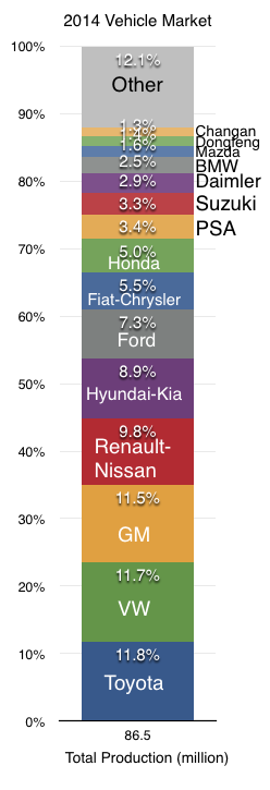
In 2014 Toyota was the top selling automaker with a total sales volume of 10.23 million vehicles. The following graph shows the leading 15 producers and the percent of total production.

Screen Shot 2015-09-25 at 9-25-2.19.47 PM


Continue reading “Meaningful Contribution”

How quickly will ads disappear from the Internet?

I was always bemused by the notion that the Internet was able to exist solely because most users did not know they could install an ad blocker. Like removing Flash, using an Ad blocker was a rebellious act but one which paid off only for early adopters. But like all good ideas, it seemed obvious that this idea would spread.

What we never know is how quickly diffusion happens. I’ve observed “no-brainer” technologies or ideas lie unadopted for decades, languishing in perpetual indifference and suddenly, with no apparent cause, flip into ubiquity and inevitability at a vicious rate of adoption.

Watching this phenomenon for most of my life, I developed a theory of causation. This theory is that for adoption to accelerate there has to be a combination of conformability to the adopter’s manifest needs (the pull) combined with a concerted collaboration of producers to promote the solution (the push). Absent either pull or push, adoption of even the brightest and most self-evident ideas drags on.

Ad blocking offers a real-time example of this phenomenon. On desktop or even laptop computers ads were tolerable and the steps required to naviagate in order to implement effective1 blocking were non-trivial. In addition, no platform vendors were keen to promote products which hindered revenues for their most important ecosystem partners.

Ad blocking as an activity had neither the pull nor the push.

Continue reading “How quickly will ads disappear from the Internet?”

  1. By effective I mean a combination of whitelists and customizations []

The new switchers

During the last quarterly earnings call, Tim Cook said that Apple has seen the highest switching rate from Android ever. That there is switching isn’t surprising. We’ve seen many surveys which show higher loyalty with iOS than with Android. But it’s been very hard to spot the evidence in the data which is visible publicly. Both iOS and Android are adding users and sales for both platforms are still increasing.

The switching effect is easier to discern when the market is not growing overall. In that situation one platform’s growth has to be at the expense of another. However, some markets do show evidence of “churn” in users.

Screen Shot 2015-08-10 at 8-10-12.52.52 PM

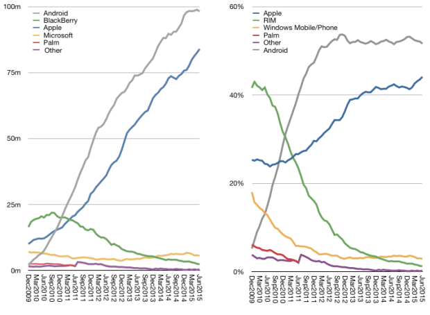
Consider the ComScore data on US platform users (above). If we look at the last six months’ data1 we can count that there are about 8.2 million more Americans using iPhones than there were six months ago. At the same time, there are 1.6 million Android users. One million users left the BlackBerry platform and about 700,000 left Windows Mobile. The data also suggests that the total number of first-time smartphone users is about 8.3 million.

Continue reading “The new switchers”

  1. these data are actually three month averages []

What next for iPad?

ComScore suggests that there are 100 million tablet owners in the US. On a per capita basis that implies penetration of about 30%. As a percent of mobile phone subscribers (above age of 13) that implies 40%. As a percent of smartphone users that implies 43%. As a percent of iPhone users that represents 47%. As a percent of households assuming one device per household that implies 85% penetration. By another measure (Pew) household penetration is around 50%.

Regardless of the difficulty in defining what is the correct “addressable market”, the more important question is whether tablets will be an ubiquitous object. Perhaps what we are seeing in the US is something similar to the MP3 player market or video game console markets where penetration saturated at around 50%. Perhaps tablets will reach PC levels which are closer to 80% of population or perhaps they will reach phone levels which are above 90%. The reason we can’t answer the question of ubiquity easily is because competing solutions can carve the usage out of a category “disrupting” it with alternatives.

The idea that jobs are the segments into which products fit and not demographics or product attributes is key to understanding this migration. The reason phones have subsumed more jobs onto themselves is because they have a rapid rate of evolution and because they have larger scale of economy and because they are conformable to our life spaces. As phones get better they take on more jobs and some of those jobs are those of tablets. The MP3 did not become ubiquitous because the phone took its job. Same for the video game and same perhaps for the PC and tablet.

Continue reading “What next for iPad?”

Where are Maps going?

At the 2015 WWDC Apple stated that it receives 5 billion requests per week for its maps service. It also said that Apple maps is used 3.5 times more frequently than “the next leading maps app.”

These two data points are the total number of data points we have about the global maps market. Neither Google nor Nokia provide usage or share or performance data. Regardless, commentary on the usage, share and performance of Apple Maps has been abundant for the three years since its inception.

The data presented allows us to make a few estimates for the first time and we can hope that additional data can allow a picture to emerge of where maps are going.

With these first two data points we can finally make some estimates. But some assumptions are still needed: We need to assume that the “next leading maps app” is Google Maps. Although there are other maps apps on the iOS platform they are probably insignificant and it’s a two-horse race between Google and Apple on iOS.

This means that the 3.5:1 split in usage results in a 78% share for Apple Maps and a 22% share for Google. If we assume that there are about 400 million iOS users of maps1, it leads to about 90 million Google Maps users on iOS and about 310 million Apple Maps users on iOS.  This includes iPad.2

Given that Google also reported 1 billion downloads in 20143 we can assume between 25% to 33% Apple Maps “market share” of usage.

Continue reading “Where are Maps going?”

  1. Note that not all iOS users are maps users. Maps are not used by all users []
  2. We are excluding OS X use of Maps. []
  3. though not necessarily all of these downloads lead to active use, obviously []