When will the migration from PCs be complete?

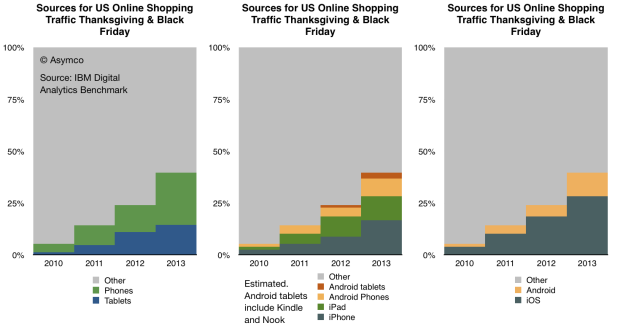
IBM Digital Analytics Benchmark (report is here) has published, for the fourth year in a row, US online shopping traffic data with a split between mobile and fixed online traffic. It reveals a pattern of consumer behavior which is quite startling: people seem to prefer to shop using mobile devices.

The data is shown below:

Screen Shot 2013-12-02 at 12-2-6.45.34 AM

Continue reading “When will the migration from PCs be complete?”

What’s an Active User worth?

Apple has sold 700 million iOS devices. Google claims one billion Android device activations. Microsoft has about 1.5 billion Windows users and Facebook about 1.19 billion. LinkedIn has 259 million users and Twitter has 232 million. Amazon has 215 active account holders and PayPal 137 million.

Markets place a value on these users implicitly when company shares are priced. For example, Twitter whose users are worth about $110 or FaceBook’s $98 and LinkedIn at $93.

This consistency suggests a universally accepted value per social media user but what is the value of an ecosystem user? Apple, Google, Microsoft and even Amazon aspire to enable ecosystems which should be seen are more valuable than mere communities. Ecosystems enable a higher level of economic activity because they are unbounded by the medium itself. Any number of media can be created. Or so the theory goes.

If we could determine a value for an ecosystem user we could test it against the going value of a social media user. Fortunately we have enough data to do so.

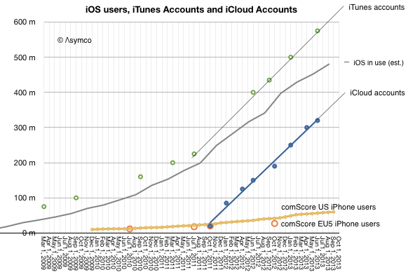
The total number of iOS devices sold per quarter allows us to measure the install base of device users. With some assumptions regarding the retirement and attrition rate we can get the following history:

Screen Shot 2013-11-11 at 11-11-11.52.34 AM

Since the total number of iTunes accounts is updated with some regularity I’ve added it to the graph. I’ve also shown on the same graph the total number of iCloud accounts. For calibration, I included survey data showing the number of iPhone users in two regions (US and EU5). Continue reading “What’s an Active User worth?”

Owing how much to how few?

For the year ending October Apple’s R&D costs were $4.475 billion. These costs have been rising. Though, as the company explains, not faster than net sales:

The growth in R&D expense was driven by an increase in headcount and related expenses to support expanded R&D activities. Although total R&D expense increased 32% and 39% in 2013 and 2012, respectively, it remained fairly consistent as a percentage of net sales.

[My emphasis]

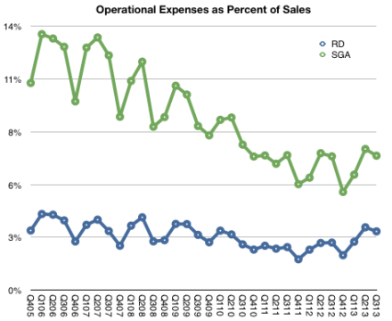
We can see this in the following graph:

Screen Shot 2013-11-01 at 11-1-4.37.48 PM

R&D has remained very nearly 3% of sales since at least 2005.


SG&A Expenses barely grew however:

The growth in SG&A during 2013 was primarily due to the Company’s continued expansion of its Retail segment and increased headcount and related expenses, partially offset by decreased spending on professional services.

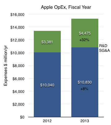
The change in R&D and SG&A on a full-year basis is shown below.

Screen Shot 2013-11-01 at 11-1-4.42.06 PM

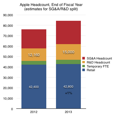
I emphasized the mention of increases in headcount. We cannot know with any precision what portion of last year’s $15 billion in operating expenses went toward wage expenses since there are other costs such as advertising1 commissions and public relations in the case of SG&A and outside services, equipment leases, in the case of R&D. However, it’s more likely that wage expenses are a far larger proportion of total R&D than they are of SG&A.

My estimate, based on wage rates, is that there are approximately 15,000 R&D staff at Apple.

Screen Shot 2013-11-01 at 11-1-4.42.49 PM

If we divide sales by this number we get $11.4 million in sales per engineer.

  1. Apple’s advertising expenditures for fiscal 2013 were $1.1 billion or 10% of SG&A or 0.64% of sales. []

How many smartphone users will there be in the US?

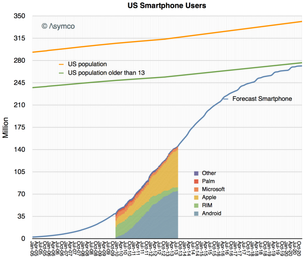
In yesterday’s post forecasting smartphone penetration I neglected to mention the exact subset of the US population being sampled. The analysis is based on comScore’s sampling which covers only those devices which are the “primary phone” for users  over 13 years old and not provided by an employer.

In other words, the population being sampled is not meant to identify how many phones will be in use but rather what is the primary phone for those non-children who choose their own phones.

So the measurement that can be obtained from the S curve analysis is a subset of all phone users and will not identify exactly how many phones will be in use. Given that, this is what that subset looks like:

Screen Shot 2013-10-08 at 10-8-9.41.00 PM

I drew a line showing the census data (and projection) for the US population and estimated what percent of that population might be Continue reading “How many smartphone users will there be in the US?”

The figurative sales of iPhones and BlackBerries

The most interesting juxtaposition in market data happened this week.

Apple announced 9 million units of the iPhone 5s/c sold in their opening weekend while BlackBerry recognized 3.7 million smartphones sold in the three months ended August 31.

I will state these data points with a different emphasis:  while Apple explicitly reported, both in a press release and in an SEC filing, Sales of 9 million units, BlackBerry reported recognition of revenues on 3.7 million units.  At the same time BlackBerry also reported sales to end users of 5.9 million units.

So, did Apple sell 9 million iPhones in three days? What about units ordered and not delivered? Which of these units will show up in the company’s income statement? Conversely, did BlackBerry sell 3.7 million or did it sell 5.9 million smartphones in three months?

The answer is dependent on what constitutes a sale. I suggest re-reading the Sold and Shipped: A Brief Introduction post from last year. Understanding is complicated by many factors, not least of which could be intentional signaling by management. We may never come to a perfectly matched comparison of the two companies’ situations but our job as analysts is to see through the signals and obfuscating language and interpret a pattern. A pattern that extends over a time and helps us learn.

My observation is one of contrast. The juxtaposition this time is that Apple emphasized sold and not shipped while BlackBerry sold more units to end users than it recognized revenue. These signals reflect precisely the inverted fortunes of the two companies.

For BlackBerry the higher sold than shipped recognition was due to a product launch failure. Units which were shipped (and recognized as revenue) last quarter did not sell and the company is not only writing off the inventory but has drastically reduced its deliveries of new units in order to drain inventory. The company explains:

During the second quarter the company recognized hardware revenue on approximately 3.7 million BlackBerry smartphones. Most of the units recognized are BlackBerry 7 devices, in part because certain BlackBerry 10 devices that were shipped in the second quarter of fiscal 2014 will not be recognized until those devices are sold through to end customers. During the quarter, approximately 5.9 million BlackBerry smartphones were sold through to end customers, which included shipments made prior to the second quarter and which reduced the Company’s inventory in the channel.

The company is essentially saying that due to the unusual circumstances of a product launch failure, they will change how they account for their business. They don’t have the confidence that units shipped will actually sell and will not recognize them since they fear they will have to write some off. They are signaling: They are being far more conservative, not reporting shipments alone because those shipments could essentially be value free.

When seen as a pattern, the new figure on recognized revenue units needs to be shown relative to the history of recognized revenue units.   Continue reading “The figurative sales of iPhones and BlackBerries”

iPhones 5c and 5s launch performance illustrated

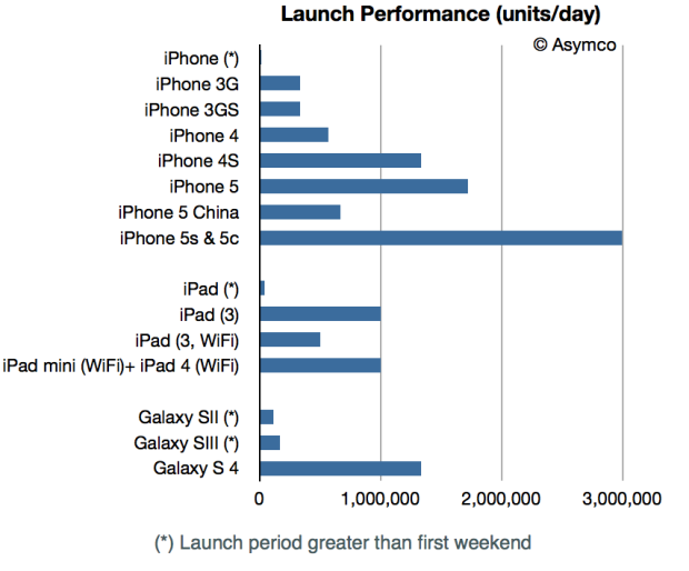
Apple today announced it has sold nine million new iPhone 5s and iPhone 5c models in the first three days after their launch. This performance is illustrated in the following graph:

Screen Shot 2013-09-23 at 9-23-7.12.13 PM

Note that the data is normalized to units/day.

The launch countries this year differed from last year in that they include all of China whereas last year only Hong Kong was included.1

The absolute number of 5x devices sold (not just shipped) seems to be an 80% increase from the 5 launch (9 million vs. 5) but accounting for China the increase is a more modest 29%.  ((The China launch event last year may have had a different dynamic as it occurred later and nearer to holiday season, but I’ll go with the unqualified data.))

However, perhaps the more relevant comparison is between different “S” generations of phones.

The data shows that the 3GS was 3x more rapidly purchased on launch than the original iPhone. The 4S was 4x more rapidly purchased on launch than the 3GS and now the latest 5s/c are 2.3x more rapidly purchased than the 4S.

The growth is certainly lower but from a much higher base. This should not be surprising.

UPDATE: Galaxy S 4 launch data is updated to show weekend performance. Previous graph showed performance over the first 27 days.

  1. I am assuming that this year China includes Hong Kong. It would be good to confirm this. []

Think local, act global

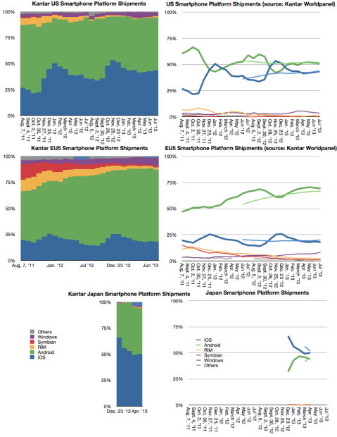
One of the curiosities of the mobile phone market is how vast it is but also how heterogeneous it has always been. I wrote about this in 2010:  Smartphone parochialism: How operator policies prevent or promote platform adoption. This observation was influenced by my time at Nokia where I became amazed at how differently users behaved in different countries.

There were many causes. Some cultural, some historical, some economic and some policy-driven. The result was that it presented a challenge to any company with global ambitions and indeed it was rare to see the same company do well in every market. Japanese companies did well in Japan, European companies did well in Europe and US (and Korean) companies did well in the US. Nokia was most successful because it was able to apply an European model more broadly (but not in the US). Samsung succeeded by simply adapting to each and every market with hundreds of products. But it was a particularly “provincial” market.

My assumption was that when smartphones would become the majority of phones in use there would be a normalization of behavior and thus a homogeneity of preferences. This is, after all, what happened in other platform games. PC form factors are globally consistent, PC operating systems are equally preferred around the world, FaceBook, Google and Twitter are also, unless censored, uniformly popular. Apple’s iPod eventually also became a global phenomenon with no material difference in preference by market. Likewise for game consoles.1

However, a decade after the broad adoption of smartphones, the relative popularity of various platforms is still unevenly distributed. Prior to the iPhone, Symbian was strong everywhere but the US and BlackBerry was very strong in the US but weak elsewhere. Windows Mobile had footholds in some markets but little traction in others. Today the picture has changed but it’s still a patchwork of preferences. Consider the following graphs.

Screen Shot 2013-09-18 at 9-18-12.57.15 PM

Continue reading “Think local, act global”

  1. Although Japanese do seem to prefer Japanese platforms more. []

My interview with Chloe Cho on CNBC Asia's Cash Flow show

My thanks to Kirk Burgess for providing this transcript:

Horace Dediu interview on CNBC Asia Cash Flow show – 10th September 2013

Chloe Cho (CNBC): Take us through what Apple is exactly trying to do?

Horace Dediu: Well, this is the first time in the six years of this competition in the smartphone market that Apple has broadened its portfolio. We have seen only a single product launch every year–this is very unorthodox in the industry. Normally each competitor [ranges] dozens of devices. Apple’s entry has been asymmetric from the start, and now in its sixth year we are expecting to see, finally, a broadening perhaps into two separate products. The question will be whether [there will be] a significantly lower price point for the so-called 5C and whether that will change the average selling price overall for the portfolio. The average selling price has been remarkably steady, and remarkably high, typically around $600 for the duration of this products life. Something, again, unprecedented. My expectation is the new price point will be quite a bit lower than $600, starting with about $450, it might drop a bit further, [which] would cause the overall price range to come down as we have seen with the iPad; [where we] also had a price erosion happen as the smaller version came out.

Q: Horace, do you think they have got the timing right? Should they have done this a little bit earlier when the market wasn’t so saturated and filled with cutthroat competition? Continue reading “My interview with Chloe Cho on CNBC Asia's Cash Flow show”

Third to a billion

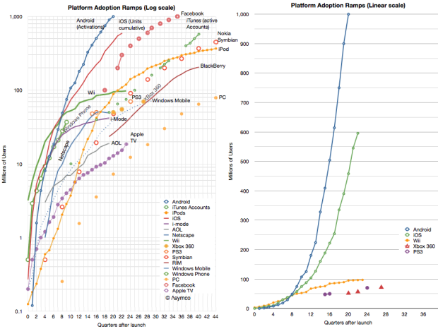
Android is the third platform to reach a billion users1 .  The first was Windows and the second was Facebook. Apple sold around 650 to 700 million iOS and is expected to be the fourth to a billion sometime next year.2

If we define the Race To a Billion to be bounded by a time limit of 10 years, then Windows does not qualify and Android is actually second. The race is shown in the following graphs (the one on the left is logarithmic scaled, the one to the right includes only a few contenders for illustrative reasons).

Screen Shot 2013-09-06 at 9-6-4.06.29 PM

Android’s activations as reported are shown in the following graph: Continue reading “Third to a billion”

  1. Although activations are not users, I’m assuming that usage is not far behind and the cumulative sales figures I gather are roughly comparable. []
  2. Separately, iTunes reports 575 million account holders. []

The Revenue Table (imperial units edition)

Tim Cook famously said:

We can put all of our products on the table you’re sitting at. Those products together sell $40 billion per year. No other company can make that claim except perhaps an oil company.

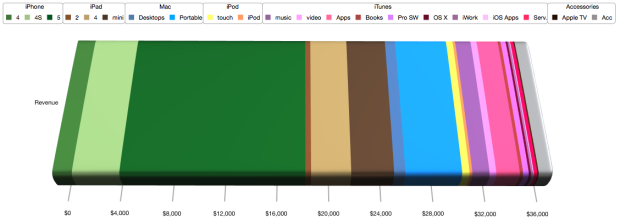
For those of you laughing, that was three years ago. The revenues quadrupled since to a total of $170 for the last four quarters. But the more interesting thought is that the table has not gotten bigger. When Tim spoke the iPad had just been announced but was not yet for sale. So we can’t be sure if he thought it should be on the table or not, but it does not take up that much space.

It would be fun to actually lay out all the Apple products on a table to see how big it would be. The trouble is that there are many things Apple sells which take up no space at all. Things like iTunes content or services and AppleCare.

So rather than trying to imagine a table full of Apple products (some of which are non-phyisical) I thought a more fitting analogy would be to allocate the revenues from these products to a table and thinking about how much space relative to each other the products would take.

To make conversion easier, I picked a rather large table; 10 feet long, big enough to fit a small conference room. What would this table covered in product revenue look like?

My estimate is that it would look like this:

Screen Shot 2013-08-22 at 8-22-11.50.54 AM

Continue reading “The Revenue Table (imperial units edition)”