Airshow coming to New York

I’m delighted to once again have the sponsorship of IBM for the presentation of Airshow. This time it’s in New York City on Wednesday, 25 September at the IBM Building, 590 Madison Ave. My thanks again to Paul Brody for being so gracious and earnest in his support.

Seating is limited but there are still 25 20 3 available.

This will be the third Airshow, having started in June in San Francisco and rolling into Chicago in July. The event keeps getting better with a plan to introduce a hands-on module allowing participants to build cinematic data-driven presentation during the afternoon.

Airshow is intended as both an exhibition of technique and as an explication of   the methods for creating persuasive presentation enabled by new technologies.

Without revealing too much, the gist of the theory espoused is that presentations can benefit from:

  • The use of directly manipulated visuals
  • Cinematic effects honed by cinematographers over a century
  • Aristotelian presentation principles

Together, these techniques solve the “job to be done” of persuasion—a job universally in demand but deeply underserved by current tools and techniques.

The participant should come away from the event with the ability to:

  • Use the iPad as their primary presentation tool, with or without a projector to large and small audiences
  • Use a cinematic technique of presentation where a layer of implicit yet easily sensed meaning is overlaid upon the words spoken and images viewed
  • Appeal with empathy, logic and credibility to all audiences.

You can register for Airshow New York here.

See also: The end of the projector.

 

The end of the projector

After having “taken the show on the road” and spending an inordinate amount of time giving presentations during the last year I came to the conclusion that what remains less than good enough for presentations is the variable quality of projectors.

The problem is not just quality of image but also the unpredictable size of screen, how far it is from the audience, how poor the contrast or color reproduction might be and to what degree there is support for wireless connections.

When presenting detailed, information dense graphs, these quality issues become presentation killers and not only do they result in poor retention for the audience but decrease the confidence of the presenter, leading to a vicious cycle.

The answer is not to lug around your own projector because many times the venue will not accept it, other times the image “throw” is not matched to the screen and it’s a pain to set up and transport.

What I think needs to happen is that the projector needs to be disrupted.

This is where the iPad and Perspective come into play. When presenting using Perspective we have the ability to “airshow” or present directly to the (iOS) devices that the audience has with them.

This way not only the presenter’s screen is “mirrored locally” but also the direct manipulation and choreography of the data reveal is instantly visible. You can see a fragment of how it works in this test:

This is the technique we use at the Airshow event and it has proven to work well even with large audiences. To see it in action (and to learn how to develop presentations into cinematic experiences) join us at the next Airshow in Chicago.

Next Airshow: Chicago, July 13th

airshow_fighters_scramble

We’re excited to bring the second Airshow to Chicago in July. Thanks to Ryan Singer and Jason Fried of 37signals.com for offering to host us this summer.  Their venue is ideal for our particular pedagogy.

Speaking of which, I should explain what it is.

Our first Airshow (San Francisco, June 9th) had several objectives:

  • To explain a theory of narration with data, especially big data
  • To narrate this explanation with a tool called Perspective
  • To reveal and test a new feature within Perspective called airshow

Now that we have revealed the feature (mirror your presentation including your direct manipulation of the visuals to any member of the audience—wherever they may be—on their own device, available in version 3.0) we can talk more freely about the structure of the show.

It’s in three parts:

  1. Performance
  2. Cooking Show
  3. Theory

The Performance is the “keynote story” whose recipe we show in the Cooking Show and whose motivation and foundations we deconstruct in the Theory. You can think of the sections as as answering “{What, How and Why} make a great story.”

The show is self-referential in that we use the process we teach to do the teaching. In other words, we use a great storytelling tool to tell great stories about storytelling. Furthermore, Airshow, as a show, uses a tool whose feature  is itself called airshow.

It’s not that complicated; at least not if you understand recursion.

Register here: airshow.asymco.com (Limited to 37, bring an iPad).

Reminder: Giving a talk at Harvard Business School this week

This is a reminder that I’ll be speaking at the Harvard Business School Technology and Operations Management Digital Seminar Series on ”The evolution of value chains in a computing markets measured in the billions of units per year.”

For the abstract see this post.

When: It’s taking place at 3:00 PM on Thursday March 7th.

Who can attend: The talk is open to the public, seating is limited.

Location: The Cotting House on the campus of the Harvard Business School (map linked), Boston. There is parking in the main lot with entrance across from the Harvard Stadium for $14/day.


Measuring the iBook market

In June of 2011 Apple announced that 130 million ebooks were sold through iTunes. In October of 2012 it announced that 400 million sold.

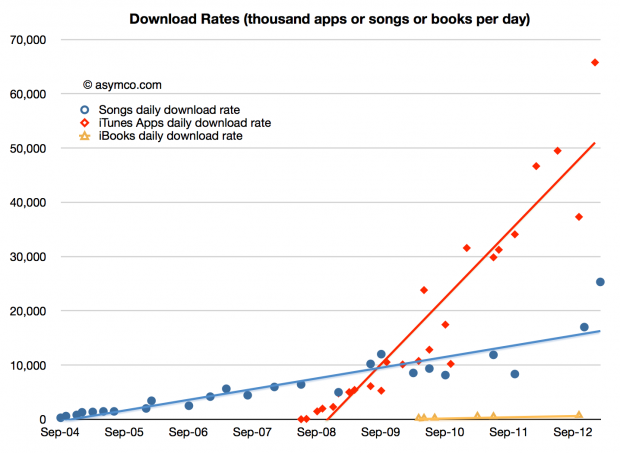
That means 270 million ebooks were sold in 16 months. Or about 17 million units per month, on average. It also suggests 2012 ebook sales of about 200 million units.[1] The following graph shows the download rate of books relative to apps and songs:

Screen Shot 2013-02-28 at 2-28-3.09.25 PM

The download rate looks paltry but we need to remember that Apps have a very low average selling price (about 23 cents including in-app purchases) and that Songs are probably priced around $1.1 on average. In contrast each ebook could be generating about $10 per download. Continue reading “Measuring the iBook market”

Bits v. Bytes: Follow the money

Google announced its first computing product: the Pixel. It’s not the first Chromebook but it is the first device which is uniquely branded as a Google product (Motorola notwithstanding.)

It’s a curious choice given that companies which have “crossed-over” from being service or software oriented to hardware have started with more “mobile” devices. Amazon launched the Kindle as a low-end product and gradually moved it up-market. Microsoft launched with the Surface tablet and then followed with the Pro version as a hybrid laptop/tablet.

It’s also curious since Google has spent years contributing to the development of mobile phones and tablets under the Nexus sub-brand. This was an approach consistent with earlier Chromebooks as well.

But the Pixel is a high-end product. It’s priced at the top of the range of what a laptop computer might cost (given the dimensions).  Perhaps it’s part of a pattern where Google will hone its hardware skills toward releasing a phone or tablet it can call its own. Starting with a more traditional computer is “easier” than trying to deliver on the more demanding smaller form factors.

And yet, the more obvious question is why would Google want to be in the hardware business? Isn’t being a web-focused company implicitly suggesting that hardware is a commodity to be farmed off to perpetually impoverished and violently abused OEMs?

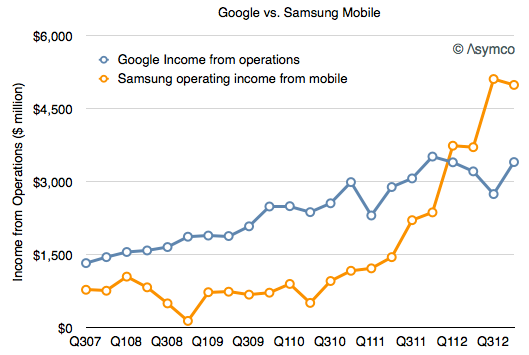
The truth is quite different from this. Samsung currently makes far more operating profit from Android phones than Google does from all its operations. Screen Shot 2013-02-22 at 2-22-3.47.58 PM

When looking at the patterns of sales and profit capture for hardware vendors since 2007 the contrast is stark: Continue reading “Bits v. Bytes: Follow the money”

Right on Cue

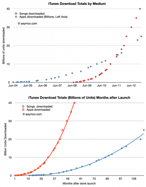
On February 6th, 2013 Apple reported that a total of 25 billion songs had been downloaded from its iTunes music store. The previous definitive value was in October 2011 though there was mention of “more than 20 billion” in November. App download totals have recently been much more frequently updated as the following chart shows:

Screen Shot 2013-02-12 at 2-12-2.17.06 PM

[I estimated 21 billion for the November total.]

The latest two data points point to a surge in iTunes song download rates. Prior to last fall the download rate seemed to be hovering around 10 million songs per day. Continue reading “Right on Cue”

The race to a billion—2012 Update

I last looked at the race to a billion in March 2011. Since then, I’ve been updating and adding data to the set giving a broader selection of platforms to compare.

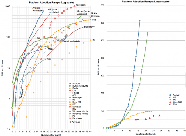
Before we dive in, an explanation: the initial review excluded Windows (PC) and Facebook mainly because (a)  the ramp scale I’m using is about a decade in duration and (b) I was reluctant to compare platforms that require payment to join to those that don’t. The (DOS/Windows) PC ramped over several decades (starting in 1981) and Facebook is a service that costs nothing to join. There was much gnashing of teeth and shaking of fists as a result.

Therefore, in the interest of inclusion, I added both to the data set and let the chips fall where they may.

The data is shown below.

Screen Shot 2013-01-16 at 1-16-2.11.50 PM

I kept the scale to about a decade so that individual lines can be resolved. As a result, you’ll note that although Windows reached one billion first it did so slowly enough to be off the scale shown. Indeed, the “race to a billion” should be titled  “The race to one billion users in less than a decade”.

In such a competition, the winner would be Facebook which, in October 2012, 35 quarters after launch, reached the finish line. The second looks to be Android (probably this year) and the third iOS (sometime next year.)

That may sound like the end of it, but what the graph also shows are the more subtle trends: Continue reading “The race to a billion—2012 Update”

The uncanny similarity between EU and US smartphone markets

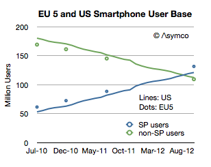
comScore released one of its rare updates to the EU5 (Spain, UK, France, Italy and Germany) smartphone market. Note that the data is claiming to show installed base and not sales in any particular period. What interests me is a comparison or contrast between the European market and the US market.

First, total users.

Screen Shot 2012-12-19 at 12-19-7.30.57 PM

The EU has about 500 million inhabitants while Europe overall has 731 million. The EU 5 total about 314 million which is very nearly the same as the US (311.6 million). Therefore the EU5 is a good comparable to the US in terms of population. As the graph above shows it’s also remarkably similar in its adoption of smartphones. Note that the scale reflects users and since the populations are very similar then the penetration should also be similar.


The mystery of Samsung Electronics SG&A

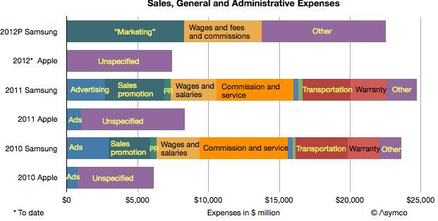
Samsung Electronics’ SG&A expenses are curiously high. Consider the following graph:

It shows SG&A as reported by Samsung and Apple over the periods 2010, 2011 and the sum of the first three calendar quarters of 2012. Note that Samsung appears to be spending three times as much as Apple on sales and administration.

The company offers a break-down of these SG&A costs and they are also shown (Apple does not provide a break-down except for advertising in its yearly report). The suspicion that something is not right comes from looking not only at the overall picture but the notion that Transportation, Warranty and “Other” for Samsung are higher than overall SG&A for Apple. Continue reading “The mystery of Samsung Electronics SG&A”