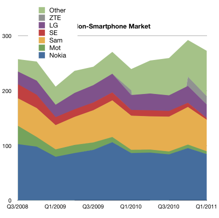
"Other" vendors sell 10% of Smartphones but 30% of voice-oriented phones

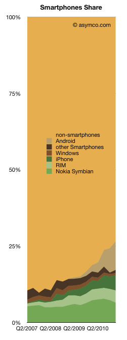
In the last post, I highlighted the difference between smartphones and non-smart device sales last quarter. The trajectory of share growth for smart devices would appear to have accelerated due to Android.

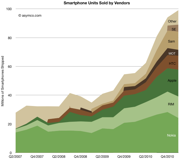
The following charts show the evolution of smartphone vendors and platforms over the last few years.

Like in the past, I used color clustering to show the separation between “integrated” (in green) and “modular” (in brown) platforms and their users.

Unlike the non-smart market where “other” make up 30% of the market, smartphones are still a big brand business. “Other” make up only 11% of units. and that number has been trending down. It would seem that the age of unbranded Android phones is still not upon us.

Comparing three years “before and after” here is Q1 2008 vs. Q1 2011 by vendors share: Continue reading “"Other" vendors sell 10% of Smartphones but 30% of voice-oriented phones”

Smartphones: the end of the beginning or the beginning of the end?

The smartphone market grew to about 100 million phones last quarter. The volumes grew sequentially and as a result reached a new record share of 27% of total phones shipped. The chart on the left shows how this market evolved over the last few years.

I’ve added each platform’s contribution.

While much of the focus will be on who had what share, the better question might be who has the better chance to beat smartphone non-consumption? Non-smart devices are still the dominant competitors. Though it’s getting easier to win against them, they still have some compelling competitive advantages.

What the chart shows is that Android (and phone versions of iOS) have taken share from direct competitors but have taken more from non-consumption. Rather than focusing on rivalry between platforms, minds should be focused on the shape of the smartphone adoption curve.

The market is largely un-penetrated and yet some argue that “it’s too late” to enter or that “the game is over” and winners have already been decided. This is an argument that we are at the beginning of the end. Once the market is predictable it’s discountable. Once it’s discountable it becomes economically uninteresting.

I’ve argued that this is far from certain. In a short span of a few years, a decades old business has been re-defined. But that was just the device side of a larger business. Smartphones have been, so far, sustaining to the telcos who capture the vast majority of revenues and are thus the true incumbents.

If and how they will be affected by further evolution of smart devices and new business models around them remains to be determined.

The Rawr Chart

The challenge with any performance metrics is that there is no single measure of business performance which is conclusive. The last few posts have covered mobile phone vendor performance measured by various methods. Growth (sequential, yearly and compounded multi-year),  margins, shares (units, profit and sales), rankings and time series. I’ve distinguished between smartphone pure plays and the diversified. Each is trying to shed light on what is a multi-dimensional puzzle.

I’ve used various charting tools and visualizations and they each render some clues, but the following chart is one of my favorites. It shows the way operating profit was distributed among the top vendors.

The areas each represent the profit from mobile phone sales in Q1. The horizontal axis shows the volume of units and the vertical the profit per unit. It thus shows how “efficiently” profits were captured a unit basis. It also shows at a glance the different strategies employed and how they reflect performance. It shows who made money and who didn’t. It shows the magnitude of differences.

The shape of this chart has not changed in the last few quarters but it prompts speculation on how it might change in the following few years.

I struggled to find a catchy name for this type of chart but @JustinD put it well here. Rawr indeed.

Apple, RIM and HTC captured 75% of mobile phone operating profits in Q1

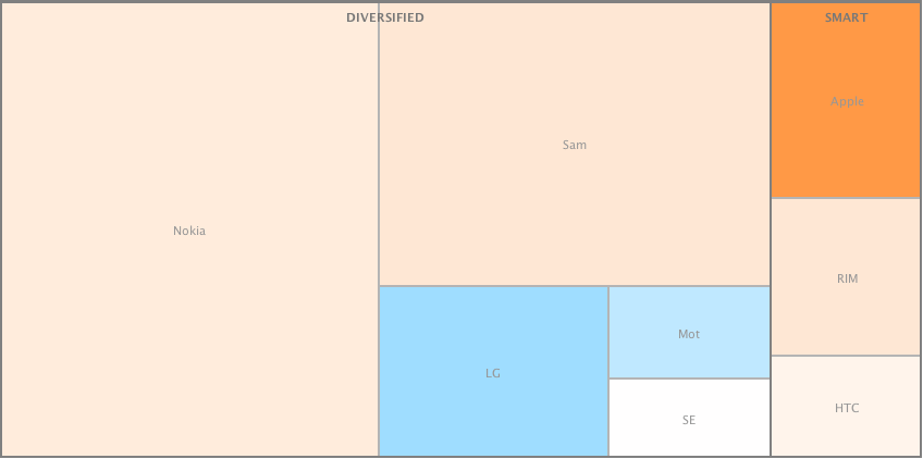
I produced two alternate views of the primary mobile phone brands in terms of volumes sold and operating profit in Q1.

These views[1] allow a comparison by categorized competitors. I grouped dedicated smartphone vendors (SMART) vs. diversified and used color coding for profitability (blue colors indicate loss-making vendors).

The same view is drawn for profitability. Loss-making competitors are excluded. Continue reading “Apple, RIM and HTC captured 75% of mobile phone operating profits in Q1”

iPhone share of phone market in Q1: 5% volumes, 20% revenues, 55% profit

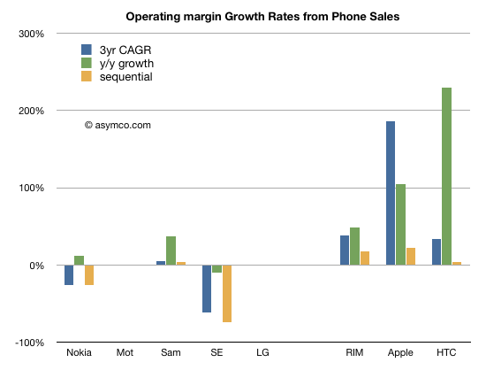
Operating profits for the eight vendors I track increased at a compounded 25% over three years. As with revenues, the growth is concentrated. The following chart shows operating profit growth across three time frames: three year compounded, year/year and sequential. Loss-making vendors are excluded from this chart.

Looking at individual performance, the following chart shows how each vendor performed over time: Continue reading “iPhone share of phone market in Q1: 5% volumes, 20% revenues, 55% profit”

Did Microsoft pay for the wrong Skype?

When a company is acquired, the price paid is usually higher than what the company is worth. This is because there is a “control premium” that needs to be paid so that the acquiring company can control the destiny of the acquired company (while the seller loses that right). So the question has to be what does the premium (or excess cost) buy? What is the value of that control? What will be the new destiny? Whose destiny is changed?

Clayton Christensen succinctly defined the value in any company as the sum of three constituent parts: resources, processes and business models. Market value can be nothing more and nothing less than these three things.

An acquisition has to be positioned on one of these targets just like a product is positioned on a specific market. The problem with being deliberate about where the value lies is that once positioned a certain way, the integration team will begin to execute on that plan. This means that the thing you decided was worth most (e.g. resources) gets all the attention and the other potential sources of value (processes or profit models) are discarded.

Continue reading “Did Microsoft pay for the wrong Skype?”

Asymco reader profile: Mobile technology web software tech developer

The 200 most popular words used to describe the Asymco audience. The data is obtained from 4.3k twitter bios (approximately 55k total words). Generated using Wordle and a bit of Automator, grep, and BBEdit. Click/tap on image for more resolution.

A summary of the attributes of the best audience on the web.

Ascent of the entrants: Taking food from the mouths of giants

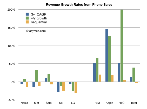
Revenues for the eight phone vendors I track increased overall during the last three years. The compounded annual growth was about 13%.  However the growth was not evenly distributed. The following chart shows revenue growth across three time frames: Three year compounded, year/year quarterly and sequential quarterly.

I separated the incumbent companies from the “entrant” smartphone vendors for contrast.

Looking at individual performance, the following chart shows how each vendor performed over time: Continue reading “Ascent of the entrants: Taking food from the mouths of giants”

The end of phone vendor tiers

It’s time to review the mobile phone market at the end of the first quarter of 2011. Before I begin, I’d like to remind that this analysis will span multiple posts and that many details will be published separately due to time and space constraints. Data about platforms, sales, profitability and pricing will be posted separately.

All data sets and chart data will be available for interaction and download through Asymco Interactive when complete. You can purchase a license to Asymco Interactive anytime and you will have access to any new data sets for next 90 days so don’t hesitate to pre-order the report.

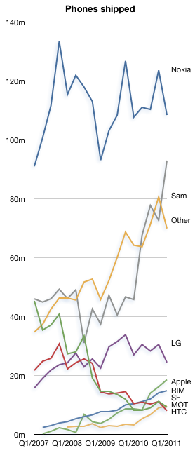
The overall phone market grew at a compound rate of 9% over three years. The pattern of entrants focused on smartphones and mobile computing growing faster than the incumbents continues. The compound three year unit growth for the tracked vendors in descending order is:

  1. Apple 122%
  2. HTC 55%
  3. RIM 50%
  4. Samsung 15%
  5. Other 14%
  6. LG 0%
  7. Nokia -2%
  8. Sony Ericsson -29%
  9. Motorola -30%

To give an idea of the split between smart and non smart, Nokia’s smart business grew at 18% compounded while its non-smart units contracted at -6% rate.

In terms of y/y growth the market grew at 26% and the vendor ranking is:

  1. HTC 194%
  2. Apple 113%
  3. Other 103%
  4. ZTE 75%
  5. RIM 42%
  6. Motorola 13%
  7. Samsung 9%
  8. Nokia 1% (smart: 13%, non-smart -2.3%)
  9. LG -10%
  10. Sony Ericsson -23%

Continue reading “The end of phone vendor tiers”

Measuring iPhone progress

Speaking of boats, there were recent claims that the iPhone is “dead in the water“. As someone who has done some sailing I can say that being dead in the water is dangerous. Not only are you not going anywhere but you also don’t have steering control. It’s movement through the water that allows a rudder to work so being stationary means that you can’t orient the boat when waves or wind might threaten stability.

This implied inability to gain directional control is what makes the accusation so powerful. How valid is it? That claim certainly was not made because the iPhone did not grow. iPhone grew at 113% year on year. It even grew sequentially in a post-holiday quarter and the growth is not slowing materially.

The claim was made that iPhone was not gaining share. But share of what? If we look at the iPhone share of all phones and share of smartphones, it’s still growing. It reached 5% share of all phones sold in the quarter and fourth most popular vendor in the world. Beating RIM, HTC, Motorola, Sony Ericsson and ZTE.

So what makes the iPhone dead in the water?

Continue reading “Measuring iPhone progress”

Asymco

Asymmetric Competition

Skip to content ↓