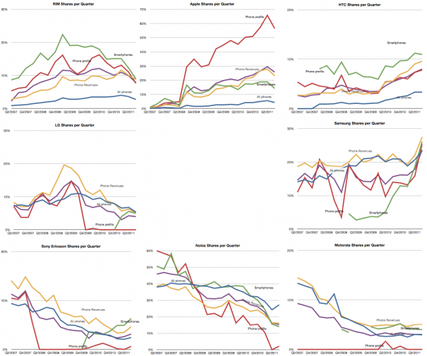
The AMP Index for Q3

The Asymco Mobile Performance (AMP) index is an unweighted average of:

  1. Share of all handset units sold (global)
  2. Share of smartphones
  3. Share of value (revenues)
  4. Share of profits

For major phone vendors. The raw data for each share is shown in the following charts (note change of vertical scale: each gridline represents 10%).

Note that the vendors are arranged in a particular way: Continue reading “The AMP Index for Q3”

Where is Microsoft's growth going to come from?

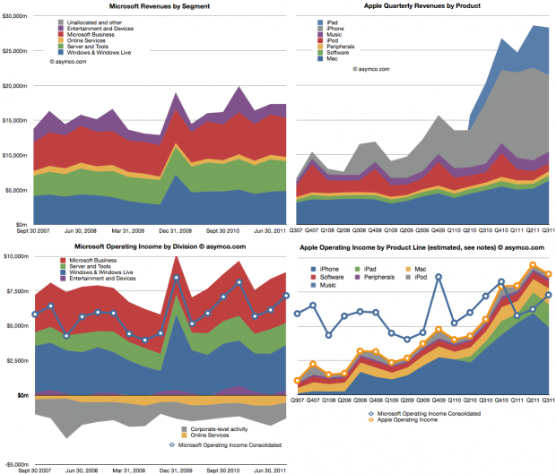
Microsoft is a stable business. Apple isn’t. The following charts compare the two. The two charts on top show revenues, subdivided into product lines. Microsoft is on the left and Apple on the right. Note that the vertical scales are the same (zero to $30 billion/quarter).

The lower two charts show operating income by division/product line. Continue reading “Where is Microsoft's growth going to come from?”

Is Innovation Valuable?

I began thinking carefully about Apple in 2005 when the stock was priced at around $55/share. I remember that the events which made me consider Apple in a different light were the launch of the iPod shuffle and the launch of the Mac mini. Both moves signaled to me that the company was serious about competing with non-consumption. At that point I thought that the company was a potential opportunity as an investment.

But I also remember that many people at the time thought that the stock price was too expensive. At $50, the company was much more expensive than the year before. The stock started 2004 at about $11/share. The reason it had climbed so much was that the iPod began to be a real world-wide growth phenomenon. Buying Apple was buying into the iPod and many said the price was unsustainable given such a strong dependency on fickle consumer tastes. It was a much riskier proposition than that of competitors like Dell and HP which made product for reliable buyers like enterprises.

Indeed, by 2006, the shine was off. In the first half of 2006 the stock collapsed from $85 a share to $50, a fall of 40%. It was becoming clear that with mobile phones taking on more music playing features, the iPod was not going to be a big story for long. What’s more, Apple had just announced that they were switching to Intel for the Mac product line. Investors saw just how vulnerable the company still was and considered that the Mac brand was in jeopardy as it transitioned to becoming a Windows-friendly machine.

However, in 2007 the company’s value recovered with the introduction of the iPhone. Suddenly there was a new product to drive sales. Nobody knew by how much or how but there was a sense that the iPhone was enough to keep Apple from oblivion.

Yet, again, in early 2008 the company lost 40% of its valuation. In a rather inexplicable period following the launch of the MacBook Air, the company’s shares went into free fall. Inexplicable because the company continued to deliver solid growth with 2008 calendar quarters showing between 32% and 155% EPS growth.

Then the recession came. It caused another 40% share price collapse. Growth slowed to a range of 11% to 61% during 2009. As the marco “headwinds” blew over, by the end of 2009, with the help of a lukewarm response to the iPad, the company’s value recovered to its 2007 level. In the mean-time its earnings more than doubled.

It may not appear to be the case, but throughout this volatile period, the investment thesis remained fairly constant: Continue reading “Is Innovation Valuable?”

The Global Smartphone Market Landscape

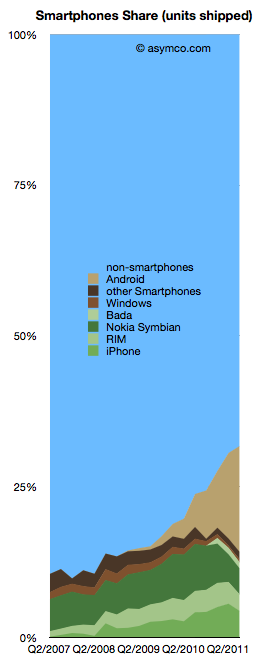
There is finally enough information to try to give an estimate of the smartphone market as a subset of the overall phone market.

The chart to the left shows the overall picture.

To sum up: The smartphone market has now reached over 30% of shipments. Non-smart devices are at 69% of total. The individual phone platform shares are as follows:

  1. Android (and Android-like): 17.6%
  2. iOS (iPhone only) 4.4%
  3. Nokia Symbian: 4.3%
  4. BlackBerry: 2.76%
  5. Bada: 1%
  6. Windows Phone 0.5%

The past quarter was the first where there is evidence of significant non-seasonal decline in incumbent platforms. Both RIM and Symbian saw two sequential drops in volume. The iPhone had a seasonal (or, more accurately, transitional) decline. Windows Phone had a very modest increase in share from 1.3% to 1.7% share though this is well below a margin of error in the estimate.

Android (and Android-like) shipments ballooned to nearly 70 million but sell-through could be about 10 million less. Nearly one in five phones sold is now powered by an Android variant. A remarkable story since the share was zero less than three years ago

Of the vendors involved, here is the division of share: Continue reading “The Global Smartphone Market Landscape”

5by5 | The Critical Path #13: The Innovation Anomalies

The Innovation Anomalies

Episode #13 • November 16, 2011 at 11:00am

Dan and Horace talk about innovations in emerging economies related to mobile service and how they might foreshadow changes in the developed world. We also discuss why some industries seem to be exempt from disruptive innovation and suggest that there are boundaries societies set to how value can be re-defined.

This show pushes beyond the boundaries of company and industry analysis and touches on the limits or “sound barrier” of innovation itself.

The end of the dedicated portable device

On October 27th, Nintendo published half year results for the fiscal year ending in March 2012. Management stated that the company lost over $900 million with a negative outlook. Nintendo cited weaker than expected sales of Nintendo DS hardware and 3DS software and Yen appreciation as the main reasons for the miss. Is this the end of Nintendo?

Before we look more closely, here is a quick summary: The company is exclusively involved in selling game hardware and software. Their console platform is the Nintendo Wii, which will be followed by the Wii U late in 2012. The Nintendo DS and Nintendo 3DS are the company’s portable game consoles. The Wii and the DS are nearing the end of their product cycles. On the software side, the company is known for gaming titles such as Super Mario and Zelda. Nintendo also pioneered the licensing model to allow third-party developers to produce games for its hardware products.

A closer look

Continue reading “The end of the dedicated portable device”

Apple's Guidance Deficits

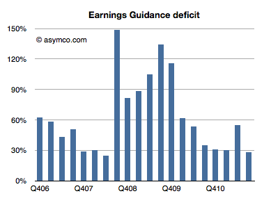
Every quarter Apple’s management issues a “guidance” or forecast of their own earnings in the following quarter. Over the years, this figure has been nearly useless because not only is it not accurate, the error itself has been wildly variable. I plotted what I call the Earnings Guidance Deficit for Apple based on the formula (Actual EPS diluted – Guidance)/Guidance.

The higher the value in the bars above, the more the company underestimated Continue reading “Apple's Guidance Deficits”

Pac-Man

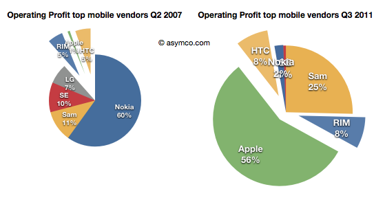
I recently posted a comparison between the profit capture of phone vendors in 2007 and the most recent quarter:

The idea was to show what a disruption looks like. A phenomenon where an entrant with none of the advantages of incumbency takes the profits away from companies privileged with ideal market access and knowledge.

The view of profit shift is the ideal view since it shows the “bottom line” impact and thus the denouement rather than more nuanced sub-plot. However, we don’t always have access to profitability data. Sometimes we only have access to revenue estimates.

Fortunately revenues have a similar story and are often a good proxy. Consider how the evolution of revenue shares occurred in the same market: Continue reading “Pac-Man”

How many iPhones are being discarded in the US?

In the recently posted US Smartphone Landscape I used comScore’s data to paint a picture of the growth of smartphones in general and the shape of the mobile platforms in the US. The source was survey data measuring the installed base. If we compare the installed base sequentially, we can get the increase (or decrease) of a particular platform. Comscore reports monthly but we can also summarize the data at a quarter-by-quarter basis.

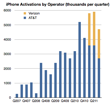
There is another source however for the US market, at least for the iPhone: operator activations. They report iPhone activations, shown below.

Can we use activations together with installed base data to learn something about the market? Yes, with some caveats. Continue reading “How many iPhones are being discarded in the US?”

Apple's Income Statement at a glance

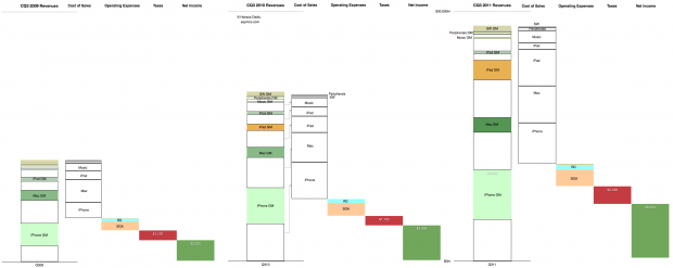
This is the cascading view of Apple’s financial performance in the third calendar quarter. It only includes information that is already in the income statement but shows the relative growth of the individual product lines, their cost structures and the relationship between fixed (Operating) expenses and their variable (cost of sales) expenses at a glance.

In the past I would publish current and year-ago data, but in this quarter’s summary I present three years’ history of quarterly data. Note that the full view is quite large (2,220 x 886 pixels).

Here are some handy tips on how to read the chart:

  • The “top line” is the size of the first column in each quarter’s chart.
  • The “bottom line” is the size of the last column.
  • The blank areas are what Apple pays suppliers.
  • The red area is what Apple pays to the government.
  • The Pink and pale blue area is what Apple pays its “exempt” employees. (Other Income and Expense is also included but is nearly invisible).
  • The Green area is what is declared as earned and becomes the “E” as part of the P/E ratio. (Note that not all of this goes to the Cash account as the cash flow statement will reveal).
  • The colored areas in the first column labeled with product name and “GM” (for gross margin) represent what Apple keeps from the sale of each product after paying expenses tied to producing that product.
  • The ratio of sold areas to the corresponding white areas below in the first column represent the margin (as a percent) per product line
  • You can observe the trend over three years by tracking each of these quantities from left to right.

The scale of the chart is shown by the line near the top representing $30 billion.

Asymco

Asymmetric Competition

Skip to content ↓