Decoding Steve Jobs: Select Commentary from HBR.org – Harvard Business Review

Announcing a new HBS PRESS BOOK

Decoding Steve Jobs: Select Commentary from HBR.org

by Norm Smallwood, Kate Sweetman, Dave Ulrich, Rosabeth Moss Kanter, Jeffrey Pfeffer, Horace Dediu, James Allworth, Max Wessel, Rob Wheeler, Bill Taylor

Source: Harvard Business Press Books

14 pages.  Publication date: Sep 22, 2011. Prod. #: 10973-PDF-ENG

“The news of Steve Jobs’s retirement from Apple may be losing steam but observations on his legacy – and Apple’s leadership future – are only beginning. In recent years, leading thinkers have contributed their thoughts on the Jobs phenomenon on HBR.org. We’ve compiled a few of the best here, and we invite you to read them through the lens of business lessons to be learned.’ We’ve selected six pieces: two from after Jobs’s August 2011 announcement and four from before. We hope you will enjoy them, learn from them, and continue to turn to HBR.org for ideas and inspiration.

Available for download for $1.99 via Decoding Steve Jobs: Select Commentary from HBR.org – Harvard Business Review.

5by5 | The Critical Path #7: Genericized Trademarks

5by5 | The Critical Path #7: Genericized Trademarks.

Episode #7 • September 21, 2011 at 12:00pm

Horace and Dan look at brand theory and decide it should not be left to the experts. Also, we ask what jobs products are hired to do and tie that to the meaning imparted in the brand and visual imagery associated with it.

The perils of possession without utilization

[Updated with new charts including data from StatCounter and not NetMarketshare]

Generally speaking there is an equivalence drawn between iOS and Android as technologies and even as user experiences. However, as I’ve pointed out on several occasions there is a very clear nonequivalence in business models and thus the “fuel” which keeps each platform running. But does this difference in models lead to some difference in the way the products are “hired” to do what they do. Does it imply anything about how the products are likely to evolve?

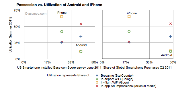
I collected into one place all the data I could find about utilization (how much of a service and how often it’s used) and possession (both in terms of current ownership and new acquisitions) of iOS and Android.

Possession data comes from comScore survey data of share of US installed base of smartphones by platform at the end of June 2011 (first chart) and share of Global Smartphone Purchases as of Q2 2011 sourced from company reports and IDC (second chart).

Utilization data (vertical axes) comes from August  2011 shares of mobile browsers (from StatCounter June 2011), in-airport WiFi associations from Boingo in June 2011 (iPhone vs. Android), in-flight Wifi associations from Gogo in June 2011,  and In-app Ad impressions from Millenial Media also in June.

The charts are divided into nine sections corresponding roughly to “low”, “medium” and “high” utilization vs. possession.

The first chart compares a US-only population for possession vs. a mixture of global and US-only populations for utilization. The second chart compares a global population to the mix of US and global metrics.

What I found interesting is Continue reading “The perils of possession without utilization”

The tell-tale signs suggesting a platform's demise

In the post on OS turning circles, I used the concept of a radius of turning as an analogy for agility. One problem with the analogy is that turning in circles implies a return to a starting point or at least a closing of the loop. The idea is that there is lifecycle repetition. However, in reality, this does not apply to the world of operating systems.

An OS, as a platform, usually has a finite life. It is born, grows and usually reaches a point where it is no longer supported. Sometimes, a new platform is born to take its place from the original owner but more often a replacement comes from a new challenger company.

So rather than circles, the analogy of OS lifetimes may be more accurate.

If we do think of platforms as finite, then the natural question is what causes an end? We need to look for patterns which may indicate when a platform is reaching end of life.

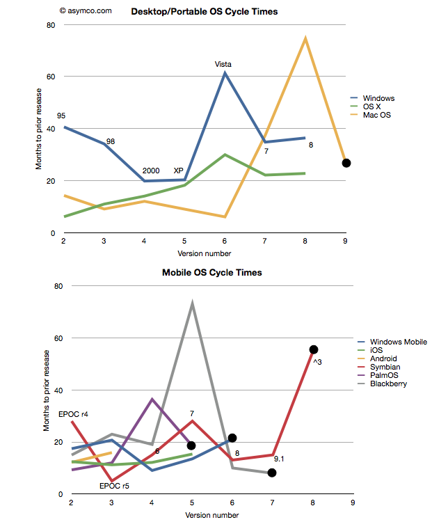
The difference in this analysis is that the measure of “age” of a platform I use is not time per se but versioning. The logic is that each major version is a meaningful and significant improvement in a platform which needs to be delineated, marketed and celebrated. It embodies the business logic as well as the engineering logic of the platform custodian.

Taking the data from the last post I added a few more platforms: Symbian[1], PalmOS and Blackberry OS[2] to seek out patterns. I also separated the desktop/portable OS’s from Mobile OS’s and plotted these version-demarcated lifespans.

One thing to observe is Continue reading “The tell-tale signs suggesting a platform's demise”

OS turning circles: Questioning Windows' maneuverability

[Updated with Mac OS versions. See footnote 3.]

I’m glad Windows 8 is named the way it is. With Windows 7 Microsoft went to a numbering system which is much more rational than the mixed naming of the past. The number 8 actually corresponds to the actual sequential number of major versions of Windows released to date.

Windows proper actually did not start with what was called “Windows 1.0”. Windows actually started in April 1992 when Windows 3.1 was released. It was the first Windows which was an operating environment onto itself, apart from DOS. It was followed by Windows 95 (which we can call “2”), Windows 98 (“3”), Windows 2000 (“4”), Windows XP (“5”), Windows Vista (“6”), Windows 7 and now Windows 8.

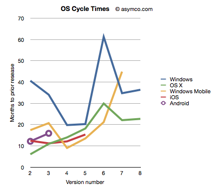
Given this nomenclature and the dates of general availability of said versions, we can derive a measure of the frequency of upgrades. For example Windows “2” followed about 41 months after “1” and “3” took 34 months after “2”. If we continue this for all the versions, and assume “8” will launch by October next year, we can plot the cycle times of new Windows versions.

To make the story more interesting I added the same data for other OS platforms. OS X, iOS and Android have version numbers which correspond to the sequential order in which they were released. I am assuming that the numbering system (1.0, 2.0, 3.0 etc.) are meaningful and that major releases are given a new integer value.[1] Continue reading “OS turning circles: Questioning Windows' maneuverability”

RIM and the lamentation of the analyst

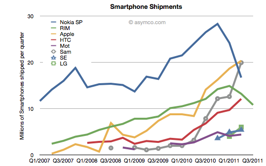
RIM shipped 10.6 million Blackberries and 200,000 PlayBooks in the last quarter. Management noted that their sell-through was significantly higher for Blackberry (13.7 million) but seems to be very weak for PlayBook as the prior quarter saw 500k units shipped. Additional PlayBook units this quarter probably mostly went into new channels in Asia and there were no additional sales into North America or Europe.

The figures for units are very poor. How poor depends on the frame of reference. Consider the shipment chart below:

In terms of the competition, 10.6 million units is less than half what Apple or Samsung sold in its prior quarter. It’s also less Continue reading “RIM and the lamentation of the analyst”

Mobile Impossible

In yesterday’s post about the “biggest mobile loser” I covered the exodus of users from non-smart devices in the US and EU5. I also said that what happens in those regions tends to happen in other regions with a time shift. In some regions it happens quicker but in most it happens more slowly.

But can we be sure that there isn’t vast non-smartphone growth in other regions? Well, no, we can’t be sure. At least not without access to reliable data.

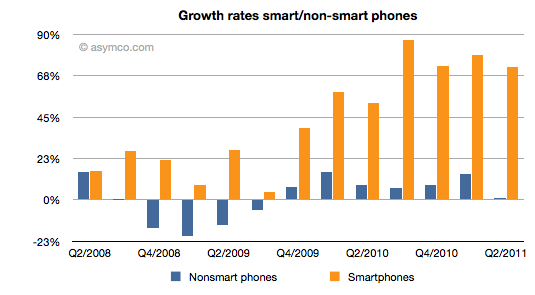
But what we can track is the overall non-smart phone market and compare it to the smartphone market. Here are the growth rates of the two sub-markets:

The difference is plain to see. We can also note that the non-smart market may be heading into a contraction–something noted by some analysts close to the market–but no real sign of that happening in smartphones.

Beside growth, we can also see actuals and the split of various vendors’ volumes in the market. Continue reading “Mobile Impossible”

5by5 | The Critical Path #6: Black Boxes

Horace and Dan tackle corporate valuation and hypothesize whether amateur bloggers know more about Apple than professional analysts. We also look at the ancient economic history of Windows and how that still shapes it today.

via 5by5 | The Critical Path #6: Black Boxes.

On iTunes: iTunes Audio

Biggest mobile loser? The non-smart phone

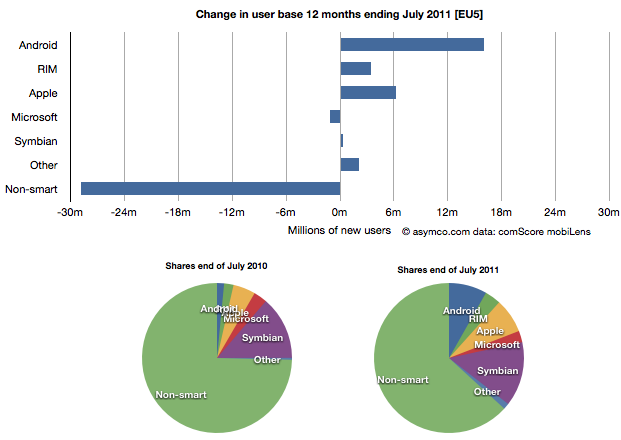
Yesterday comScore published survey results for EU5 (France, Germany, Italy, Spain, UK) on smartphone use and installed base. The headline is very similar to what would be written about the US: Android had phenomenal growth over the last twelve months. I also noted that the apparent growth of Google (16.2% share change) seemed to be matched by an apparent decline of Symbian (-16.1% share change.) However the reading of the data is not so simple.

In order to understand what has happened to usage, it’s much more valuable to look at consumption and the actual number of users rather than change in share of a subset of the market. Consider the following charts:

The bar chart shows that Continue reading “Biggest mobile loser? The non-smart phone”

Growth and punishment: The vector space model

After processing more than 1500 data points on the performance of thirteen technology companies, patterns are beginning to emerge. The steps so far:

The final step is to plot the changes in the relationship between pre- and post-crisis for the set of companies normalized to the same starting point and then classifying them: 

The chart shows how the “average P/Es” changed after 9/30/2008 vs. how the companies performed during those periods. An evocative categorization is suggested for the four quadrants.

One way to read the data would be as a degree of effect of the crisis. Continue reading “Growth and punishment: The vector space model”

Asymco

Asymmetric Competition

Skip to content ↓