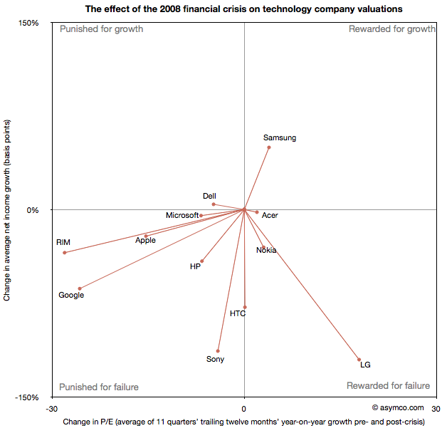
Following the presentation of growth/PE of comparable companies in the previous post, here are charts showing the Growth vs. P/E as a scatter plot. I highlighted the quarters pre-crisis as red dots and the quarters post-crisis as blue dots. I also added a vector line showing the migration of the average (centroid) of the pre-crisis values to post-crisis values (11 points averaged in each case).
Growth profiles of 13 companies
The previous article showing the profile of Apple’s growth vs. its P/E prompted a similar review of a set of comparable companies. The cohort is composed of:
Apple
HP
Dell
Lenovo
Acer
Sony
Samsung
LG
Nokia
RIM
HTC
Microsoft
Google
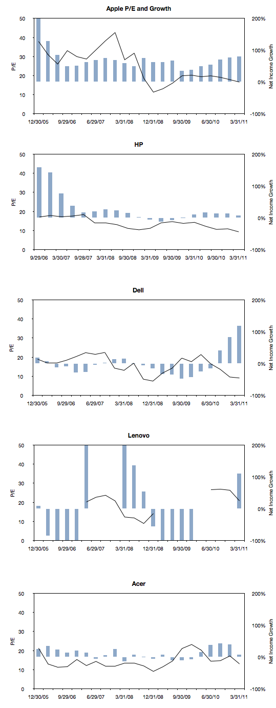
The following charts are a simple representation of P/E (line chart with left scale) with Net Income growth super-imposed (bar chart with right scale.) The time period is 22 quarters; 11 quarters after the crisis (i.e. quarters after the one ending in Sept. 2008) and 11 quarters before the crisis (quarter ending 12/20/05 through the one ending 6/30/08).
We made one change to the growth data from the previous post where the Net Income growth is not quarterly year-on-year but average of four quarters year-on-year. This reflects the fact that P/E is also a trailing twelve months’ earnings. It also has the benefit of smoothing the growth data making it easier to discern.
Here are the charts:
Apple's P/E compression illustrated
The reason we look at valuation is that it offers insight into how innovation is perceived. If a company is a successful innovator it usually creates vast wealth for its owners. However, the timing of that wealth creation depends greatly on its recognition by others. In other words, valuation lets you determine how recognizable innovation is. If your analysis tells you that a company is supremely innovative but nobody else recognizes this then you have an investable opportunity.
So with that in mind we like to compare industry and innovation analysis with what “the market” thinks about Apple.
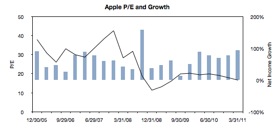
The latest method we had in mind was to compare P/E (a measure of valuation) and Growth. We’ve shown before that they seem to be moving in different directions. That’s not been news for over a year. What we will try to do now is to see if there is discernible change in the relationship before and after the financial crisis.
The following chart is a simple representation of P/E (line chart with left scale) with Net Income growth super-imposed (bar chart with right scale.) We chose a time period of 22 quarters. 11 quarters after the crisis (i.e. quarters after the one ending in Sept. 2008) and 11 quarters before the crisis (quarter ending 12/20/05 through the one ending 6/30/08).
We then plotted a scatter of all these pairs (P/E vs. Net Income Growth). Continue reading “Apple's P/E compression illustrated”
Why Apple's shares rose after Steve Jobs resigned
CEO resignations often cause share prices to rise. Witness the effect of the latest CEO departure on Yahoo!. This typically happens because CEO replacements are not necessary when companies are successful. In times of crisis, the market sees management change as a hopeful sign. But Apple is doing well. So it was commonly believed that if Steve Jobs were to leave the helm at Apple the stock would fall. However, as the chart below shows, the stock price has since risen.
Apple’s share price rise of 3% even out-performed the Dow Jones index, and this phenomenon is not for the short term only. The Jobs resignation sent Apple puts to one-year lows.
So how do we reconcile this? How can such a valuable person be priced as a liability? Continue reading “Why Apple's shares rose after Steve Jobs resigned”
Why Carol Bartz was fired
Occasionally I write articles titled “Why CEO X was fired.” You can read one here, and here and here.
These are allegorical stories. I don’t base the opinion on evidence but on perception of what’s wrong with a particular company’s strategy and then try to trace the point of strategic failure which should have triggered management change. Of course, the reasons are often something else, probably mundane or “political” in nature.
The objective therefore is to analyze strategy and more precisely strategy failure.
So, Yahoo! What went wrong?
Before we answer that, we should know what went right. Yahoo, like Google, depends on advertiser revenues. For that, it sells the behavior of its users. It processes over 25 billion events every day and builds a database (estimated to be in 10s of petabytes) to mine for information that is, hopefully, worth something to advertisers.
But in order to get user behavior it needs to provide compelling reasons for user participation. For that, Yahoo licenses content and offers communication services (among other things.)
This sounds like a reasonable business model. So what could go wrong? Continue reading “Why Carol Bartz was fired”
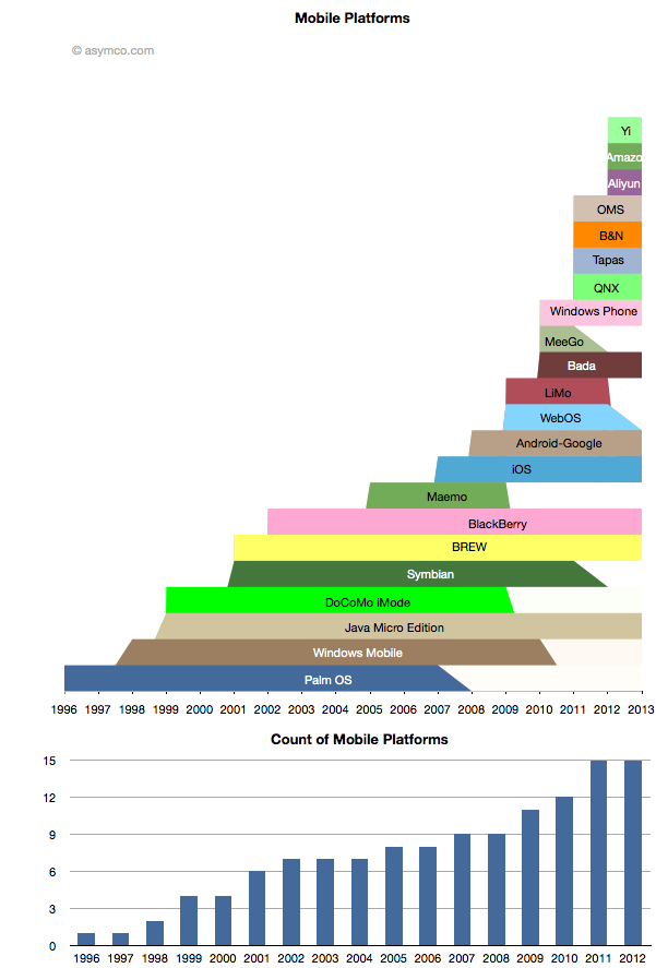
The proliferation of mobile platforms
While some mobile platforms are being withdrawn from the market, others are being introduced. The net is that there are more mobile platforms announced for 2012 than ever before. The following chart shows the lifespan of the platforms that I can recall.[1]
Quantifying the phobia of owning Apple shares
As the market continues to exhibit signs of instability, an interesting paper[1] identified a correlation between the U.S. stock market and an index of the U.S. Financial Conditions. This index measures the assessment of the probability of a crisis.
The conclusion is that an imminent crisis mentality pervades equities markets today and implies that pricing is largely disconnected from fundamentals. On this blog we’ve discussed the topic of fundamentals and marveled at how pricing seems to be largely exclusive of it.
The case is made by the following chart: Continue reading “Quantifying the phobia of owning Apple shares”
The third ecosystem. What are the odds?
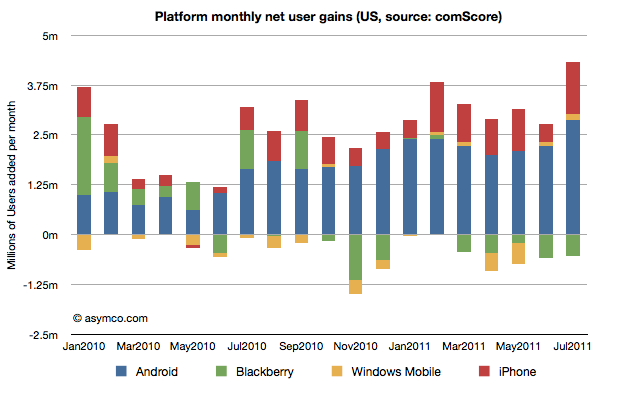
The latest survey from ComScore breaks down the installed base of specific mobile platforms in the US. Tracing the data over time shows the following charts:
The case for the iPad's future
The question of low end disruption should be a concern to any manager. It’s one of the most important sources of growth and has led to a vast amount of wealth creation.
Apple was an early low end disruptor by selling personal computers at a fraction of mini-computer prices. Toyota also offered “cheap” cars as an entrant in the market. Pixar made blockbusters for a lot less than live action studios. Google offers good enough office software without a license. Finally Microsoft built its whole business on low-end business software at knock-down prices.[1]
All these entrants made fortunes often at the expense of entrenched incumbents. Disruption grows the pie but also transfers a lot of value away from existing competitors.
So it should not be surprising that new products like the iPad should be scrutinized for their vulnerability to low end disruption. Brian Caufield asks the question if Apple has any future with the iPad given the potential for $99 tablets.
The question is indeed why not introduce an ultra-cheap tablet, for example from Amazon, which makes up for the low price with an innovative business model like selling content or user behavior data. After all, game consoles are sold this way. This is the classic razor/razor-blade business model.
The answer to why not is actually not simply that the economics don’t work. They might work some day even if they really don’t today.
The answer to why not is that the iPad is not good enough.
US smartphone penetration growth rate update
The survey data from comScore is in and it suggests that smartphone penetration increased by a significant 1.58%. It is now 35.1% with 82.2 million users.
The weekly new user rate was about 863k/wk during July or about 586k/wk average over the last three months. I plotted the weekly add rates for the last 18 surveys and overlaid the three month moving average.
The chart shows that there is an upward slope to the upper and lower bounds of the moving average. Extrapolating trend forward gives me confidence in projecting 50% penetration by July 2012.