Google's Strategic Mistakes Drove Motorola Buy – Horace Dediu – Harvard Business Review

My thanks to Eric Hellweg, HBR editor, for offering the opportunity to write in the Harvard Business Review blog and the help in editing and sharpening the message.

You can read the article here:Google’s Strategic Mistakes Drove Motorola Buy – Horace Dediu – Harvard Business Review.

Please use the forum at hbr.org for discussion.

The perils of licensing to your competitors

Google’s acquisition of Motorola is clearly designed to be an acquisition of Intellectual Property rather than an entry of Google into the phone business, but the impact on the business will be felt in many ways.

It is surely going to send some Android vendors scrambling. The situation is not without precedent however. The history of governance and ownership of Symbian shows how the licensing of platforms by licensor competitors leads to unintended consequences.

Symbian was formed to be governed in a way very similar to the original Android via the Open Handset Alliance. The company was owned by a consortium of phone vendors.[1] The shares were not equally distributed however with Nokia holding a larger share (though not a majority).

Although nominally involved in decision making, the smaller shareholders never felt entirely comfortable with the arrangement and over time some sold their shares and left the group even though they continued to license the OS.

Eventually Nokia ended up acquiring the company outright and open sourced the code. However, by then the product was obsolete and the only licensee was Nokia itself.

The lesson (and warning) was that a licensor that is also a licensee makes other licensees uncomfortable. The supplier is also a competitor. This is classic channel conflict and never ends well.

Open or not, with or without equity, these arrangements are always unworkable.

So Google’s promise that

“This acquisition will not change our commitment to run Android as an open platform. Motorola will remain a licensee of Android and Android will remain open. We will run Motorola as a separate business. Many hardware partners have contributed to Android’s success and we look forward to continuing to work with all of them to deliver outstanding user experiences.”

seems naive at best.

Notes:

  1. Before its outright purchase by Nokia in December 2008, Symbian Ltd. was owned by Nokia (56.3%), Ericsson (15.6%), Sony Ericsson (13.1%), Matsushita (10.5%), and Samsung (4.5%). The company’s founder shareholders were Psion, Nokia, Ericsson, Panasonic/ Matsushita and Motorola. Motorola sold its stake in the company to Psion and Nokia in September 2003. Psion’s stake was bought by Nokia, Matsushita, Siemens AG and Sony Ericsson in July 2004.

A motion chart for the mobile phone market

The charts published here typically show data across two dimensions, (X-axis and Y-axis). Since many times we have to look at data over these dimensions and through time, there are no easy ways to do it without some iteration of the same chart.

As an alternative a “Motion Chart” let you look at data across up to five dimensions (X-axis, Y-axis, Color, Size and Time). This is a dynamic flash-based chart that allows you to explore several industry/vendor indicators over time. You can:

  • Select x-axis from seven options
  • Select y-axis from five options
  • Select type of chart (tabs in the upper right of chart: bubble, bar, line)
  • Set color from several variables
  • Set bubble size from several variables
  • Select to track individual companies (and enable tracks or trails that trace the patch of individual bubbles)
  • Play through time (and change playback speed)
  • Scrub through time manually over any time range
  • Mouse-over any data point for the actual values it represents in all dimensions (mouse-over and click to select to track that vendor)

This data and chart are updated and available at higher resolution at the following (permanent) location: https://www.asymco.com/hire-me/vendor-bubbles/
[hang2column foo=”bar”]
[/hang2column]

Mobile phone market evolution: An animated view

I took the stacked cascade chart of profit/phone x phones sold into a multi-quarter animation subtitled “The evolution of Shipments, Revenue, Profitability and Cost structure of eight vendors selling mobile phones between second quarter 2007 and second quarter 2011.”

(I recommend selecting 1080p HD view and full screen to sufficiently resolve details.)

httpv://www.youtube.com/watch?v=Vg8idQCc1D8

Updated AMP Index for Q2

This is an updated view of the AMP index including Q2 data. As a reminder, the AMP (Asymco Mobile Performance) index is an unweighted average of four “shares”:

  1. Share of all handset units sold (global)
  2. Share of smartphones
  3. Share of value (revenues)
  4. Share of profits

You can see the last quarter’s standings here.

The updated index figures and spark lines are shown also on the right-most column on this site.

The biggest mover was Nokia which dropped 6.5 points. The second mover was Apple, with a gain of 3.2. Samsung followed with a gain of 1.38 and LG with a 1.21 and HTC with a gain of 0.95.

RIM lost about 1 point and Motorola and Sony Ericsson remained nearly flat.

The plunge in Nokia’s AMP score is nearly matched by Apple’s gain over the four year time period observed.

The full picture of each component is shown below: Continue reading “Updated AMP Index for Q2”

The Mobile Marshalling Yard

The phone vendors’ ranking relative to each other on three measures of share (Unit or Volume, Revenues and Operating Profit) is shown below:


Although not much changed in the unit rankings since last quarter, revenues did see Samsung and Nokia trade places. In the case of Profitability, the chart shows a sparseness that is quite unprecedented. Only positive profit figures are charted.


The fate of mobile phone brands

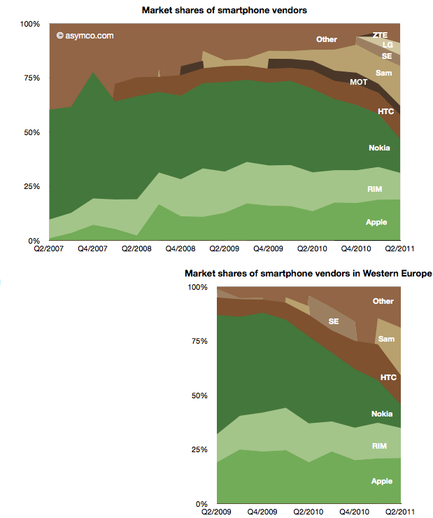
The violence with which new platforms have displaced incumbent mobile vendor fortunes continues to surprise.

  • Nokia’s Symbian platform has gone from 47% share to 16% in three years
  • Microsoft’s phone platforms have gone from 12% to 1%
  • Other platforms have gone from 21% to zero
  • Although far less dramatic, RIM’s decline from 17% to 12%  is causing acute pain and anxiety

This while entrants have grown share in spectacular fashion:

  • Android from zero to 48% (A two year period)
  • iOS from 2% to 19%
  • Bada from zero to 4% (two quarters only)


The picture of platform share over time looks like this: Continue reading “The fate of mobile phone brands”

A new view into the phone market

The profitability (aka Profit/Phone x Phones Sold, aka Rawr) chart is a great way to see the “shape” of the industry at a glance, with attention to volume and profitability.

What is missing however is a perception of the sales level and the pricing of the products. To help in that regard, I prepared an extension to the profitability chart which covers the price and sales for each participant.

You can interpret this graph as an extension of the profitability chart where the “empty” or white areas above each profit area are payments to suppliers and operating expenses. Thus the sum of empty and filled areas (above zero) are equivalent to revenues. If the sum of the empty and filled areas are greater then revenues (i.e. they extend below zero) then the difference is operating losses.

The top of both empty and filled rectangles are set at the average selling price per phone (and the top of each filled rectangle is the operating profit per phone). The width of both rectangles is the volume of phones shipped.

The things you can read into this chart are: Continue reading “A new view into the phone market”

Asymco

Asymmetric Competition

Skip to content ↓