The Competition

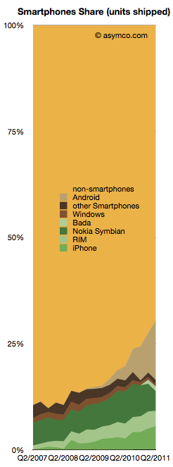
Smartphones made up about 30% of global phone sales last quarter. That is a significant increase from 10% in Q4 of 2007.

From this perspective, iPhone obtained 5.6% share, Android 14.2%, Nokia Symbian 4.6%, RIM 3.6%, Bada 1.1% and Windows 0.4%.

The competition however still has 70.5%.

The chart to the right shows the challenge remaining and the progress being made.

The good news is that the non-smartphone market is not growing while the smartphone market is. In fact, the non-smart market has had a three year CAGR of 0% and a y/y growth of 1.0% and a sequential decline of 6%.

The non-smart portion of each branded vendor’s business is pretty dismal:

  • Nokia saw 17.57% decline y/y
  • Samsung’s non-smart business declined by 8.14%
  • Sony Ericsson’s dropped by a dramatic 80%
  • LG’s fell by 38.56%
  • Motorola is the only one that grew y/y, by 17.86.

The reason all these brands fell is because the unbranded vendors took their place. “Other” non-smartphones grew by 43%. They have been sustaining growth at the rate of 57% compounded over three years.

The following chart shows the increasing share taken by the “other” vendors in non-smartphone units: Continue reading “The Competition”

The Android and iOS pincer movement

Nearly all the data on smartphone shipments is now available for the second quarter 2011. Some fragments are still not public, including ZTE and Huawei (and any others) shipments. We also have estimates for the various platforms including an estimate for Windows Phone and Bada (though not for WebOS).

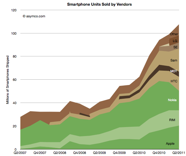
This allows the following chart:

Using the traditional color scheme which separates “integrated” from “modular” vendors, the chart shows overall volume growth and how the volumes are split among vendors.

The market grew at about 73% y/y and 50% compounded over three years and 9% sequentially. The y/y growth rates for individual vendors were: Continue reading “The Android and iOS pincer movement”

The Samsung hedge: Estimating Bada for Q2 and hence Samsung's Android shipments

The number of Bada phones shipped last quarter is not public, however some assumptions can be made that lead to plausible estimates.

First, we know that Samsung shipped about 3.2 million smartphones in Q2 2010 and that total included Bada and Android (and perhaps even some Windows Mobile).

Second, we know that there were about 19.9 million smartphones in Q2 2011.

Third, Canalys published an estimate that Bada grew by 355% y/y.

So if we knew how many Bada phones shipped in Q2 2010 we could derive the current Bada shipments and also realize how many of the nearly 20 million smartphones from Samsung were actually Android.

The clue is in an estimate from December last year Continue reading “The Samsung hedge: Estimating Bada for Q2 and hence Samsung's Android shipments”

Apple share of phone revenues increased to 28%

As previously pointed out, Apple reached two thirds profit share in mobile phone vendors among the eight vendors I track. The following charts shows the historic growth in that share and the share of revenues (including 4 quarter trend line). Revenue share increased to 28% in the last quarter.

The share doubled from Q4 2009. I should also point out that it was the highest of all the competitors. The following chart shows the split over time: Continue reading “Apple share of phone revenues increased to 28%”

The end of easy growth in smartphones

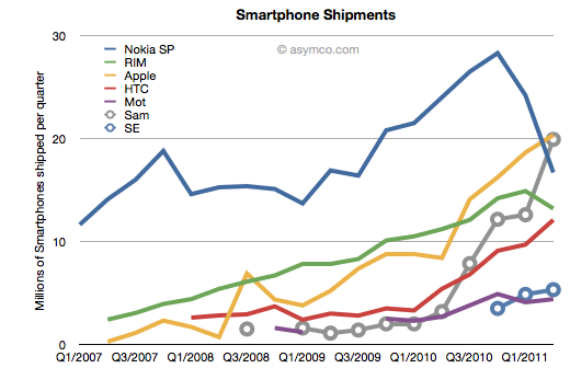
At the end of last year I was saying that the smartphone boom was a tide that lifted all boats. That is no longer the case.


But the big story is that there has been a clear non-seasonal counter-cyclical decline in Nokia and RIM’s smartphone performance. RIM’s steady rise has come to an abrupt halt. Nokia’s decline has accelerate precipitously. So much so that Samsung and Apple have overtaken Nokia and RIM and it looks like HTC will overtake RIM within one quarter and perhaps Nokia as well.

Continue reading “The end of easy growth in smartphones”

The Profit/Phone x Phones Sold Chart

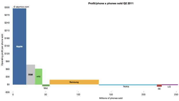
The following chart shows the current profit distribution between phone vendors with an eye toward identifying volume dependencies. The vertical axis represents operating profit per phone and the horizontal axis the number of phones sold.

The area of each vendor bar is therefore the total operating profit that vendor captured. A vertical (portrait) orientation implies high profitability with relative low volume while a horizontal (landscape) orientation implies a high volume/low profitability focus.

The other important observation is that bars can also be negative. Those vendors’ names are listed below the bars rather than within them.

You can also compare the chart with the one from last quarter:

The Rawr Chart | asymco

Apple captured two thirds of available mobile phone profits in Q2

The major publicly traded phone vendors have all reported results for the second quarter. Based on the data available so far we can begin putting together a picture of the market.

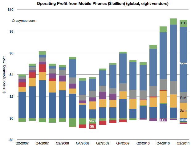
The first picture I’ll draw is usually the last: profitability. The following chart shows operating profit from the sale of mobile phones among the eight vendors I follow (Nokia, Samsung, LG, Sony-Ericsson, Motorola, HTC, Apple, RIM).

This quarter saw a slight sequential decline in overall profit for the sector, but four vendors did not manage a profit from selling phones. Nokia, Motorola, Sony-Ericsson and LG all saw losses. The other vendors split the slightly decreased pie with Apple getting two thirds of it (66.3%)

This share is up from 57% in Q1 and 50% in Q3 and Q4. Samsung’s share went to 15%, though that’s not a peak level historically. In Q1 2008 the company was at 21%. RIM was at 11%, a level in a range that has been unchanged for three years. Finally, HTC captured 7.4%, a new high and an increase from 6% since last quarter.  The profit share chart follows: Continue reading “Apple captured two thirds of available mobile phone profits in Q2”

The Verizon small bang

As Verizon has reported iPhone sales for one and a half quarters, it’s time to try to discern the impact on the product. There were several hypotheses floating around prior to the “big bang” of Verizon.

Some assumed that there would be a large migration away from AT&T and that AT&T iPhone sales would slump. Others that there would be no Verizon iPhones volumes at all because there were so many Android users already converted. There were also suggestions that the iPhone would explode in growth with two major operators carrying it.

What really happened?

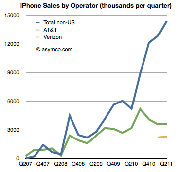
The first chart shows historic AT&T activation with Verizon activations added. It also shows sales to “none of the above”, namely non-US sales of iPhones[1].

AT&T iPhone activations show no significant impact from Verizon and Verizon itself shows a modest start to sales[2]. What did not happen is an exodus from AT&T. We also did not see a rejection of the iPhone by Verizon customers long exposed to anti-iPhone Droid advertising. We also did not see a considerable impact of Verizon on growth.

Verizon did contribute (4.5 million Verizon iPhone users is nothing to sneeze at)  but the contribution was to a degree that was nowhere near a big bang.

That was because the real big bang was from the rest of the world. The same data in the first chart is shown below as a stacked area chart and a share chart. Had Verizon not come on board the business would still have grown year-on-year over 100% (and sequentially). Continue reading “The Verizon small bang”

Visualization of Apple's Income Statement

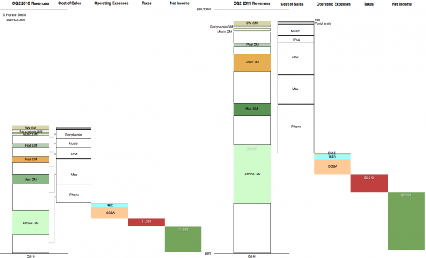
This graphic representation of the current and year-ago sources of income and sources of expense for the company shows how the business evolved in the last year.

The colored segments in the first column are Gross Margin contributions per product for Calendar Quarter 2, 2010. The white segments are cost of sales for those products. These costs are combined in the second column and the operating expenses are shown in the third column, taxes in the fourth and Net Income is shown in the fifth.

The same information is shown for Calendar Quarter 2, 2011. Click for larger view (1440 x 873 pixels)

The increase in the first columns is the “top line” growth and the increase in the last (fifth) columns is the “bottom line” growth

Similar charts for the last few quarters are shown here:

Combating superlatives fatigue | asymco

Summary view of Apple’s income statement [Updated] | asymco

Describing Apple’s growth, cost structure, product-level and overall profitability in a self-explanatory chart | asymco

Apple has moved on

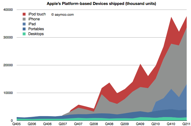
When Apple changed its name from Apple Computer to Apple Inc. they signaled that their business has moved on. We can say it’s to devices or to mobile computing or to the Post-PC era. To understand that this is not a shift driven only by wishful thinking we can plot the change in volumes for the platform-based devices Apple sells.

The stack of products is shown in an increasing level of mobility. At the bottom is the non-portable desktop Mac, above are Mac portables (laptops) followed by the iPad, iPhone and iPod touch. The mobile computers Apple sells are explosively more popular (and important).

To gauge importance consider the following chart which shows the unit values above multiplied by the average price they are able to obtain for a picture of the sales mix. Continue reading “Apple has moved on”

Asymco

Asymmetric Competition

Skip to content ↓