How we do all this will never be the same

In a new ad for the iPad Apple once again makes the case that the tablet is a good substitute for a PC in a number of use cases (and permits some new ones.)

We’ll never stop sharing our memories. Or getting lost in a good book. We’ll always cook dinner and cheer for our favorite team. We’ll still go to meetings, make home movies, and learn new things. But how we do all this will never be the same.

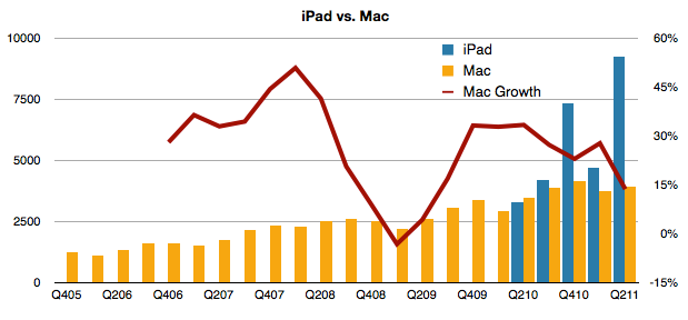
This belief that the iPad “cannibalizes” the PC is a powerful concept. The growth of the PC has certainly been affected. But has the Mac’s growth also been affected?

Tim Cook seems to think so. In the earnings call he said:

In terms of cannibalization, we do believe that some customers chose to purchase an iPad instead of the new Mac during the quarter, but we also believe that even more customers chose to purchase an iPad over Windows PC. And as I’ve said before, there’s a lot more of the Windows PC business to cannibalize than the Mac.

If we look at the behavior of Mac vs. iPad, the following chart may be useful:

Continue reading “How we do all this will never be the same”

Apple's share price (adjusted for earnings and growth) reaches new low

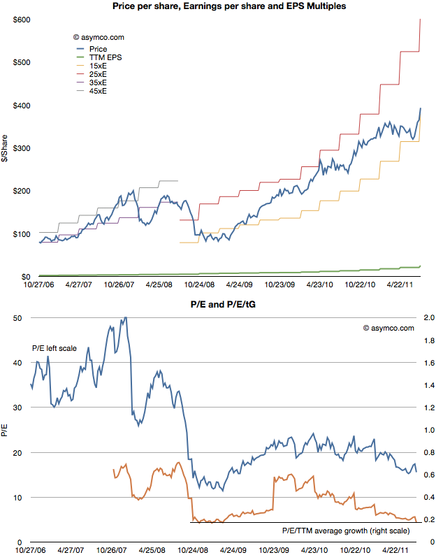
After Apple reported earnings growth of 125% its share price dropped to a P/E of about 15. This reduction in valuation is part of a trend I’ve written about for over a year so there were no surprises. The first chart below shows how the stock has traded between increasingly lowered P/E bands.

As the second chart shows, not only is the P/E ratio declining, but when seen against the trailing twelve months (TTM) average growth rate, the P/E/TTM ratio is now at the lowest since the great recession (around 0.17–a value of 1.0 is a rule of thumb for “fair value” in a growth stock).

Those values include cash. Excluding cash, the P/E as of Friday was 12.4. On a forward basis (my estimate–which has shown be be conservative lately) the P/E is around 7.

Perhaps some day in the future Continue reading “Apple's share price (adjusted for earnings and growth) reaches new low”

A princely sum

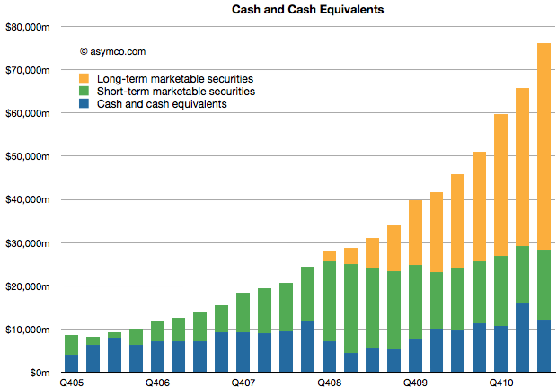
Apple’s cash and marketable securities increased to $76,156,000,000. The increase was 15% sequentially or $10.4 billion in three months. That’s the equivalent of an increase of $11 per share (to a current $81.2/share.)

The composition and growth of liquid assets is shown in the following chart:

There is little I can think to say about this that hasn’t already been said (see last Critical Path show.)

Except maybe that the amount is now nearly 16% higher than three months ago. And that the amount added last quarter is higher than the amount on hand 4.5 years ago. And that the cash added is higher than Google’s overall revenues in the quarter.

Footnote:

In Q1 2009 the company’s share price briefly traded at $78. A buyer of shares at that price will have recovered their investment in retained earnings in nine quarters.

How did I get the iPhone number so wrong?

Here were my predictions for the third fiscal (second calendar) quarter from April 25th.

Estimates for Apple’s third fiscal quarter (ending June) | asymco

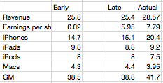
Later in the quarter I updated them for submission to Philip Elmer-Dewitt’s blog at Fortune. The original and updated figures are shown in the following table (with actuals).


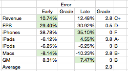
The changes were not significant except in a reduction of iPads. Three items were better in the early call and three were better in the late with one item equal. Using a simple method for scoring the results I gave myself the following report card:


As the Revenue and EPS figures are dependent on the other line items, the most significant error is clearly the iPhone where the error was over 30% (and hence deserves an F). The other figures were not very close either  so the overall grade point average is a very mediocre C (2.3).

So, as in previous quarters, nailing the iPhone number is everything. Having failed to guess correctly, the whole performance fell apart.

So how did I manage to get the iPhone number so wrong? Continue reading “How did I get the iPhone number so wrong?”

Apple's growth scorecard for second quarter 2011

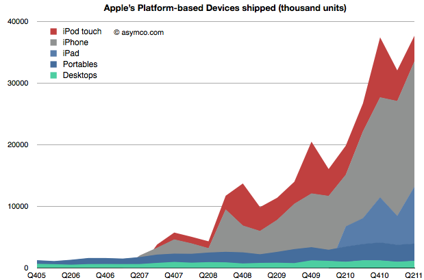
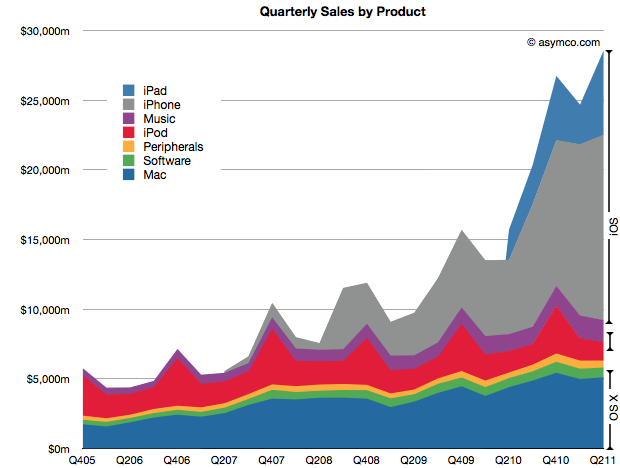
Apple’s second calendar quarter was a record breaking performance. This is surprising because it shows super-seasonal performance. For as long as I can remember the fourth calendar quarter (i.e. holiday) was always the strongest quarter, by a large margin. This quarter was higher than the last holiday quarter. A glance at the following chart shows the anomalous performance:

iOS products make up 71% of sales (and at least 78% of profits) which makes the following growth scorecard a bit moot.

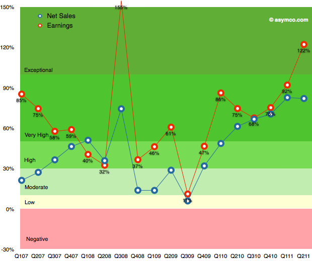
The growth in iPhone sales of 150% is hard to understand given the previous product cycle, but more about this later. The 122% growth in profits is (nearly) unprecedented. The growth in Q3 2008 was due to the launch of the iPhone 3GS and since there was no iPhone launch this quarter the growth shatters existing assumptions about the franchise.

The pattern in the table above is shown in the following chart:

This performance needs to be digested and contemplated a bit longer but I will make one early conclusion: One of the most common themes during the last year was that Apple’s growth rate was unsustainable. The theory cited was one of the “law of large numbers”. Apple’s performance shows it to be nonsense.

Instead of decelerating, Apple’s growth is accelerating.


A new way to value Apple

Almost all valuation models for Apple assume it’s a hardware company. The modeling algorithm for hardware is simple:

  • For each year in near future
    • For each product line
      • Compute contribution
  • Determine company value by summing contributions and multiplying by a P/E ratio

The major difficulty is in predicting the growth of each product line. This is difficult because buyers can be fickle. Companies employs all sorts of tools in order to secure repeat customers but if switching costs are low, the company can crash in value. For this reason, analysts pick various ways to predict device  sales. Some choose to index each product on production (channel checks), demand (customer surveys,)  or even on a top-down share of total (market research on growth of whole market and assumptions of share).

Although simple and convenient, this model does not probably match the way Apple is managed. The company does not build hardware products to sell and forget. It builds platforms which are best seen as sources of recurring revenues. Users are incentivized to continue buying devices. iCloud, iTunes and other Apple properties are expressly designed to that goal–and they are not cheap to run. So, the company must see the world through a different set of lenses than the default model shown above.

To think about the business like they do, we need to put the data through a similar set of lenses. I began with a modest proposal last month to value each user as a source of recurring revenue. Now it’s time to expand on this method.

The following chart shows the recurring revenues per user by product and the current and possible future size of user bases.[2]
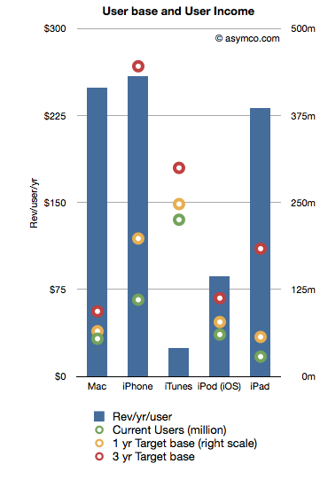
Revenues/yr/user are bars with the left axis and the User bases are various colored circles indexed with the right axis.

The assumptions that went into the data are as follows:

  1. Device life span is as per previous article linked above
  2. User base growth for 1 year is: Mac 20%, iPhone 80%, iTunes 10%, iPod 30%, iPad 100%
  3. User base growth for 2nd and 3rd years (recurring): Mac 20%, iPhone 50%, iTunes 10%, iPod 20%, iPad 80%.
  4. The Revenue per user is assumed constant

Note that the user base growth figures are lower than the product growth levels seen historically. Obviously, the model is highly sensitive to these growth assumptions so they need to be scrutinized and tested rigorously.

Nevertheless, as a straw-man proposal,  the recurring revenues for all these products[1] is shown in the following chart:
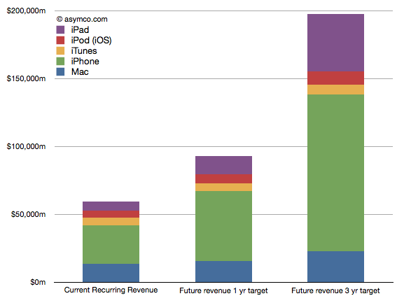
Once the income is estimated, we can take that value and assume a profit margin (net) and then multiply the earnings by a multiple. Using a 20% net margin and 12x P/E yields the following chart.
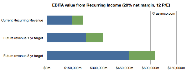
(I added an assumed level of cash in green.)

This model would imply that the company today could be valued at $208 billion on the basis of its installed base alone. That value would be about $323 billion in one year and $620 billion in three years. Dividing by the number of shares outstanding (935m this year increasing at 2% a year) yields a share price of $222, $339 and $629 by mid 2014.

These values can be considered “lower bounds” on valuation since they assume income from previously secured customers. The speculative part of investment would be based on what the future bases will look like (so, for example, if one believes these assumptions, the $629 figure could be considered a target to be discounted to today).

Notes:

  1. Excludes Software, Peripherals, non-iOS devices, and any other service revenue.
  2. Compare this char to social media companies (MIT Technology Review)

The Frontiers of Platform Adoption

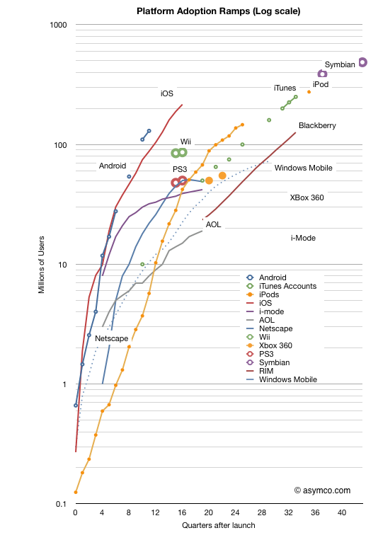
In the last two weeks we received two more data points which allow an update to the “race to a billion” platform growth trajectories. Android reached 130 million active users and iOS reached 200 million.

The updated picture looks like this:

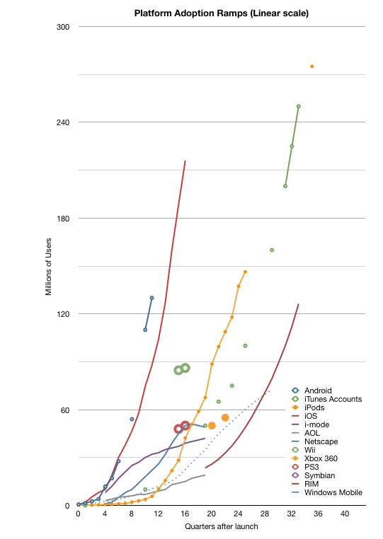
Note again that this is a log scale graph. Every major horizontal gridline is an order of magnitude (10x) larger than the one below. It’s a busy graph. The linear version follows:

For the detail-minded, it makes for some interesting comparisons, but I want to create a more compelling visualization. One where each platform can be judged for potential and impact at a glance.

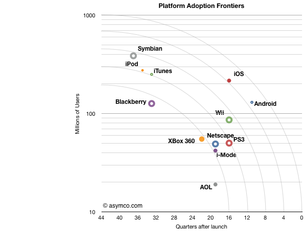
To that end I came up with something I call the platform “adoption frontier” view. Based loosely on the Pareto efficiency concept the chart is reduced to show the latest known figure of (users,time) and overlay concentric arcs centered on 10 million/10 years and radii of unit years (x-axis).

Note that the time axis is reversed from the chart above. This was to allow the best performers to be shown at the upper-right of the chart.

The way to read this is as follows:

  • Each platform is represented by a point which shows its currently known peak in users and time to reach that number of users.[1]
  • The arcs (frontiers) represent possible performance classes.
  • The lowest frontier spans “four years to reach 10 million” to “10 years to reach 200 million”. The highest frontier spans “<1 year to reach 10 million users” to “10 years to reach 1 billion users”. Each frontier can be read in a similar way.
  • The main assumption is that a platform can reach more users but it takes time. Better performance is when a platform moves toward a frontier further from the origin.[2]
  • I chose the limits of the chart specifically: 10 years is roughly the limit of most platforms[3] in the current cycle time of technology disruption; One billion users is an upper bound set by Windows.

One thing you can read from the chart is to say that “from a growth point of view, Blackberry is weaker than any of the other platforms.” Sitting below the lowest frontier with fewer users than Android which has been in the market for less than a third of the time it seems to be less impressive. It is, however, in a similar band of growth as Xbox 360, which, by some measures, is a success story. So the performance standard is relative.

One can also see the rough equivalence in growth between iPod and Symbian, both having crossed the second frontier. But iOS and Android are in a different league. They sit alone beyond the fourth frontier. The fifth frontier is the “billion user in a decade” potential and it seems within reach for both.

What this view also offers is an answer to the question of competitiveness. Although platforms can co-exist and don’t necessarily overlap, the question of becoming overwhelmed with “good enough” by widespread low end alternatives looms for the specialized platforms. For example, game consoles look very vulnerable because they simply do not have the potential to cross high frontiers and orders of magnitude of casual gamers (with potential TV connected devices) might orphan the consoles.

I’ve also included some platforms that have peaked and faded (AOL and i-Mode and Netscape) as a warning. The frontiers illustrate of how hard it is to reach the upper limits of growth. Each level is exponentially more difficult than the last and achieving it with paying customers is a remarkable story of value creation.

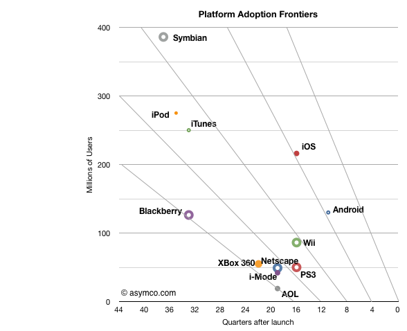
[UPDATE]

I add below the frontier chart with a linear vertical axis. Note that the frontier lines are not equivalent to the frontier arcs in terms of coverage.

Note:

  1. The data I have is for platforms where users have to pay something to participate. I exclude platforms where users are the only merchandise being sold (i.e. social networks or email provision).
  2. I only include the initial ramps not upgrades. Windows is anomalous because it is so old. During its first decade (1985 to 1995) it reached over 17 million users but placing it on this chart does not do it justice given the growth occurred in its second decade.
  3. See Symbian and Windows Mobile. However again, Windows which is nearly 30 years old, is an exception.


Is the tablet computer a new PC or post-PC?

Steve Ballmer stated and Andy Lees confirmed that Microsoft views iPad and other tablets as “just PCs”. From a market measurement point of view Canalys agrees. IDC and Gartner don’t, calling the new devices “media tablets.”

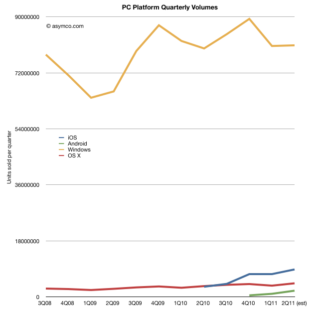
Before deciding whether tablets belong with PCs in market metrics, it would be interesting to look at what the data shows. When seen as a combined market, the focus should be on platforms. The following chart shows the four main PC+tablet platform volumes since late 2008 [1].

The second chart shows the same data as share of total market: Continue reading “Is the tablet computer a new PC or post-PC?”

iTunes app total downloads (finally) overtook song downloads

It was only a few weeks ago (at WWDC) that we had an update on the app store growth rates. The data was presented here.

One of the data points from the event was that iTunes hit 15 billion song downloads. Last week we heard that iTunes also hit 15 billion app downloads.

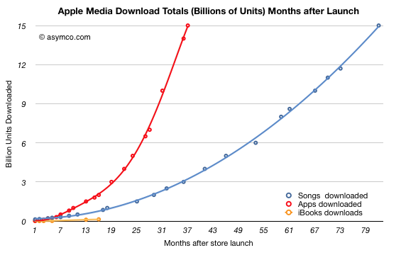
The milestones were reached within less than a month so it’s a fairly safe assumption that apps have overtaken songs. I had originally guessed that the cross-over would take place at 13 billion at the end of 2010.

The actual performance is shown below (total downloads indexed to same starting date):

The 15 billion app threshold was passed within exactly three years while the 15 billion song threshold was passed in six years and 10 months. Shown on the actual time scale, the chart looks as follows: Continue reading “iTunes app total downloads (finally) overtook song downloads”

Asymco

Asymmetric Competition

Skip to content ↓