Following up on my last post on how misleading US-only share comparisons can be, I decided to draw charts to visualize the comparison.
As Android and iPhone compete in various ways, it’s hard to see which is the preferred choice given a direct comparison. In other words, iPhone and Android devices rarely are placed next to each other with similar terms.
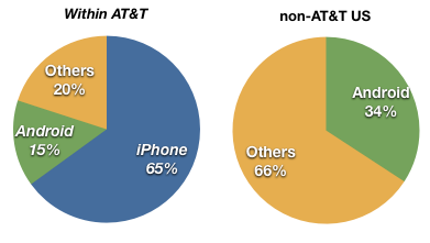
Take the US market for example. The overall data from NPD suggests that last quarter Android reached 28% share vs. 21% for iPhone. Many of those Android devices were new to market or at least newer than the iPhone which in Q1 was coming to the end of its product cycle. Second, pricing for Android devices seems to have been quite aggressive with buy one get one free sales. But I won’t dwell on tactics now; what I do want to note are the differences in share between AT&T users and non-AT&T.
 Note that within AT&T, iPhone outsells Android over 4 to 1. iPhone also outsells “others” (mainly RIM) more than 3 to 1. However, outside AT&T, where the iPhone is not available, Android does not outsell “others”.
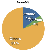
If we exclude the US altogether, we also see that Android does not have a great distribution.
 Outside the US, the iPhone also outsells Android nearly 4 to 1, but it has a way to go before challenging Symbian which makes up the bulk of “Others”.
So in markets where Android is head-to-head with the iPhone (AT&T and non-US markets), iPhone’s lead is quite high (still). The possibility still exists that Android will overtake iPhone given the broad licensing and distribution, but it’s not necessarily a given. And in any case, iPhone is not the market share leader today and that leadership does not seem to be their objective (note the pricing).
The bigger question is what will happen to RIM and Symbian as Android grows.

